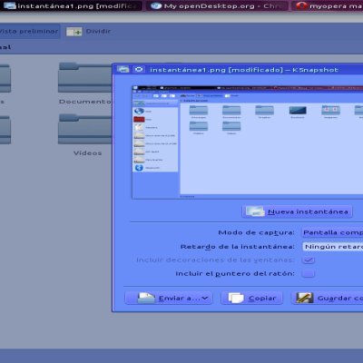
While there are lots of beautiful Windows 7-like color schemes out there I put special interest in this theme to be: a) pleasant to the eyes, b) easy to the eyes for long-hours work and c) comfotable.
While my opinion is totally subjetive and biassed I think I did a good job because it's been a while I'm using it and I still enjoy it ^^
What you will find:
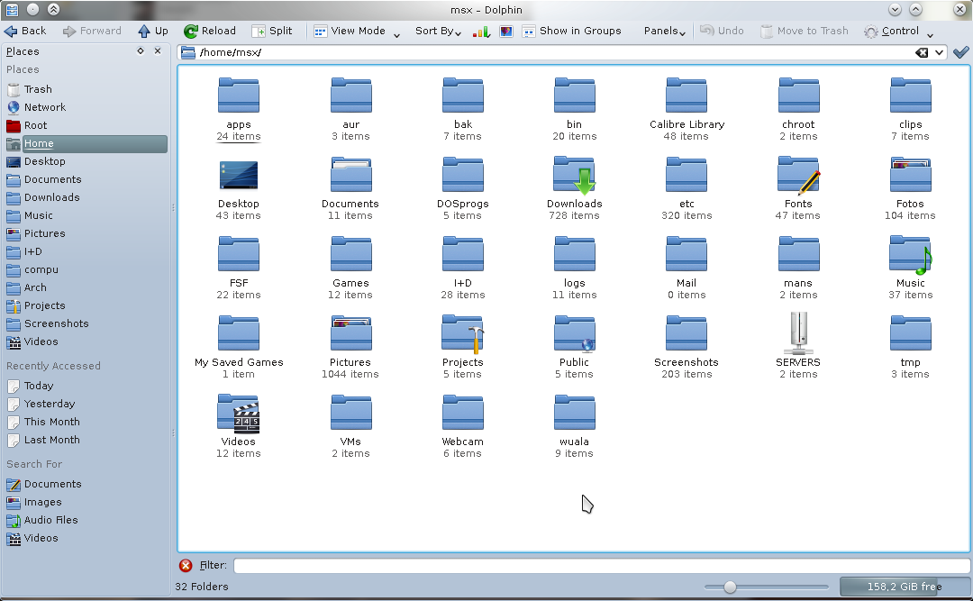
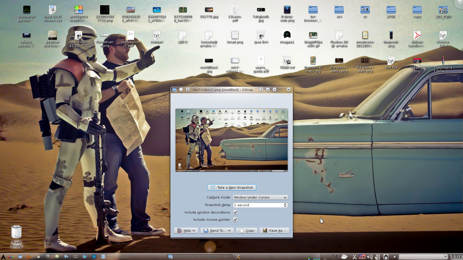
1. a nice, smooth light-blue gradient window background.
2. a sharp yet smooth buttons color that blends perfectly with the background sporting a gray light-blue tone.
I looked forward them to have enough contrast from the background for easy find yet to be perfectly blended with the window general look and feel.
3. the Selected Item background color is of a darker bluish tone for added contrast and easiness on eyes - most other color schemes I've found have this set to a way-too-bright cyan-like tone.
4. minor tweaks and adjustements all around the scheme.
Enjoy and fork






Ratings & Comments
2 Comments
When installed, this is called 'msx.Win-7-marble'. I was looking for a theme called 'Windows 7 colours' after installing. I uninstalled and reinstalled it a couple of times before noticing. The trend of obscure naming is rampant in the desktop widget world, please, let's not follow that here. Name your theme the same as you call it, or call it what you name it. I like this, by the way. It's now my default. Good job. Also, I need to clean out the themes I don't use. Thanks for making me notice that as well.
O_O Seems I forgot to cleanup some mess! I'm glad you like it, I just put together some nice color sets I found on KDE-Look.org and made a little change here and there. Power to the F/LOSS!!!