Love the theme. My partner loves it, too, and she doesn't take change on the computer easily.
Three suggestions: (1) Icons for System Menu and Terminal Sessions appear identical. Perhaps System Menu could be changed? (2) Add some simple colors to apps: Firefox, Opera, Amarok, KCalc, KWrite, etc., to bring them into harmony with others. (3) Expand icons to include OpenOffice.org, GIMP, and other common programs.
Again, beautiful work. Thanks.
as always, im your fan.
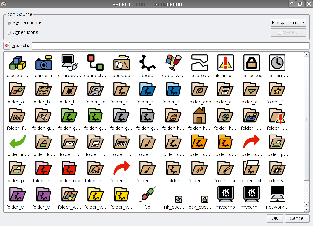
the icon for compressed files is not clear. it seems to be a zip. i suggest either making it more clear, or change to a 'package'-like icon.
you are doing a wonderful job.
thanks, the-q.
These are the absolute finest icons I've ever seen on any GUI operating system, and I've tried almost all of them!
Danny, you are a true artist. My sincerest compliments.
These are really great if you spend a long time in front of the computer.
Very easy on the eyes, with nice clean lines. Color choices are very good too.
This is the total anticandy theme. ;)
Eagerly awaiting for colors for the rest of the set.
Excellent iconset :) Been using it for a few months now, and even though there are iconsets out there that are prettier in a flashy sort of way, this one's so far the best I've tried from a usability perspective.
Keep up the great work :)
I think I like the grayscale version better, but this is nice too. And sometimes the gray icons can look very dull on my desktop; other times they look just fab. I look forward to testing these new, coloured versions.
Your icon theme has successfully made me switch icons AND my profile view in the file manager....which is no an easy task since I am very particular on the look of my desktop. Keep up the great work!


Ratings & Comments
22 Comments
9 +
An Update would be nice. It is a good looking theme!
Lots of missing icons. Would be great if it was updated.
... but the back, up, and next icons are all instead displaying as a K-menu icon. Any ideas as to why this is happening? (I'm using KDE4 BTW)
Love the theme. My partner loves it, too, and she doesn't take change on the computer easily. Three suggestions: (1) Icons for System Menu and Terminal Sessions appear identical. Perhaps System Menu could be changed? (2) Add some simple colors to apps: Firefox, Opera, Amarok, KCalc, KWrite, etc., to bring them into harmony with others. (3) Expand icons to include OpenOffice.org, GIMP, and other common programs. Again, beautiful work. Thanks.
as always, im your fan. the icon for compressed files is not clear. it seems to be a zip. i suggest either making it more clear, or change to a 'package'-like icon. you are doing a wonderful job. thanks, the-q.
Great icons, much better than all those crystal/aqua/ibored icons
These are the absolute finest icons I've ever seen on any GUI operating system, and I've tried almost all of them! Danny, you are a true artist. My sincerest compliments.
Congratulations on this icon set. It's unobtrusive, (just how I like it) but remains absolutely clear and crisp. Well done.
It has been chosen in Semantik (for the flags): http://www.kde-apps.org/content/show.php/Semantik?content=55242
These are really great if you spend a long time in front of the computer. Very easy on the eyes, with nice clean lines. Color choices are very good too. This is the total anticandy theme. ;) Eagerly awaiting for colors for the rest of the set.
simple, elegant, fun even. the most perfect icon set i've ever used. thanks!
"The file is not a valid icon theme archive"
...along with the Monochrome version, this icon set is one of the best I have ever used. Please keep up the excellent work!
Excellent iconset :) Been using it for a few months now, and even though there are iconsets out there that are prettier in a flashy sort of way, this one's so far the best I've tried from a usability perspective. Keep up the great work :)
Danny, I've used your icon sets for a couple years now, and they just keep getting better! thanks so much for sharing your work.
Very nice and consistent... This is very complete, there is even an icon for kwave! Keep up the great work!
what a lovely icon set. i've been using it for a few days and i'm not going back - well done on a great job.
I think I like the grayscale version better, but this is nice too. And sometimes the gray icons can look very dull on my desktop; other times they look just fab. I look forward to testing these new, coloured versions.
Actually, after using these icons fora couple of days, I really like them! And, yes, I like them better than the grayscale versions. Great work!
This is a very very smooth and clean icon set. The colors go well given their context (green play button, etc) Cant wait for release 2!
Your icon theme has successfully made me switch icons AND my profile view in the file manager....which is no an easy task since I am very particular on the look of my desktop. Keep up the great work!