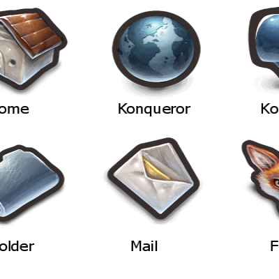
Description: A tangoish icon theme for KDE 4! I was waiting for someone else to release one and just got sick of waiting!
I like the simplicity and how easy it is to identify various actions. Apparently 'Tango' is more of a way of organizing things, not the actual style of icons, so this theme is 'tangoish'. I think it works beautifully with the default Oxygen style of KDE 4.
I've included a list of things which are missing/inadequate. I appreciate any suggestions for changes or what apps/icons you want added!
Licensing: As I was looking to make a complete iconset for KDE 4, the tango-icon-theme by itself didn't cut it and I had to borrow from a number of different sets including bctangokde, gnome-icon-theme, and ubuntu's human icon theme (among others). I've included a list in a file called 'licenses' which details the license(s) each icon falls under. Keep this in mind if you plan on adapting this theme or using any of the icons contained within: some are CC BY-SA and some are GPL! Those licenses are not compatible, meaning you can't simply relicense any ol' GPL app/image you find as CC BY-SA, and vice-versa.
Note also that I have so far only created a few of these icons, all the rest were done by talented artists such as jimmac and boskicinek. Even those few were just patched together from others' work. As such, consider this a compilation more than an original work.
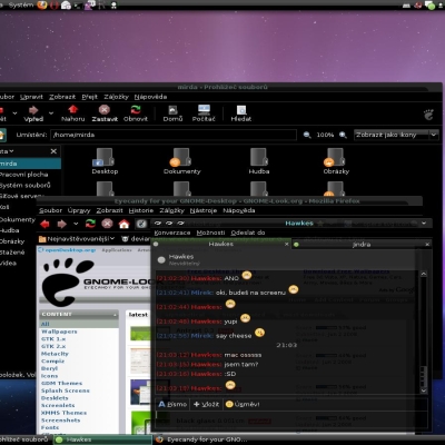
Installation: simply unzip the file, then open up system settings > appearance > icons, add and select the theme, and hit 'apply'!
Enjoy!Last changelog:
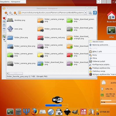
0.4: ~80 new icons Kmail complete Konversation (kde4) complete Ark complete Dolphin complete 0.3: Various app icons user-* icons transform-* icons Amarok icons 0.2: Added app icons Added korganizer icons Other small cleanups 0.1: First Release
Agreed. Thank you very much for this nice set. Now, my KDE 4-testinstallation looks finally good :-D. Please keep on working on it.
Disclaimer: This is my personal taste! The Oxygen icons are a really, really great work of art and I like them - but (currently *g*) I prefer some less shiny icons on my desktop.
Best icon theme for KDE4 so far!
Too bad that some icons are still missing. Mainly, I miss transform* icons (if I move a plasma-applet in a panel it looks pretty ugly right now).
But keep up the good work!
I could only find 16x16 and 22x22 icons for two of the transform-* icons. Hopefully that works. I'm assuming you're using KDE 4.1 or an unorthodox plasma theme, since it looks like the themes themselves take care of those widget appearances.
There are a lot of icon themes that "work" with KDE 4 (mostly), but this is the first one I've tried other than the default Oxygen that really does work well, seems to be complete, doesn't have any missing icons that revert to Oxygen, etc. Regardless of the rating, I will also say that some of us who converted from Gnome really do appreciate the sense of Nostalgia. I've been running this, along with QtCurve (set to mimic Clearlooks), Plastic window decoration and color scheme, and the Aya plasma theme. It feels like I've come home to Gnome... --except it doesn't suck anymore. :D


Ratings & Comments
7 Comments
Simply the best Tango icon set for KDE 4. I love it :)
The Tango/Gnome icons are better usable at smaller sizes than these shiny looking new stuff on "modern" desktop enviroments.
Agreed. Thank you very much for this nice set. Now, my KDE 4-testinstallation looks finally good :-D. Please keep on working on it. Disclaimer: This is my personal taste! The Oxygen icons are a really, really great work of art and I like them - but (currently *g*) I prefer some less shiny icons on my desktop.
Best icon theme for KDE4 so far! Too bad that some icons are still missing. Mainly, I miss transform* icons (if I move a plasma-applet in a panel it looks pretty ugly right now). But keep up the good work!
I could only find 16x16 and 22x22 icons for two of the transform-* icons. Hopefully that works. I'm assuming you're using KDE 4.1 or an unorthodox plasma theme, since it looks like the themes themselves take care of those widget appearances.
There are a lot of icon themes that "work" with KDE 4 (mostly), but this is the first one I've tried other than the default Oxygen that really does work well, seems to be complete, doesn't have any missing icons that revert to Oxygen, etc. Regardless of the rating, I will also say that some of us who converted from Gnome really do appreciate the sense of Nostalgia. I've been running this, along with QtCurve (set to mimic Clearlooks), Plastic window decoration and color scheme, and the Aya plasma theme. It feels like I've come home to Gnome... --except it doesn't suck anymore. :D
I'm glad you like it! I'm using the default Oxygen style with it (looks snazzy) and Aya as well!