Will you people be PATIENT? Considering that Code2 has to, first and foremost, make a living and feed his family, and has kindly worked on this Kore suite for FREE, I think you should be a little more grateful, instead of yelling, "Hurry up!" all the time.
He didn't HAVE to do all this, for free, for you...
/izo\
I'm very impatient seing the fully completed suite.
I don't know what your priorities are, but would a 100 CHF persuade you to finish it sometimes before 2008?
PS: I'm standing to my word...
Goodness, I'm becoming very impatient to see at least a semi-completed icon set! :) I have a distinct temptation to badger you about it. However, I can understand that there are likely other things you must attend to, and resign to waiting with bated breath. :)
Those icons look quite abstract but extremely nice. Good job. Keep working in this direction, hope to see first release of given Icons Theme soon and start using it on my own computer ;)
I can only guess as to what these icons are supposed to represent, but from an aesthetic angle, you seem to be on the right track. :)
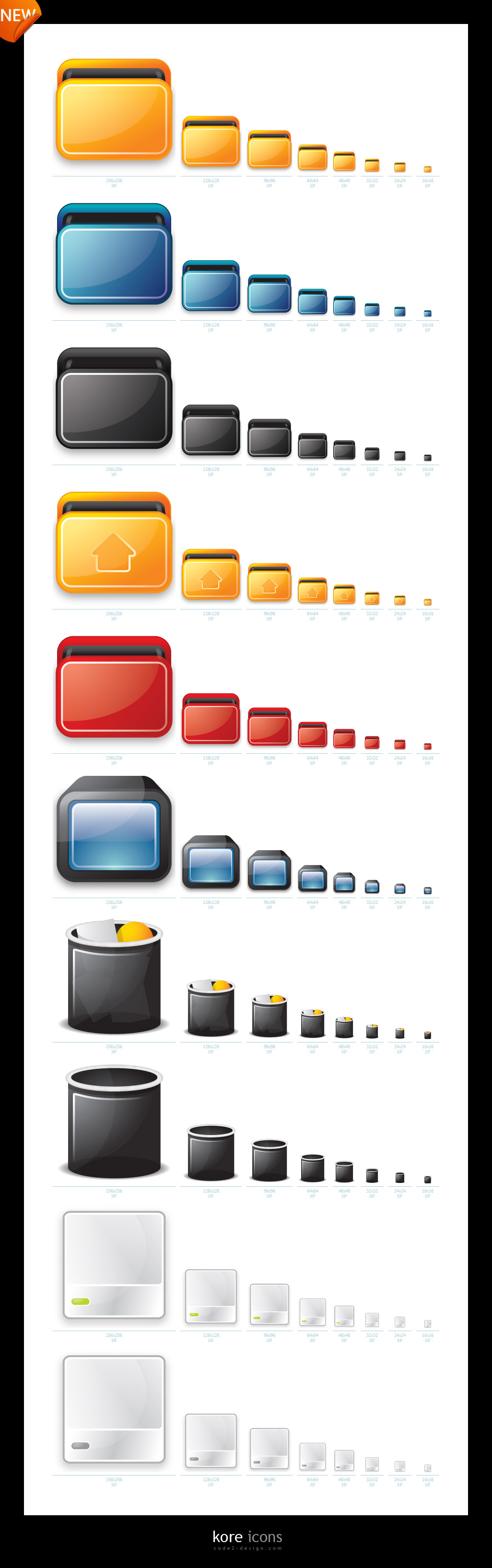
The rounded glossy reflection on the bottom icon (black frame, blue panel) is interesting... It flicks back and forth in my mind as a reflection from the object versus a reflection near the object (like there's another layer of glass just in front of the visible icon).
The lighting effects on the whitish icon are completely different from those on any of the other icons. Is that one of the ways in which you might be differentiating, for example, mimetype icons and application icons?
I very much appreciate that this theme is not dominated by blue, as so many others are. :D I like the orange/amber on the first line. ^_^
Thanks very much, this took 4 attempts to get it near to where i wanted it.
3 days of making a home icon, calling it shit, making a new one, reworking it, throwing it away again asf. HAHA
We, all designers walk through this path my Friend.. and then, the a beautiful work comes to light.
Keep it up, you are talented, i like your style, cause have some of mine too :)


Ratings & Comments
16 Comments
Any previews and not actual themes should be in the category Screenshots, as there is no actual theme to download.
..he's developing Windows skins :( slackero is a sad panda. http://code2.deviantart.com/
maybe we can help ? im good with photoshop ;)
Will you people be PATIENT? Considering that Code2 has to, first and foremost, make a living and feed his family, and has kindly worked on this Kore suite for FREE, I think you should be a little more grateful, instead of yelling, "Hurry up!" all the time. He didn't HAVE to do all this, for free, for you... /izo\
I'm very impatient seing the fully completed suite. I don't know what your priorities are, but would a 100 CHF persuade you to finish it sometimes before 2008? PS: I'm standing to my word...
Goodness, I'm becoming very impatient to see at least a semi-completed icon set! :) I have a distinct temptation to badger you about it. However, I can understand that there are likely other things you must attend to, and resign to waiting with bated breath. :)
available? Not accurate, but something like "In 5 months" or so. It looks so awesome!
Lokking forward to these!! need to add a bit of colour to desktop computing :)
Ok, looks promissing, I am just concerned about the usability due to semiotics but just time will say.
Cool Theme and look very nice Thanks, Mena
Those icons look quite abstract but extremely nice. Good job. Keep working in this direction, hope to see first release of given Icons Theme soon and start using it on my own computer ;)
You are my hero!!!!!!!!!! Keep up the brilliant work! :)
I can only guess as to what these icons are supposed to represent, but from an aesthetic angle, you seem to be on the right track. :) The rounded glossy reflection on the bottom icon (black frame, blue panel) is interesting... It flicks back and forth in my mind as a reflection from the object versus a reflection near the object (like there's another layer of glass just in front of the visible icon). The lighting effects on the whitish icon are completely different from those on any of the other icons. Is that one of the ways in which you might be differentiating, for example, mimetype icons and application icons? I very much appreciate that this theme is not dominated by blue, as so many others are. :D I like the orange/amber on the first line. ^_^
I love your work, its just brilliant!
Thanks very much, this took 4 attempts to get it near to where i wanted it. 3 days of making a home icon, calling it shit, making a new one, reworking it, throwing it away again asf. HAHA
We, all designers walk through this path my Friend.. and then, the a beautiful work comes to light. Keep it up, you are talented, i like your style, cause have some of mine too :)