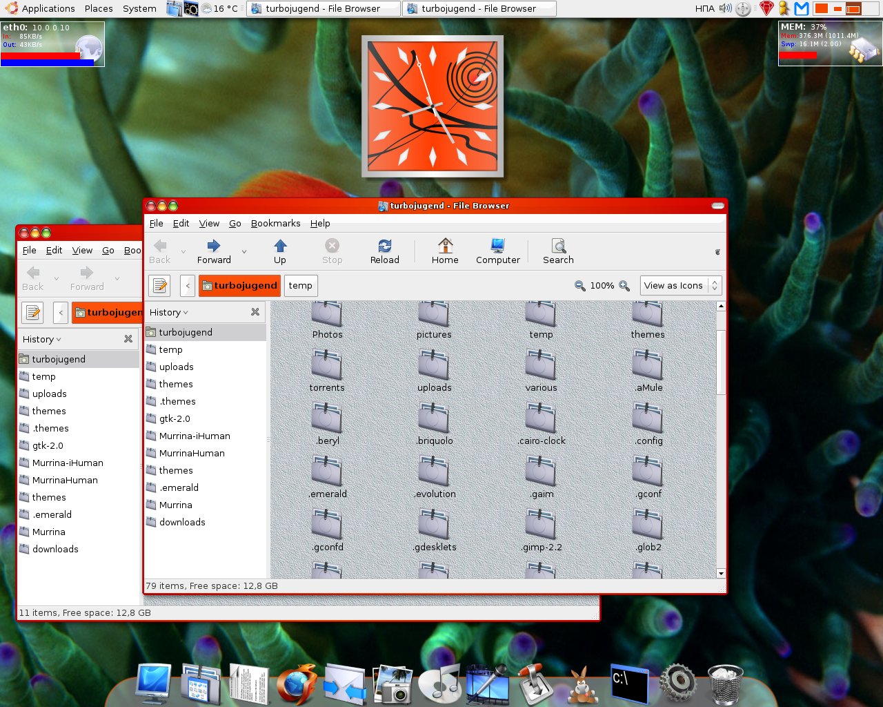
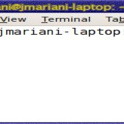
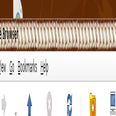
Description: >>> INTRO : Here it is, an emerald border theme that is enough eyecandy yet it is not a copy. I think we lack those... I had to use top-left positioned buttons as it is more spontaneous to newcomers (not long time windoz users), and combined with tMilovan's buttons is looking nice. I hope you like but make sure you leave a comment or at least rate, so I am are of your feelings.
>>> USE-WITH: Murrina-iHuman, they match good enough, so your desktop looks more "human".
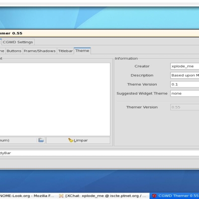
>>> HOW-TO : Just import this theme for your emerald. If you use compiz's cgwd just change the ".emerald" with ".cgwdtheme".
>>> NOTICE : I am using tony milovan's buttons, which are great.Last changelog:
The two main things that I don't like about this theme are:
The Color - Its a little too harsh, as in it dosn't really blend in with anything
The Buttons - Os X buttons only really look good with an osx theme, and even in some of those themes, they look bad, so I would stay clear of the osx buttons
Hope this Helps
Is this really so bad, and if it is plz leave a comment so I can adjust this to your liking. I don't see any point in just rating this bad, leave a comment so it can get better.
Regards TurboJugend.


Ratings & Comments
6 Comments
I agree that the colour is way too harsh. Something a little softer would be great. The OSX buttons really don't do anything for me either.
WHat is the Icon theme used please:) I like it very much!
excuisite icons, they are in this site.
thanks
The two main things that I don't like about this theme are: The Color - Its a little too harsh, as in it dosn't really blend in with anything The Buttons - Os X buttons only really look good with an osx theme, and even in some of those themes, they look bad, so I would stay clear of the osx buttons Hope this Helps
Is this really so bad, and if it is plz leave a comment so I can adjust this to your liking. I don't see any point in just rating this bad, leave a comment so it can get better. Regards TurboJugend.