


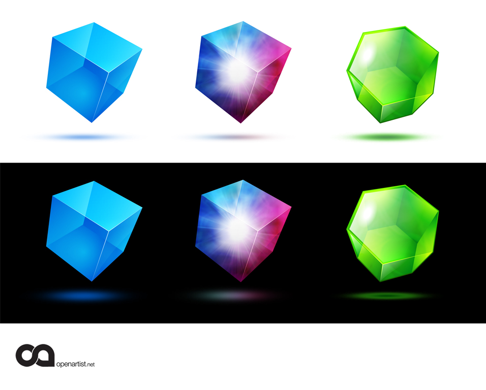
So yesterday after returning from the Live Earth Concert in NY (NJ) I found that my design had gotten dugg. So I went ahead and updated the design to what I actually submitted as my final designs. Thanks for the digg! And here's to a beautifully designed opensource community!

-----------
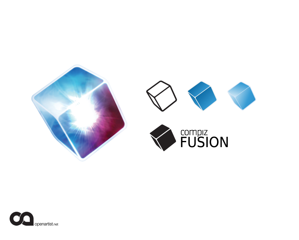
This is a logo concept that came to me just a day or so ago. The idea was to actually illustrate a fusion between the two older brands giving them both a sort of new dimension and energy. The shape is more "crystalline" than just pure box like the old compiz logo and the arrow is replaced with the fusion explosion in the middle, suggesting directionality but in a more dynamic and energetic way that relates more directly to fusion.And then you have the kind of mixing of the colors which adds another visually interesting quality.
Anyway, thought it was interesting.
Hope you like it.openartist.net


Ratings & Comments
34 Comments
bravisimo!!!!
what a shame openartist didn't win :(
Since we now have Compiz Fusion, shouldnt there be a Compiz Fusion section on Gnome look?? why do we still have a Compiz section and a Beryl section?
Considering you are representing both beryl and compiz in this project (and being up to this point a beryl user) I couldn't help but notice that the 16-bit colour cubes are only blue. I wonder if there's a way you could represent the fusion in these logos?
OMG!! Love the green hexagon!!
how would I install this? do I? where would I put it if I find no read me that makes sense?
hey guys if you want this to be the official Compiz Fusion logo you need to vote!! register and vote here: http://forums.opencompositing.org/viewtopic.php?f=4&t=1711 OpenArtist is currently in second place!! Come on, help him win!!!
It has been over for a while. search the topic for "win" for the winner.
the big one on the left in the second picture is amazing.
I love the central logo. It should be the final one. It actually merges the 2 colors of compiz and beryl, and inside the centre a kind of "nuclear fusion" love it
I love the central logo. It should be the final one. It actually merges the 2 colors of compiz and beryl, and inside the centre a kind of "nuclear fusion" love it
great update!
Paul: The graphics are great, very beautiful and also very colorful. But you need to keep in mind that besides a colorful logo, you'll also need a 16-colors logo, a grey-scale logo, and a B&W logo. The idea is great, but I can't see it through these other color mappings.
Thanks for the comment. You definitely have a good point,but I first would consider how a logo/icon is being used. My thoughts are that when designing for a product that is mostly delivered via the internet and requires a pretty good video card in order to implement you stand on pretty solid ground not to need a 16 color version. I mean there are some circumstances, but few. As far as greyscale and black and white, you're right the logo would need to be adjusted, but also, this isn't the sort of logo that will be popping up on letterhead or business cards, and CMYK printing is sometimes even cheaper than 2-color. These will be used small but before I do the work to tweak them to perfection, I think it's better to know it's worth the effort (ie. the designs won the contest). To be honest, designing things at this level takes an enormous amount of work and tweaking that isn't all that suited for a "hey, make me a logo!" sorta situation. In a perfect opensource world we'd develop new ways for designers and developers to interact. But in order for that to happen, coders need to hand the reigns over to some degree and work within restrictions set by graphic and UI designers instead of designers always having to conform to the need to the developers. I think it can and will happen, it'll just take good diplomacy, education, a new kind of model for "open" tiered participation, and a revolution in consciousness. ;)
amazing they should definitely use this, great work mate
I think it looks great! Good work! It also looks good in a small size. I didn't much like the Beryl-diamond.
That's great.. At last, better then mine ;) Good Work!
I like this logo a lot.
i hope this becomes the compiz fusion logo. i looked through the logo thread on the compiz forum and this is the best there
Indeed a very nice icon. Great job
Wow... very beautiful logo. Would be incredible to have a plugin, that would animate such a nice fusion inside the compiz/beryl cube!
This is the best compiz fusion logo I've seen so far. It really makes me want to install compiz-fusion right now dude! *headbang*
Oh I forgot, anyone knows a wallpaper with the style and colors of this logo? it would be awesome.
wow O_O nice logo! great job!
very good, use it ! :)