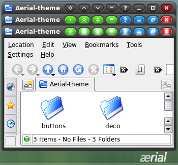
Description: Port of WindowBlinds theme by danilloOc. I had to create a lot of the buttons since they don't exist on Windows.
My recommended settings for deKorator:
Misc Pressed buttons shift: y=1 Show bottom border when window shaded: checked Colors Colrize inactive frames: checked Colrize inactive buttons checked Animate Effect: Fade, 5, 30, Keep Animating Hover and Press Effect: Use Image Colors, 5 Active Color: #FFFFFF Inactive Color: #7F7F7F Colorizing method: Kde Method Buttons Inactive Buttons: checked Close: #FF7F7F All other buttons: #C3C3C3 Paths Use masks: checked Paths Use masks: checked Close: #FF7F7F All other buttons: #C3C3C3
And I'm using the "KDE Default" color scheme for now. I'm hoping to get the other parts of the theme ported over, but that's more complicated. I've also included the wallpapers and kicker background that came with the original theme. Although it's difficult to have both a dark window border and dark kicker in KDE. I'm working on this issue.
http://www.mediafire.com/download.php?nwximdowntz
I had to get past a chinese captcha, it was a complete pita to beat it, but i did it. That's one complicated character set, wonder if anyone ever manages to learn it fully
nice one, I like it - just a note I'm using it with a dark colour & the kicker bkground you provided (colourised it to match) & it looks nice...
cheers
hi, nice theme but when activating I have a pink triangle on the upper right and left side? On the screenshot it's transparent? Did i do something wrong? Can 't find a solution...
No problem. I'm thinking that the need for separate mask files will be removed in the first release of my fork of DeKorator. We'll see. Right now I'm working on loading up an XML based theme. I've already added support for images for inactive window borders and buttons, and spring like button groups. Stay tuned, the release shouldn't be far off. Thanks for your votes!
This is a good suggestion, and I have to say I have thought about this. However, this is not something you will see in the first release. There seems to be some issues related with doing that. It is on my list of things to think about for future releases.
Thanks for pointing that out. I believe if you remove your spacers it should look ok. Unfortunately, this seems to be a problem with deKorator when you set a background for the buttons. If that's not the case let me know. Otherwise, I'll keep this in mind, as I am in the process of developing a project as a fork from the deKorator source.


Ratings & Comments
13 Comments
http://www.mediafire.com/download.php?nwximdowntz I had to get past a chinese captcha, it was a complete pita to beat it, but i did it. That's one complicated character set, wonder if anyone ever manages to learn it fully
Seems to be a server problem or something. I get a 404 error when I try to download it.
Yes, I'm sorry about that. That domain is currently down and I don't currently have access to the theme. I will post an update when I recover it.
nice one, I like it - just a note I'm using it with a dark colour & the kicker bkground you provided (colourised it to match) & it looks nice... cheers
hi, nice theme but when activating I have a pink triangle on the upper right and left side? On the screenshot it's transparent? Did i do something wrong? Can 't find a solution...
I have solved the problem! activate: Use masks ;)
No problem. I'm thinking that the need for separate mask files will be removed in the first release of my fork of DeKorator. We'll see. Right now I'm working on loading up an XML based theme. I've already added support for images for inactive window borders and buttons, and spring like button groups. Stay tuned, the release shouldn't be far off. Thanks for your votes!
good to hear... ;) Maybe one feature request... remove the borders (right/left and bottom) when expanding a window to full screen)
This is a good suggestion, and I have to say I have thought about this. However, this is not something you will see in the first release. There seems to be some issues related with doing that. It is on my list of things to think about for future releases.
The top right corner needs a little correction. Here is a link to a screenshot of the specific region. http://www.divshare.com/download/392469-ac9
Thanks for pointing that out. I believe if you remove your spacers it should look ok. Unfortunately, this seems to be a problem with deKorator when you set a background for the buttons. If that's not the case let me know. Otherwise, I'll keep this in mind, as I am in the process of developing a project as a fork from the deKorator source.
doh! thank for for figuring that out for me. great theme and i look forward to seeing what you come up with regarding the fork of deKorator.
I've set it up just like you suggested and the result is very cool. I'm going to keep it for a while. Thanks for sharing :)