


All credits go to KDE devs/artists.
QtCurve theme
Color scheme
Flattr Icons
Plasma theme
Mouse Themes
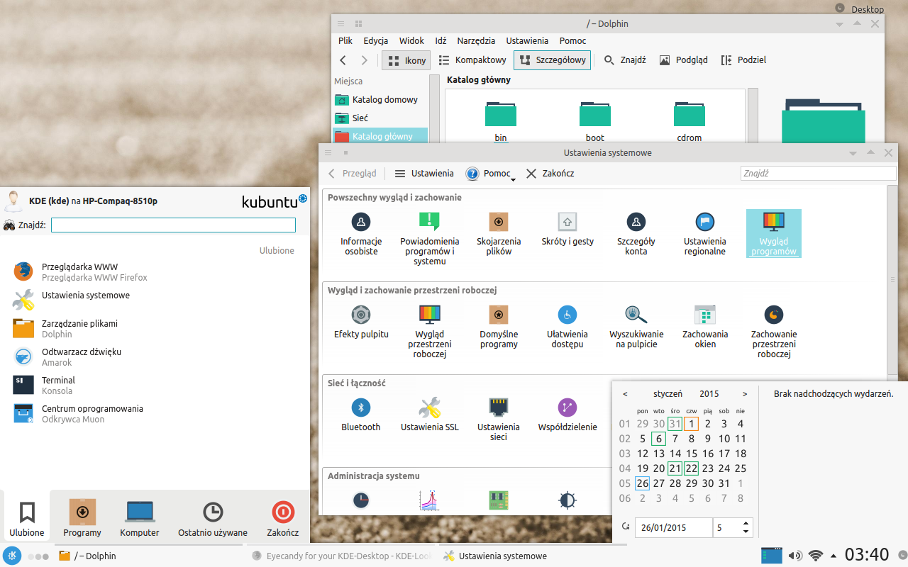
Instructions for Kubuntu (probably works for other distros too)
Extract Flat Zephyr - KDE Plasma 5 look.tar.gz .
Icons:
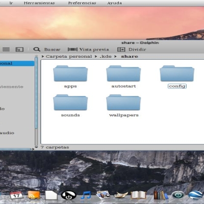
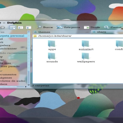
Copy flattr-icons-master folder to /home/.kde/share/icons
Then go to System Settings>Application appearance>Icons and choose Breeze theme.
QtCurve theme:
Install qtcurve from your package manager.
Then go to System Settings>Application appearance>Style. Choose QtCurve as widget style, then Configure...>Import and navigate to Flat_Zephyr.qtcurve file.
Color scheme:
Go to System Settings>Application appearance>Colors>Import scheme and navigate to FlatZephyr.colors file.
Plasma/desktop theme:
Copy KDE_5 folder to /home/.kde/share/apps/desktoptheme
Then go to System Settings>Workspace appearance>Desktop theme and choose KDE 5
Cursors:
Copy Breeze folder to /home/.icons


Ratings & Comments
3 Comments
Flat themes don't work visually on KDE - too much clutter. The eyes fight to distinguish between layers and sections. No criticism of your work though - just a general point about flat themes, from a personal point of view.
I understand, but for me Flat design associated with the order, readability and clarity. Here I tried to compromise by different layers and sections not merged. I wanted to pay attention to color contrasts and were clearly visible and tidy and clear, but not oversaturated and candy as the default Oxygen or similar, which I do not like. Thus, it has to be - Clearly and transparently - Functional and without satiety - Color contrasts to pay attention The taste is not discussed;).
Maybe I'll do a few color schemes for this theme.