Any progress on this style?
It has a professional look'n'feel, and it is great.
If author won't mind, I'll be fixing some drawing problems and publish the new code, maintaining original credits.
Regards.
When I try to install the Float style on KDE 4.2.2 (Kubuntu 9.04) and use the command
./install.sh
it says
Qt4 library path could not be determined from the pkg-config output
Aborting
Hey, very nice style! good work!
Two thinks that I've noticed.
When there is only 1 tab, it looses right border. http://tranfuga.no-ip.org/onlyonetab.png
and spinboxes arrows gets painted out of the frame. http:/tranfuga.no-ip.org/spinbox.png
Any idea for the items inside a toolbox?
I love this style, just installed it and already looking forward to the next version!
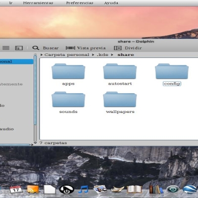
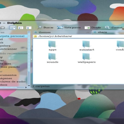
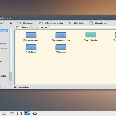
(I see some visual bugs, especially on Dolphin, but as this is an older version, I assume most of them are already solved by now, if not I can post a screenshot that clearly shows the bugs).
Just thought I'd let you know:
qtiplot (http://soft.proindependent.com/qtiplot.html) crashes when the theme is loaded. If you are interested in debugging the issue, let me know what to do.
Hi,
I can't test this live, but I'm looking forward with warm interest.
I'd like to suggest you a couple of ideas:
- try to keep scrollbars a little more "flat" and with no grips in the throbbers. That make a lot of "noise". Eventually replace the grips with something less noisy, like a little circle or something.
- try to keep less dense the progressbar: so many vertical lines in it can make it... noisy.
- keep the toolbars (you didn't include 'em in the preview so I'm just wondering here) very flat, with no line separators between menu/toolbar/rest of the window and, mainly, with no toolbar grips !
- keep your original buttons, very stilish yet very intuitive.
http://img100.imageshack.us/my.php?image=544771ka7.png
this is a little mockup I did in a hurry, trying to show you what I'm talking about.
As I said, looking forward...... very promising.
Thank you for the mockup. Your effort is apreciated. First I want to be complete and bug free, then I'll take your ideas.
what is the red cross at the top-left corner?
Finally, Really nice QT style.
The only problem I have with it is those tabs. First, captions inside tabs are not well-centered. And then, gradients on inactive tabs gives them the 'plastik' resemblance. I would DEFINITELY loose those damn gradients.
Everything, except tab bar, looks great to me (including push buttons and lines, which are most discussed things here :) )
Hi,
all your elements look awesome, by far the best Qt theme I have ever seen (actually I wanted to do a gonx-inspired style for kde3 (called konx, it's here on kde-look, for those interested), but never did it that beautiful as you did, thanks a lot.
The only widget, which I think can be made better is the pushbutton, especially when it has the blue focus border.
keep up the good work,
Martin
Thanks for your comment. I have been using konx. Some ideas are from it. The progress bar for example.
The pushbutton is a copy from the original gonx. Do you have any idea? can you waste 5 minutes and make a picture?
I hope for a little more flat scrollbar and progressbar. Maybe just the "grips" (damn, I don't know the name).
I'd also love this for kde 3.5 ...
Great looking !
This is plain gorgeous! It has the realistic - layered, hovering paper feel.
The buttons do detract from that a bit, but what a must-have!
Just saw the Oxygen theme demo video, and this will kick Oxygen's ass!
Try making the buttons similar in style to the pull-down boxes and other "floating" elements. You can probably differentiate the buttons well by either making the border thicker and/or rounding the corners.
I am so looking forward to this thing!


Ratings & Comments
33 Comments
Any progress on this style? It has a professional look'n'feel, and it is great. If author won't mind, I'll be fixing some drawing problems and publish the new code, maintaining original credits. Regards.
When I try to install the Float style on KDE 4.2.2 (Kubuntu 9.04) and use the command ./install.sh it says Qt4 library path could not be determined from the pkg-config output Aborting
Hey, very nice style! good work! Two thinks that I've noticed. When there is only 1 tab, it looses right border. http://tranfuga.no-ip.org/onlyonetab.png and spinboxes arrows gets painted out of the frame. http:/tranfuga.no-ip.org/spinbox.png Any idea for the items inside a toolbox?
here is the images that I've pointed before... the server seems to be down time to time... problem with one one tab present: http://img23.imageshack.us/img23/3559/onlyonetab.png spin box overdrawing on indicators: http://img528.imageshack.us/img528/3368/spinbox.png scrolls bar: http://img232.imageshack.us/img232/7775/scroll.png
I really hope this style gets more development, since I really like it! I would love to see a window decoration for it!
I love this style, just installed it and already looking forward to the next version! (I see some visual bugs, especially on Dolphin, but as this is an older version, I assume most of them are already solved by now, if not I can post a screenshot that clearly shows the bugs).
Just thought I'd let you know: qtiplot (http://soft.proindependent.com/qtiplot.html) crashes when the theme is loaded. If you are interested in debugging the issue, let me know what to do.
Hi, I can't test this live, but I'm looking forward with warm interest. I'd like to suggest you a couple of ideas: - try to keep scrollbars a little more "flat" and with no grips in the throbbers. That make a lot of "noise". Eventually replace the grips with something less noisy, like a little circle or something. - try to keep less dense the progressbar: so many vertical lines in it can make it... noisy. - keep the toolbars (you didn't include 'em in the preview so I'm just wondering here) very flat, with no line separators between menu/toolbar/rest of the window and, mainly, with no toolbar grips ! - keep your original buttons, very stilish yet very intuitive. http://img100.imageshack.us/my.php?image=544771ka7.png this is a little mockup I did in a hurry, trying to show you what I'm talking about. As I said, looking forward...... very promising.
Thank you for the mockup. Your effort is apreciated. First I want to be complete and bug free, then I'll take your ideas. what is the red cross at the top-left corner?
The red cross was meant to say "don't show toolbar grips, pleeeease" ;-)
This looks great. Would love if someone could provide an OpenSUSE 10.2 rpm. I can't seem to compile it (installed qt4-devel, etc).
Finally, Really nice QT style. The only problem I have with it is those tabs. First, captions inside tabs are not well-centered. And then, gradients on inactive tabs gives them the 'plastik' resemblance. I would DEFINITELY loose those damn gradients. Everything, except tab bar, looks great to me (including push buttons and lines, which are most discussed things here :) )
Please fix small error. When QProgressBar has range 0, 0 and it's value is 0, it should move from left to right and back. In float it does nothing.
Thanks for the observation. I'll fix it in the next release
very nice. thanks for sharing! worked out of the box for me. we more of that.
is it possible to use this in a qt4 program like wengophone? if so, how?
No. Qt3 styles are for Qt3 apps, Qt4 styles are for Qt4 apps.
Well, if wengophone is a qt4 app it works, of course. Just run qtconfig.
Hi, all your elements look awesome, by far the best Qt theme I have ever seen (actually I wanted to do a gonx-inspired style for kde3 (called konx, it's here on kde-look, for those interested), but never did it that beautiful as you did, thanks a lot. The only widget, which I think can be made better is the pushbutton, especially when it has the blue focus border. keep up the good work, Martin
Thanks for your comment. I have been using konx. Some ideas are from it. The progress bar for example. The pushbutton is a copy from the original gonx. Do you have any idea? can you waste 5 minutes and make a picture?
how bout that http://img155.imageshack.us/img155/9576/floattc0.png not perfect but might spur your creative juices =)
Interesting. I take your idea for the 0.2 version
I hope for a little more flat scrollbar and progressbar. Maybe just the "grips" (damn, I don't know the name). I'd also love this for kde 3.5 ... Great looking !
I will be nice to have this theme/style for KDE 3.x too. I am looking forward for it :).
This is plain gorgeous! It has the realistic - layered, hovering paper feel. The buttons do detract from that a bit, but what a must-have! Just saw the Oxygen theme demo video, and this will kick Oxygen's ass! Try making the buttons similar in style to the pull-down boxes and other "floating" elements. You can probably differentiate the buttons well by either making the border thicker and/or rounding the corners. I am so looking forward to this thing!