I'm proud to present you this new theme. It mostly aims to give KDE a kind of modern look, while waiting for KDE4 It may give you another vision of your desktop, though it won't be as perfect as Kore, and won't have any emerald theme (at first at least). Anyway I'm sure some of you will like it, and the good point is that everyone can use it Please leave some comments, as I see it's really shared between "good" and "bad", just tell me what you like or don't like in it, so that I can improve it ...
Contents:
This suite should contain once finished :
-A theme-manager theme -A domino config -A dekorator theme -Several wallpapers -A KBFX theme -A Moodin theme -A KDM theme
Realease Date:
Released the first part
Currently working onBeryl theme
Needing Improvement :
-Dekorator Theme -Wallpapers
Finished :
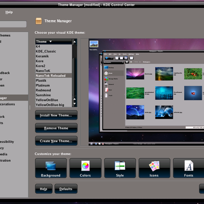
-Theme manager theme
Made with GimpLast changelog:
04/10/2007 : Published Preview
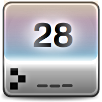
05/10/2007 : Cleaned the Bottom Corners of the dekorator theme
06/10/2007 : Cleaned the top Corners, adjusting the masks so they could have a better roundness and be less pixalised over white. Guess it is now close to the cleanest. Modified the size of the top bar grey line from 2 px to 1 px. Looks also cleaner. Finishing KBFX theme, will have to cut the cake soon
07/10/2007 : Upload new screenshot after replacing the corners, it's starting to get awsome !
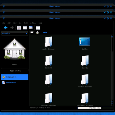
11/10/2007 : Upload new screenshots showing the different colors of the button while hovered or press. Working on KBFX and Beryl port of the dekorator theme
12/10/2007 : Upload new screenshot showing the KBFX theme. See the 3rd screenshot. I just need to finish the KBFX buttons and I'll upload everything at last
13/10/2007 : Uploaded first part, got some problems for the wallpaper upload (too heavy for imageshack).
I'm sorry I don't think I can delete these messages...
If you're talking about the color scheme, I changed several things already like the contrast for selected text. I'll upload some new screenshots soon.
So you're working for a theme dedicated to opensuse ? I tried opensuse 2 years ago. I tried different systems in fact, debian at first, then ubuntu, then opensuse and then gentoo which I'm on :)
I didn't quite get what you want from my theme. If you're talking about the symbols they are on transparent background so that should be easy for you when I'll release the theme to use them with yours ;)
BTW I see you're using the domino windeco, is it possible to modify the buttons ? just wondering...
Anyway cool KBFX theme once again ;)
bahh, really really sorry about the messages...
No, i really dislike rpm based linux distros like Suse, Fedora, Mandriva,...
My linux is a Kubuntu based system because i love .deb packages and the installer of it (i dont know why but i think debian sistems are easier)
gentoo... i use sabayon here, and it is gentoo based too o/
greetings.
Hello mayku, IMO your theme is kinda overdone. Maybe it's just taste, but I prefer themes with mainly "modest" colors, flashy ones like intense blue or pink only used for highlioghted fields/buttons/etc.
Your theme is probably also based on Kore by code2? There are so many atm, I have also made a mod of his work (just fixed some bugs, nothing really changed) and will make a self-installing package to install the whole Kore with just one configure file.
It hink code2 is the most influencing artist on the whole site. (Maybe Crystal Project > Kore, but CP is being made by a whole group and Kore only by code2).
Look:
http://www.kde-look.org/CONTENT/content-pre2/54701-2.png
he uses this light blue only for some active and important buttons, and this makes Kore that good. If you like having blue everywhere more, it's for sure OK, but I at least recommend using a black Kicker wall and not a blue/white one.
I have similar problems with my project. It's really hard to make a theme that has a high eye-candy effect and at the same time doesn't disturb your concentration.
That your Domino theme is really good. Nice contrast and not overdone. I think you could build up the theme around the domino theme.
--I'm only talking about the blue theme. I totally dislike the pink one, sorry.
on the theme i just was working since 2 months for create it. And so I finally have an idea, that with this kubuntu based linux, should have 4 themes of mine on the theme selector (before install). If so, is better for the flavour from users...
the theme are, this blue and pink above, plus this...
http://img516.imageshack.us/img516/6821/snapshot37ft3.png
and the last theme i will probably uses green or red color for it, because some linuxers hates blue (win/mac color). But i don't know if i should make a "modern" or "radical" or simply" theme...
I think from your theme is good to make the text-color as priority, it's not easy to combinate grey+blue... and don't worry about the firefox eye-view because we can use "Flock" (a better firefox for linux) instead of it, without any problem with skins.
my last job...
for boys...
http://img396.imageshack.us/img396/9743/snapshot36wh9.png
for girls...
http://img398.imageshack.us/img398/3813/snapshot29mu0.png
i will wait for your theme because i need the borders button of it (close, maximize, minimize) the buttons from mine aren't so beautiful, and my theme i don't want to share on public because it will probably be an standard theme for the next release of the linux that i'm using.
Hey man, Illuminate indeed as passive inspiration ;) You watch it once, you can't forget it. Still I'm not trying to copy anything from there, and there's also already a dekorator theme for illuminate, looks like the previous previews from this summer... My other inspiration is from the apple website, for the gradients grey to black (see the macbook pro page) on the domino buttons. Still everything you see in this screenshot I made under gimp, pixel by pixel. The rest color theme, and domino style, with light grey background, and blue font is from my imagination. I put some antialiased font also, like in Kore, I really liked the idea, though I made it bigger, and use a different font. I'm just trying to make a dark clean theme. By the way did you watch the screenshot in the download section, I've improved the windows and also the wallpaper looks clearer (replaced the text in white on this background only for the desktop, not on the screenshot) and makes the windows more shiny ? I've been following your work, though can't try it (can't run emerald, I've 8 Mo of video memory ;)). Still I think you should give a bit more contrast to the blue (in your sky theme), using something a bit darker than the grey, or make the blue clearer and use something clearer like white, like in your previous sky. Well well that's just my opinion, thank you for your comments and keep up nice work :)
WOW. I found someone to talk with & someone who shares some interests with me.
Most people I want to communicate with aren't even viewing their comments. :hapy:
I'd prefer round corners on the bottom of the windows, or at least "real" corners (90° x/y). And the color contrast for selected units should be higher (either lighter text or background with more intensive blue).
About the sky theme...
the first try was just ugly, I know that. So I took some sky images to get natural colors. But I'm not very happy with the reswult, too...
The colors are too pale, I think. But Idk what I should change first- the buttons (close minimize etc) or the color scheme (the first attempt to change was bad too).
Ill pick some better blue colors and intensify the contrast. Hope it will improve to an acceptable niveau that way.
BTW: Prolly its juz taste, but Id like your windeco more if ud put the close etc buttons to the very right side.
BTW#2: I use Emerald cuz of 2 reasons :1st I got used to it by using code2s Kore emerald theme and 2nd I think it's very simple& easy & logical in use (as little bitmaps necessary as possible; I welcome that very much since pixel editing is definitely NOT fast. When I first used Gimp I didnt even know that there is a function to make color-changeovers so I edited EVERY pixel and it took so much time to get the right colors...lol)
Sorry didn't have much time to reply on yesterday :(
Well I really agree with you about the selected text color, so I kept the blue, and now the selected text is dark grey (kinda black) so that contrast really on it.
I can give a try to the square corners, but I think it's gonna look better with so more rounded corners. I made the top corners using some circle motives in GIMP, then applied the gradient. Then I copied the top corners to make the bottom ones. That's why they're not so round. Well I'll improve this.
About the buttons if I want to put them all more to the edge I have to edit both top corners, that's not a problem either (make them shorter for the title bar). That's it :)
Cheers for the dekorator theme ;)
It looks very similar to code2's Illuminate (see on code2.deviantart.com). But doesn't mean I don't like it.
It's really beautiful, but (1) BLACK background makes most web pages unreadable. It's hard enough with grey background
(2) I like Kore more.
i'm waiting for this theme, like seems i have since a month created an same theme but with another window borders. The theme from you is very much better than mine. Keep this wonderful work.
My KDE theme:
http://img476.imageshack.us/img476/415/snapshot17rv1.png
Linux + KDE = future
Thank you so much for your comments. I really appreciate that you like. Watched your screenshot, I really like the KBFX theme :). I don't use much the domino window decorations, though I use it more than polyester for the widget style. Well well I guess this next week I'll finish the KBFX theme and post everything. I'm just a bit surprised by the scores, but that's a dark theme so... Stay updated ;)
It looks really nice. Reminds me of LCARS. Unfortunately one problem that all dark schemes have is what happens when you crank open a web browser? You get this blinding white blast with a dark frame around it. Not much can be done about that of course, but it's a limitation that really throws off the balance of these kind of themes.
Thanx for your comments :) Well I see what you mean, the contrast between the decoration and the web pages may be strong. Well for me that's not much a problem. Moreover all the sites are not all made of only white ;) But I agree on the fact that dark themes are not so easy on eyes. I usually keep black theme for a while than change to white and so on. Maybe I'll make a white one, if this one is successfull...


 It may give you another vision of your desktop, though it won't be as perfect as Kore, and won't have any emerald theme (at first at least). Anyway I'm sure some of you will like it, and the good point is that everyone can use it


Ratings & Comments
23 Comments
Sorry for the last update 1 min ago, just replaced some text in the description and forgot to uncheck the checkbox for updating :(
sorry, can you please delete some of this 4 coments above? my browser has done an error here, really really sorry ~_~
I'm sorry I don't think I can delete these messages... If you're talking about the color scheme, I changed several things already like the contrast for selected text. I'll upload some new screenshots soon. So you're working for a theme dedicated to opensuse ? I tried opensuse 2 years ago. I tried different systems in fact, debian at first, then ubuntu, then opensuse and then gentoo which I'm on :) I didn't quite get what you want from my theme. If you're talking about the symbols they are on transparent background so that should be easy for you when I'll release the theme to use them with yours ;) BTW I see you're using the domino windeco, is it possible to modify the buttons ? just wondering... Anyway cool KBFX theme once again ;)
bahh, really really sorry about the messages... No, i really dislike rpm based linux distros like Suse, Fedora, Mandriva,... My linux is a Kubuntu based system because i love .deb packages and the installer of it (i dont know why but i think debian sistems are easier) gentoo... i use sabayon here, and it is gentoo based too o/ greetings.
Hello mayku, IMO your theme is kinda overdone. Maybe it's just taste, but I prefer themes with mainly "modest" colors, flashy ones like intense blue or pink only used for highlioghted fields/buttons/etc. Your theme is probably also based on Kore by code2? There are so many atm, I have also made a mod of his work (just fixed some bugs, nothing really changed) and will make a self-installing package to install the whole Kore with just one configure file. It hink code2 is the most influencing artist on the whole site. (Maybe Crystal Project > Kore, but CP is being made by a whole group and Kore only by code2). Look: http://www.kde-look.org/CONTENT/content-pre2/54701-2.png he uses this light blue only for some active and important buttons, and this makes Kore that good. If you like having blue everywhere more, it's for sure OK, but I at least recommend using a black Kicker wall and not a blue/white one. I have similar problems with my project. It's really hard to make a theme that has a high eye-candy effect and at the same time doesn't disturb your concentration.
That your Domino theme is really good. Nice contrast and not overdone. I think you could build up the theme around the domino theme.
That your Domino theme is really good. Nice contrast and not overdone. I think you could build up the theme around the domino theme. --I'm only talking about the blue theme. I totally dislike the pink one, sorry.
on the theme i just was working since 2 months for create it. And so I finally have an idea, that with this kubuntu based linux, should have 4 themes of mine on the theme selector (before install). If so, is better for the flavour from users... the theme are, this blue and pink above, plus this... http://img516.imageshack.us/img516/6821/snapshot37ft3.png and the last theme i will probably uses green or red color for it, because some linuxers hates blue (win/mac color). But i don't know if i should make a "modern" or "radical" or simply" theme...
on the theme i just was working since 2 months for create it. And so I finally have an idea, that with this kubuntu based linux, should have 4 themes of mine on the theme selector (before install). If so, is better for the flavour from users... the theme are, this blue and pink above, plus this... http://img516.imageshack.us/img516/6821/snapshot37ft3.png and the last theme i will probably uses green or red color for it, because some linuxers hates blue (win/mac color). But i don't know if i should make a "modern" or "radical" or simply" theme...
I think from your theme is good to make the text-color as priority, it's not easy to combinate grey+blue... and don't worry about the firefox eye-view because we can use "Flock" (a better firefox for linux) instead of it, without any problem with skins. my last job... for boys... http://img396.imageshack.us/img396/9743/snapshot36wh9.png for girls... http://img398.imageshack.us/img398/3813/snapshot29mu0.png i will wait for your theme because i need the borders button of it (close, maximize, minimize) the buttons from mine aren't so beautiful, and my theme i don't want to share on public because it will probably be an standard theme for the next release of the linux that i'm using.
I think from your theme is good to make the text-color as priority, it's not easy to combinate grey+blue... and don't worry about the firefox eye-view because we can use "Flock" (a better firefox for linux) instead of it, without any problem with skins. my last job... for boys... http://img396.imageshack.us/img396/9743/snapshot36wh9.png for girls... http://img398.imageshack.us/img398/3813/snapshot29mu0.png i will wait for your theme because i need the borders button of it (close, maximize, minimize) the buttons from mine aren't so beautiful, and my theme i don't want to share on public because it will probably be an standard theme for the next release of the linux that i'm using.
I think from your theme is good to make the text-color as priority, it's not easy to combinate grey+blue... and don't worry about the firefox eye-view because we can use "Flock" (a better firefox for linux) instead of it, without any problem with skins. my last job... for boys... http://img396.imageshack.us/img396/9743/snapshot36wh9.png for girls... http://img398.imageshack.us/img398/3813/snapshot29mu0.png i will wait for your theme because i need the borders button of it (close, maximize, minimize) the buttons from mine aren't so beautiful, and my theme i don't want to share on public because it will probably be an standard theme for the next release of the linux that i'm using.
I think from your theme is good to make the text-color as priority, it's not easy to combinate grey+blue... and don't worry about the firefox eye-view because we can use "Flock" (a better firefox for linux) instead of it, without any problem with skins. my last job... for boys... http://img396.imageshack.us/img396/9743/snapshot36wh9.png for girls... http://img398.imageshack.us/img398/3813/snapshot29mu0.png i will wait for your theme because i need the borders button of it (close, maximize, minimize) the buttons from mine aren't so beautiful, and my theme i don't want to share on public because it will probably be an standard theme for the next release of the linux that i'm using.
Looks very similar to code2's Illuminate http://fc04.deviantart.com/fs19/f/2007/257/3/c/ILLUMINATE___PREVIEW_VII_by_code2.png But It's good to have this cuz Illuminate will be Windows theme AFAIK.
Hey man, Illuminate indeed as passive inspiration ;) You watch it once, you can't forget it. Still I'm not trying to copy anything from there, and there's also already a dekorator theme for illuminate, looks like the previous previews from this summer... My other inspiration is from the apple website, for the gradients grey to black (see the macbook pro page) on the domino buttons. Still everything you see in this screenshot I made under gimp, pixel by pixel. The rest color theme, and domino style, with light grey background, and blue font is from my imagination. I put some antialiased font also, like in Kore, I really liked the idea, though I made it bigger, and use a different font. I'm just trying to make a dark clean theme. By the way did you watch the screenshot in the download section, I've improved the windows and also the wallpaper looks clearer (replaced the text in white on this background only for the desktop, not on the screenshot) and makes the windows more shiny ? I've been following your work, though can't try it (can't run emerald, I've 8 Mo of video memory ;)). Still I think you should give a bit more contrast to the blue (in your sky theme), using something a bit darker than the grey, or make the blue clearer and use something clearer like white, like in your previous sky. Well well that's just my opinion, thank you for your comments and keep up nice work :)
WOW. I found someone to talk with & someone who shares some interests with me. Most people I want to communicate with aren't even viewing their comments. :hapy: I'd prefer round corners on the bottom of the windows, or at least "real" corners (90° x/y). And the color contrast for selected units should be higher (either lighter text or background with more intensive blue). About the sky theme... the first try was just ugly, I know that. So I took some sky images to get natural colors. But I'm not very happy with the reswult, too... The colors are too pale, I think. But Idk what I should change first- the buttons (close minimize etc) or the color scheme (the first attempt to change was bad too). Ill pick some better blue colors and intensify the contrast. Hope it will improve to an acceptable niveau that way. BTW: Prolly its juz taste, but Id like your windeco more if ud put the close etc buttons to the very right side. BTW#2: I use Emerald cuz of 2 reasons :1st I got used to it by using code2s Kore emerald theme and 2nd I think it's very simple& easy & logical in use (as little bitmaps necessary as possible; I welcome that very much since pixel editing is definitely NOT fast. When I first used Gimp I didnt even know that there is a function to make color-changeovers so I edited EVERY pixel and it took so much time to get the right colors...lol)
Sorry didn't have much time to reply on yesterday :( Well I really agree with you about the selected text color, so I kept the blue, and now the selected text is dark grey (kinda black) so that contrast really on it. I can give a try to the square corners, but I think it's gonna look better with so more rounded corners. I made the top corners using some circle motives in GIMP, then applied the gradient. Then I copied the top corners to make the bottom ones. That's why they're not so round. Well I'll improve this. About the buttons if I want to put them all more to the edge I have to edit both top corners, that's not a problem either (make them shorter for the title bar). That's it :) Cheers for the dekorator theme ;)
It looks very similar to code2's Illuminate (see on code2.deviantart.com). But doesn't mean I don't like it. It's really beautiful, but (1) BLACK background makes most web pages unreadable. It's hard enough with grey background (2) I like Kore more.
i'm waiting for this theme, like seems i have since a month created an same theme but with another window borders. The theme from you is very much better than mine. Keep this wonderful work. My KDE theme: http://img476.imageshack.us/img476/415/snapshot17rv1.png Linux + KDE = future
Thank you so much for your comments. I really appreciate that you like. Watched your screenshot, I really like the KBFX theme :). I don't use much the domino window decorations, though I use it more than polyester for the widget style. Well well I guess this next week I'll finish the KBFX theme and post everything. I'm just a bit surprised by the scores, but that's a dark theme so... Stay updated ;)
It looks really nice. Reminds me of LCARS. Unfortunately one problem that all dark schemes have is what happens when you crank open a web browser? You get this blinding white blast with a dark frame around it. Not much can be done about that of course, but it's a limitation that really throws off the balance of these kind of themes.
Thanx for your comments :) Well I see what you mean, the contrast between the decoration and the web pages may be strong. Well for me that's not much a problem. Moreover all the sites are not all made of only white ;) But I agree on the fact that dark themes are not so easy on eyes. I usually keep black theme for a while than change to white and so on. Maybe I'll make a white one, if this one is successfull...
i have to agree but.... i have a dark theme for firefox so it woldnt matter to me anyways