


0kmeleon
somekool


Source (link to git-repo or to original if based on someone elses unmodified work):
20040108 - Included source files. Download now contains 3 versions: Adobe Illustrator 10, EPS, and SVG formats.
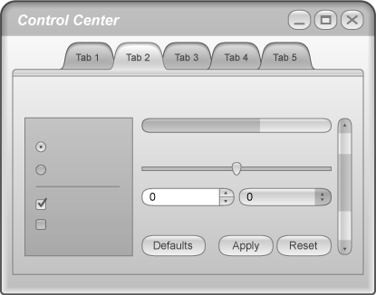
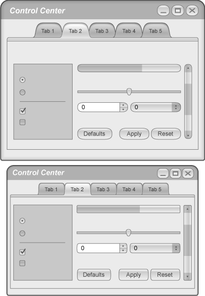
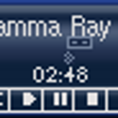
20040108185108 - Added Screenshot 2, which shows what a 'lite' version might look like.
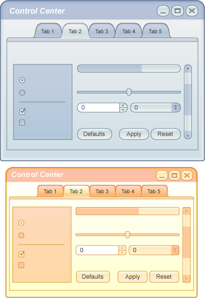
20040109111705 - Added Screenshot 3, which shows what this theme might look like with different color schemes.
20040109154548 - Replaced Screenshot 2 with a mock up of a flat version of theme (no background gradient) based on the advise of thomas12777


Other Various KDE 1.-4. Styles:
Ratings & Comments
42 Comments
please, anyone, implement it! this theme looks really great and i'd love to be able to use it!
This looks awesome. Please could someone turn that into native kde decoration/window decoration? Only thing I didn't liked was that the buttons of that big header are too big for it. and they are looking that they shouldn't be there. :)
make it already! it still rocks!
This is like the offspring produced by a WindowsXP-MacOSX union, with KDE's Plastik being the co-genetor. Still, very fresh. Nice work. This style looks like it could merge very nicely with the recent SkyOS GUI redesign.
yes, this theme looks really good, hope it becomes available.
I really like this theme idea. That big window decoration is very cool and big tabs. I just hope that "loading" bar would be animated. And if you can use different color like in other theme, this will came to my favorite #1 ps. i think that smaller sucks, but it would came too if someone like to use smaller...
I think that someone (or you) should make a GTK theme that matches this one. I agree with previous posts- make the combobox, checkboxes a bit less like Aqua. Also on the window decoration- first, make it smaller. I don't like window decorations that are really big, they eat up room on the screen. (Like Windows XP's) I think you should make the buttons change color like Glow, or put a sort of bubble, highlight, etc. around the text. (Like Keramik, MandrakeGalaxy window decoration)
I like this idea a lot except...
- Drop-down list is too aqua
- Radio button is also too aqua
Apart from that I think it looks great! IMHO the big tabs look better than the small ones.Thank you for the helpful suggestions. I'm actually considering modifying the very widgets you've named because I agree with your basic premise. I'd prefer this style not to be another Aqua copy (there are already so many good ones available), but rather something more unique to Linux, and KDE, more specifically. Look for a 'fixed' version coming to KDE-Look soon! :-)
KEWL!!! :-D Someone agrees with my opinion *sniff* *wipe away tears*
I don't like anything wich look s like the (IMHO) horrible aqua style. The blend effect from light to dark is pretty nice tho. I would love to see that in more style's
I'm getting a little tired of the aqua look alikes, myself, which is why I chose not to give this a stippled, white background with blue widgets :-) . You're correct in noting that it has some influence from Aqua, but I've tried to downplay that and distance this from Aqua as much as I can (maybe I should do so more?). Following your advice, in choosing a name for this theme/style, therefore, I think I'd rather avoid the use of any form, or translation of the word 'Aqua', in an attempt to make this something more uniquely KDE/GNU-Linux, as opposed to another Mac copy (not to put down any of the Aqua copies out there. There are some exceptionally good ones, and I've used more than a few).
Great! Please, speed up a little bit, I want to have this on my desktop:).
You have some nice design ideas. Even without a gradient, it still looks very clean and innovative. Hopefully we can get this idea off the ground for ya. It would be interesting to see what the kde devs think about your designs. I'm interested in looking into helping implement this as well. Although I haven't done a windec before, I have coding experience and could probably figure it out. cheers, -p0z3r
do you have the sources in a Gimp friendly format?
Great theme idea ! I'm looking forward it's being released.
I need 4 themes for my Suite: 1 - Stands for LOVE 2 - Stands for PEACE 3 - Stands for TOLERANCE 4 - Stands for RESPECT please can i take this one as PEACE???! this would be a DREAM =) i would put it together and design it how u want to animated and fading and smooth...... hope you give an O.K. =) greetz Da FloW
... about this is the gradient on the widget background. It looks really nice, but will force you to create a window size (well, actually height) pixmap for the polishment + (and this is the biggest problem) capturing vertical size changes and in this case recreate the gradient and redraw allmost all widgets. (and - as qt doesn't like to create alpa pics - you will have to crop a valid background image for all non rect widgets on a vertical resize). Try to find something nice with a tilable background pixmap. Everything else will lead to painfull slowdowns (as iTunes style would)... or wait for keith's xserver and have the ability to use eg. lightmaps. Sorry - it's an awefull style anyway.
I was kind of afraid this would be the case. The background gradient was probably the main reason I had originally asked if such a theme was even possible. I thank you for your answer to my question. I've changed Screenshot 2 to reflect what a flat (gradient-less) version could look like. It's not quite as pretty, but at least it may be a bit more realistic an expectation.
> ... about this is the gradient on the widget background. Uhm, that's fully possible using Qt. See the KDE RiscOS theme (it uses the kthemestyle qstyle), or Mosfet's old MegaGradient style (you can look around in webcvs.kde.org, it was briefly part of KDE 2.1.)
Did i say, it's impossible? It's just a problem you have to face and the cost is speed loss.
I really like this, it is different enough from OS X, yet still has its appeal... I would shrink the titlebar slightly (screen realestate is important), and mabe add ome color (not to mutch), but otherwise it will be to gray. The colors could be configurable in the final version
I went ahead and added a 3rd screenshot to illustrate what it might look like with different color schemes.
looks origional and nice. hope somebody is going to work out the theme soon
for the sources! :) and for this work of course.