


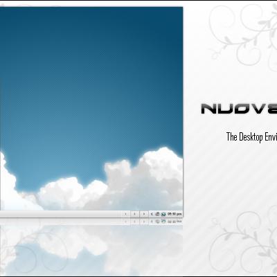
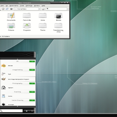
NuoveXT2-Theme
falco101


Source (link to git-repo or to original if based on someone elses unmodified work):
Alpha files uploaded!
-Decided on crystal for default non-3D window border (I know not everyone has 3D-accel)
-Added more wallpapers (for variation)
-Polyester Style (using the menu effects, will upload ktheme soon)
- NEEDE contributing artsists willing to commit to working on the KDM/Splash screens and assisting me with the icon theme.
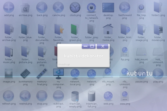
-Dekorator preview 1 is finished. All coments and suggestions are welcome.


More Various KDE 1.-4. Styles from falco101:
Other Various KDE 1.-4. Styles:

Ratings & Comments
17 Comments
Something about Kubuntu's default design and color set has always struck me as drab. I dont know if it was due to the integration of unified dull-light-violet into a great deal of the pallette or what it is. This seems to continue the tradition somewhat, the only difference is that its shinier and sleeker. Integrating more greys and more darkness into Kubuntu's already depressing pallete doesnt seem to do much, the idea we should be aiming for is diversity in the color pallette not uniformity (perhaps yes, uniformity among similar elements, but not uniformity among different elements). Look at the Windows XP palette for example -- while many of the people who visit KDE-Look.org hate Windows, it did do a few things right, and from the artistic viewpoint the variation, combined with consistency of its pallete helped to make it more appealing (e.g: by using brights and primaries -- green as the 'go' color, yellow (e.g. tabs) as the highlight color, blue for the scrollbar colors), giving it a friendly, accessible look. Ubuntu even did many things right -- and while its pallete is consistent (shades of brown) it does vary somewhat by injecting color (bright orange) into important elements like icons and creating a high level of contrast and the occasional hue tweak -- (note the sharply outlined icons as well). Never does the color become the stale grey, medium-light grays are the color of interface elements that you would want to ignore (a good example of this is the color of the background in KDE-look.org) Making things shinier does not make them friendlier necessarily, if you want to make something slick, try to make it friendly and appealing at the same time if possible. Thx for reading!
And also, there is a reason why Crystal SVG is the consistent default on many KDE distros. It is friendly and well constrasted. Not to say that shiny icons are bad, but they should be edged well.
The icons are nice, you can tell a lot of effort has been put into making them.
Thanks for the feedback, I guess that would be a good idea to add more color, at least more saturation. I will keep this in mind, I am considering going back and finishing Kubista, but I still need some assistance on the icon theme.
Just noticed you use my nick for your theme (which is basically a mix of Kubuntu and Vista). Glad someone else thought of it too! Please don't use it lightly.
I just recently lost a large portion of my work for this theme when my usb drive was stolen. I will not be continuing this theme until KDE 4.0 becomes stable, I will then continue theming it for KDE4. If someone would like to take over the project and make a KDE 3.x theme, more power to ya.
Hi! Awwsommee!! First Nouve and now Kubista! Just one little thing... I use KDE on Gentoo and sometimes FreeBSD, so could you make a KBFX button and wallaper with the KDE generic logo?? I mean.. For those who does not use Kubuntu... Thankss!! Cheers sirope
Not really my style, but very very nice. And MILES beyond the UGLY default. I think the terrible defaults really turn a lot of people away from KDE, this would be a great step to remedy this.
Have to agree here, the butt-ugly default style having always been the foremost reason of turning away from KDE after not even an hour playing with it. Those icons just give me sore eyes. Like I'm in a toy store. If stuff does not have style, it is just harder to use. Coffee tastes better from a simple one color mug than from one covered with yellow stars and blue configuration wheels. Anyway, if stuff like this seeps into main, I might stick around for over an hour next time.
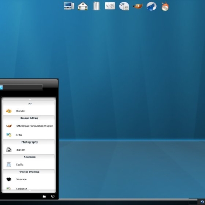
Are you planning on doing a full theme? I've been looking for something that looks excellent and has everything covered from the the login screen through to the desktop (and possibly some applications like Amarok).
Hopefully. I plan on doing a full theme, if everything goes according to plan I hope to have a complete theme made from scratch. (I am still looking for contributing artists for Kubista)
How to change the KDE logo in the menu? I have downloaded the new one yet but I don't know how to exchange.
If you are talking about the kmenu button, you could change that by taking the "normal.png" button and resizing it to have a height of 128px, 64px, 48px, 32px, 24px, or 22px (whatever the hieght of your kicker). Then rename the file to kmenu.png and copy it to your current icon theme {/home/(username)/.kde/icons/(your theme)}. This theme was origanaly made for kbfx, so you could download kbfx for your distro and set the the button using kbfxconfig. If you need any more help just post again.
Hi :) I made this, as a inspiration of Your theme :) http://www.kde-look.org/content/show.php/Kubista_my_own?content=68510 regards
I've been avoiding the blue and purple schemes because they remind me too much of MSFT (which is really red/white/blue and I don't really have a problem with that...). HOWEVER, this is nice. I think you have hit on the shade of blue just right that looks great. I'm watching and waiting for this one!
CAn't see the screenshot! post it please!
sorry about that. they are here now.