


ACID Metacity
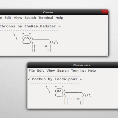
Padster


Source (link to git-repo or to original if based on someone elses unmodified work):
0.76-fixed cut off portal symbols (maximize), and improved scrollbar A LOT.
0.85-added menu button (Aperture logo), edited cake a little, fixed up scrollbars more.
0.9-shrunk Aperture logo by 2 pixels, fixed bug on left titlebar edge, fixed both titlebar edges (made them match the left and right frames)
0.95-edited cake, moved title over 20px, made buttons 1px apart
0.96-fixed small bug in bottom left corner


More Metacity Themes from Padster:
Other Metacity Themes:

Ratings & Comments
12 Comments
Nice, I think we don't really need cross and square buttons^^ But it don't match with my portal themes, I think I will have to create one me too! I think it is hard to implement a cake and a cube in the metacity decoration, in fact a GLaDOS system must be a command line system xD Thanks
Thanks! The icons are really easy to do, actually. You just have the images set as the buttons. I figured I'd have it all Portal-themed, and that the portals and cube were cool. Did you see how when you click on the cake a bite gets taken out? ^^
I saw, nice effect^^ But I wanted to explain it is hard to implement icons like this for "ergonomic purpose" (I am French, it is hard to be understood sometimes xD) A cross is a good way to say "close" in "ergonomic language" but a companion cube... I want to do something like elegant gnome theme, but with a few portal references nearly hidden :p A theme we can like, even if we don't know what is Portal... Or maybe I will do cake, it is more easy and so delicious :/ Have a nice day :p
^^ okay. Well, when you're using it, I think it's pretty easy to get used to. Have a nice day :)
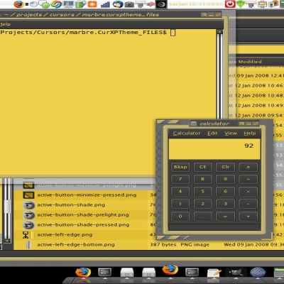
Hello,it's a very nice theme! What is the GTK theme on the screenshots?
thanks for the comment :-) the gtk theme is included in the download, called "Portal" as well. it has the scrollbars and colours.
Thank you! I've just installed it,and it looks great.
hey padster i like your idea it looks not as all other metacity themes ... vote it up :D
thanks.
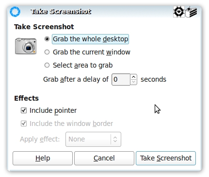
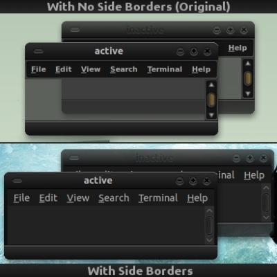
I like it. The middle button on the larger screenshot (blue portal) could be slightly smaller though. It's clipping a little bit due to its size, at the moment. Looking forward to further developments =D
thx for ur comment. i fixed that issue, and redid the scrollbar as well.
Looks good =D