i put your button in luxierayku's emerald theme, and put my darker minimize one in:
http://www.2shared.com/file/10456859/e1f20d08/Mac-Firefox-Like-edited.html
http://kimag.es/share/39974035.png
Krig has given us a new year's gift by presenting his Moz-style theme here on gnome-look !
It captures almost exactly my thoughts about this theme here.
I think we should use this work to perfect it even more.
A very good job done !
Yet, as I commented, your emerald theme would perhaps look better with the button I made earlier. You will need to adjust the size of my button but I think it would work nicely.
I'm still looking for a good solution for a metacity-theme however...
Thanks for the work you've done already !
another mock-up:
if it's symmetrical:
http://kimag.es/share/12057110.png (all buttons)
http://kimag.es/share/54611545.png (just the close button)
then it wouldn't look so bad when there isn't a maximize button. tell me what u think.
I decided it's time for some serious work on my part:
Here's the close button( it's not finished yet, extension on both sides I need to do)
http://kimag.es/view/65846184.png
I would still prefer some roundiness on the sides. It is possible (as in my bad mock-up) but you need to separate the buttons more in the XML-file so there is a visible blanc area


Ratings & Comments
39 Comments
i put your button in luxierayku's emerald theme, and put my darker minimize one in: http://www.2shared.com/file/10456859/e1f20d08/Mac-Firefox-Like-edited.html http://kimag.es/share/39974035.png
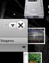
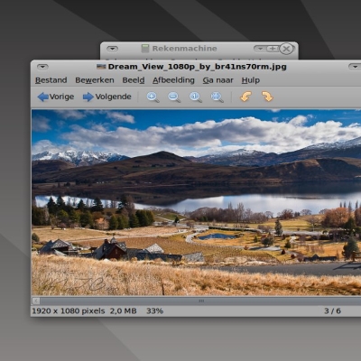
http://kimag.es/view/48908747.png The firefox buttons on mac We can change some things and make and good emerald
yeah, we could have close, maximize/restore, and minimize.
To maximize an arrow up and to restore a down arrow
yeah.
Krig has given us a new year's gift by presenting his Moz-style theme here on gnome-look ! It captures almost exactly my thoughts about this theme here. I think we should use this work to perfect it even more.
ok, well, i just made this: http://kimag.es/share/92376986.png that's with your button, and modified the maximize button to fit.
great job ! I've been meddling with Krig's theme and this is the result: http://kimag.es/share/62038718.jpg
that's nice. how did you do the indent part? is it the buttons, or the background?
just dowload Moz theme van Krig and look in the file. You will see he used a richt-top-frame background for the shaded part under the buttons.
Looks good, but I prefer slightly larger buttons
here, i did one kind of like luxierayku's i'll make a version with your button, too. http://kimag.es/share/77103219.png
I will try to make a Emerald theme, it's more simple
ok, sure. i don't know if it will work tho.
What do you think? http://gnome-look.org/content/show.php?content=117955
yeah, that's good. the x is darker in the middle.
A very good job done ! Yet, as I commented, your emerald theme would perhaps look better with the button I made earlier. You will need to adjust the size of my button but I think it would work nicely. I'm still looking for a good solution for a metacity-theme however... Thanks for the work you've done already !
Thanks ^^ I'm trying to look good with Mac4Lin
another mock-up: if it's symmetrical: http://kimag.es/share/12057110.png (all buttons) http://kimag.es/share/54611545.png (just the close button) then it wouldn't look so bad when there isn't a maximize button. tell me what u think.
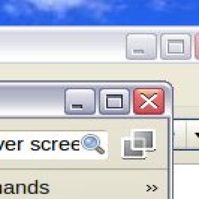
I decided it's time for some serious work on my part: Here's the close button( it's not finished yet, extension on both sides I need to do) http://kimag.es/view/65846184.png
I would still prefer some roundiness on the sides. It is possible (as in my bad mock-up) but you need to separate the buttons more in the XML-file so there is a visible blanc area
ok, i'll make a version like in your mock-up. or were u doing it?
Please work on it Padster and Qdark, you obviously have more experience with it then I.
I've added a badly made mock-up to show if it is possible to make these as stand-alone buttons. The closebutton has an extension at both sides.
should i make one like the mock-up you put up? it's do able.