

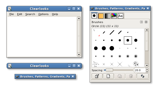
Clearlooks 2
Sparrk


Source (link to git-repo or to original if based on someone elses unmodified work):
0.6 Update:
Added Clearlooks-Balloon (all rounded) and Clearlooks-Sharp (all squared).
0.6:
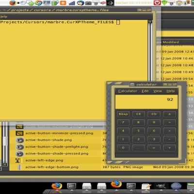
- Window icon is now fixed-size (no blurring).
- Slightly smoothed out the titlebar gradient.
0.5.2a:
- Fixed the tarball, so you can install via drag and drop again. Sorry about that!
0.5.2 (the "double-edged" release):
- Square bottom corners.
- Square utility windows.
0.5.1:
- Unfocused titlebars are less dark.
- Tweaked the prelighting.
0.5:
This is a major rework. If you liked the original Industrial-modification, you better make a backup of it.  The changes are:
- More advanced titlebar gradient, which looks softer and is also less bright, so it works well with bright themes like the new Ubuntu Human.
- New buttons which look quite a lot more like normal Clearlooks buttons.
- Unfocused windows do not look insensitive anymore.
- Utility windows have a smaller titlebar.
- The one-pixel padding below the titlebar is gone, this will look fine with the tweaked menubar in Clearlooks 0.5.
- Considerably better performance according to the Metacity benchmark tool.
First Release:
Differences to the last version included in Clearlooks 0.3 (Gtk engine) are a more rounded look for the buttons, slightly smaller icons and some minor fixes.


Other Metacity Themes:
Ratings & Comments
55 Comments
these are great. i especially like sharp.
Looks like Winders to much for me.
Fine.
I think the changes between 0.5.1 and 0.5.2 were a mistake. Having some windows with rounded titlebars and some (however rare) with squared ones makes the theme look somewhat inconsistent, in my view. Squaring off the botton corners of the window matters less, but is still inconsistent with the rounded corners of all the Clearlooks GTK+ widgets. Otherwise, it's a great theme, but I think 0.5.2 is a slight step down from 0.5.1.
I have problem with latest Metacity theme. titlebar gets overlaped with menubar. To be more clear, here is an example: http://img98.exs.cx/img98/4400/bug9ze.png This only happenes with Clearlooks Metacity theme.
It goes away if you enable font hinting in the font preferences, as somebody else found out. It also happens with Gorilla, so it would be interesting what all other themes do differently. I haven't looked into it yet.
I have problem with latest Metacity theme. titlebar gets overlaped with menubar. To be more clear, here is an example: http://img98.exs.cx/img98/4400/bug9ze.png This only happenes with Clearlooks Metacity theme.
this happens to me too, and you can trigger it by selecting "no hinting" in the font panel advanced preferences. To workaround the bug, enable font hinting (I know, it sucks....)
can you provide the same clearlooks-metacity package also on your clearlooks space on sourceforge. It's more difficult to pack a package when the source is here.
It's now on sourceforge.
./configure: line 10830: --variable=gtk_binary_version: command not found checking for pkg-config... no *** The pkg-config script could not be found. Make sure it is *** in your path, or set the PKG_CONFIG environment variable *** to the full path to pkg-config. *** Or see http://www.freedesktop.org/software/pkgconfig to get pkg-config. configure: error: GTK+-2.0 is required to compile clearlooks-engine
I love version 0.4, but really don't like 0.5, because everything that made it so "clear" for me is gone. -I don't like the new 'soft' titlebar gradient, the 0.4 gradient seemed more clear and flat to me, the 0.5 titlebar looks raised and pseudo-3d, but I prefer the flat look. -I loved how the inactive windows looked like they were carved out of one piece, with the same color for window, titlebar and the filling of the title-bar-buttons, giving the windows a seamless look. -I don't like the new buttons (close/maximize/...), I prefer the solid darker blue filling. Basically I think this: http://www.gnome-look.org/content/pre1/19527-1.png is the perfect clearlooks-version. In general I prefer 0.4 because of the more "flat" look, 0.5 just isn't that clear anymore. I don't want to be rude, I just think 0.4 was superior to 0.5, and since I'm really sad my Ubuntu upgraded 0.4 away, I registered an account here to let you know.
This is a waste of time. I'm very convinced of the improvements and most of the feedback has been very positive. The rating mysteriously went up from 78% to 84% when I released the upgrade (which is high for a metacity theme). I guess some people have the same bad taste as me then. I will _not_ revert to what I personally find far inferior. I already said above, that I'm not stopping anyone from re-releasing the old version under a different name. Please do that if you care so much, it would be far more constructive.
Did you keep the screenshot of the 0.4 version? If so, can you post a link to it? Thanks!
The screenshot xyme linked to is still using 0.4.
Sparrk, I posted your old version. Let me know if I need to add/change anything to the posting. http://gnome-look.org/content/show.php?content=22513
Looks fine.
First of all, I really like the new look of the title bars and buttons. The other updates are nice too. But i think im going to be sticking with v0.4 because of this "Unfocused windows do not look insensitive anymore." One of my favorite parts about clearlooks was that the titlebar blended perfectly on unfocused windows so it looked like it just wasnt there. I thought it was a really freakin cool idea. I think that with the more 3Dish gradients of the new titlebars paired with the old style windows it would look like the active title bar was a completly seperate part of the window that was snapped over the top of whichever window is being used.
The theme is not meant to look clever or different, it's meant to make sense. You should really make a custom version of it if you want anything more fancy. Notice that the flat look was nothing specific to Clearlooks, it was simply taken from Industrial/Winter. The next minor update will use a lighter shade for unfocused titlebars though, which looks noticably friendlier.
This theme is much better. From the previous version I switched to bluecurve because the metacity theme didn't quite fit properly. Very nicely done, and the polish added to a previously very good theme is amazing. Again, well done!
Thank God I saved the previous version! This version isn't butt ugly or anything but the previous version was way better.
Dude, you can say that in a much nicer way... BTW, while I think that the original wasn't good work and don't want to offer it for download anymore, I'm not stopping anyone from re-releasing it (just under a different name please).
Yeah, sorry about that. Now that I think about it, the new titlebar gradient, although subtle, really does make for a nice upgrade. However, the new buttons are definitely keeping me from using you're latest work. Excellent work nevertheless...even if I'm not a big fan of the new buttons. :)
I quite like the new version. The old version just didn't cut it with me.
Spark How do you get the square look? B