

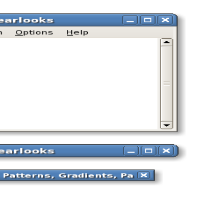
Clearlooks
Sparrk


Source (link to git-repo or to original if based on someone elses unmodified work):
2.1:
- Gave up and switched to pixmaps for icons.
- Focused icons have a soft shadow outline for better visibility (thanks to dhonn for the mockup).
- Well, happy new year!
2.0.1:
- Tweaked separator line on unfocused windows.
- Icons on active buttons are always white.
2.0:
- Initial release.


Other Metacity Themes:
Ratings & Comments
27 Comments
Look's really nice, personally i cant stand themes with that gotten all it's corners rounded. The top can be rounded but not the bottom. Really nice theme i like it = D
WooW! I'm in love with the new design! I'm sure it'd be "defaulted" in many upcoming distros. Congratulations!
Can you post what is the background ?
On the first screenshot it is one by Jimmac for Novell Desktop 10, called "golden-harmonics". You should be able to find it if you google for "golden-harmonics jimmac". The second was a contributed screenshot and the background on it AFAIK is from Windows Vista.
That's completely wrong ! Credits for this wallpaper goes to AmericanPsycho on DeviantArt : http://americanpsycho.deviantart.com/ This does NOT come from evil-Redmont.
very very nice . i prefer it to the original . great work :-)
I agree. Pretty freekin' cool man.
I thought the original was better. Maybe because the buttons were bigger and fit the bg better? Not to mention the pixmap buttons are not accessibilty friendly. If shooting for 'default' along with the clearlooks gtk, that would be a big issue, no?
i hate the square bottoms. why? why not round them? i think uniformity looks better, its silly when the top is rounded and the bottom is not.
Just for the record, comments like this are the best way to _not_ make me post a balloon variation. Maybe someone else will do it though. Ideally I would round all corners just a little, but that's not possible yet.
I still think that the buttons on the focussed windows seem too metalic, or heavy for the rest of the bar. Surely I'm not alone...maybe its the dark-light outline, along with the darker "shiny" look. Comments? (apart from "no, I don't think they do :P)
I think that buttons on titlebar are to big... In previous version were better.
After a day of usage I think you should rework the titlebar of inactive windows. It doesn't give impression of shiny/gradient bar. The difference between lighter and darker shade is to big and make the border between them very noticable. And that makes it look bad.
I have thought about that, but there are too many problem with it. Especially it would make unfocused windows too similar to focused windows, so with some color combinations or for color-blind people this could become problematic. It would also make the theme feel much more heavy. For now I have just lightened up the separator line a bit.
This m-city theme is great. Much better than the previous version, which sadly can't be said about gtk2 theme. Shiny lolly-pop blue scrollbars? Please..
If I remember correctly the 'lolly-pop' scroll bars will be a compile time variable... maybe I'm wrong though. It certainly should be, I agree.
They are a theme option.
Even better. :)
I like the theme. Although, the metalic-style widgets don't seem to fit in with the rest of the title bar. Either the buttons need to be less metalic, or the rest needs to be more metalic.
seems to me that the buttons should be white (#ffffff) like the title and not from gtk color, since not all gtk themes are the same. I have a lot of themes that give me a black button and it would be nice if this white was universal, despite the theme being used. ???
Yes, I'll probably change that. There are various reasons why I did it as it is in Clearlooks, but it doesn't really work well with the new style anymore. Mostly because the buttons are darker now. Maybe I'll also experiment with putting a shadow or black outline behind the icons.
..job drawing the buttons on code instead of using pixmaps! My only issue is a 24px titlebar with the default 10 font size (I think that's default), but that's easily changed. Thanks for the theme!
Yeah, the scalability is my favorite feature of metacity. I actually used a font size of 11 before, but with the wide buttons, 10 is just right for me. I can see how it can be too large for some especially on lower resolutions, but at least it's not as huge as XP titlebars. :)
I can't wait until the next version of gtk-engines comes out.
This looks great! Any chance of one with squared corners?