


ATER 5 color
Simzer


Source (link to git-repo or to original if based on someone elses unmodified work):
2006.06.27 - v0.9.6
- size changing when roll up - fixed
- complete redraw of the buttons
- button bg drawing - rewrited
2006.06.24 - v0.9.5
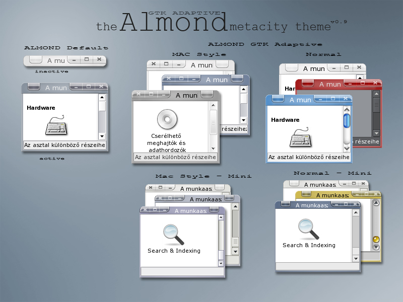
- Border width increased to 4 pixel
- Title height decreased, title files redrawed
2006.06.22 - v0.9.4
- new version with thinner titlebar and MAC button order
- pixel bug in titlebar's corner - fixed
2006.06.21 - v0.9.3
- new version with thinner titlebar
2006.06.05 - v0.9.2
- active triplet buttons graphic style - modified
- mac style, maximized, close button bug - fixed
- triplet button separator color - fixed
2006.06.05 - v0.9.1
- New button captions
- GTK Color use - rewritten
- inactive button style - fixed
- button border colorchange - finally fixed
2006.05.29 - rewritten. v0.9.0
- transparent pixmaps
- mac button order implemented
- font size fixed
- inactive button states added
- wider border implemented
- bottom outline uncontrast fixed
- button stroke lightchange fixed
2006.05.22 - First beta version 0.8


More Metacity Themes from Simzer:
Other Metacity Themes:
Ratings & Comments
51 Comments
nice. thanks.
Any thought of doing a matching gtk theme? I'm mainly thinking that scrollbar handles would look great with the same treatment as the titlebar buttons. Anyway, wonderful work. Thanks.
yes, i want to make a gtk theme. i already made a mockup, but its not that good. i tried scrollbars look like the win buttons, but they were strange and too much. maybe i should load up the mockup before i make the theme. and its hold back me, that i dont know how much work is it
Yes, I can imagine that getting it to look just right can be a challenge. The only gtk theme I've found that approaches what I think I'm looking for is CleanLime/Blue/Orange - but these have too much color and shine for my taste. I'm hoping for something more subtle. But subtle is hard I think. The mockup/preview approach seems to work well here. People give good feedback.
Almond just gets better and better. I noticed that with the borders now set to 4 pixels, the shaded title bar shifts in size when the window is "rolled-up". The fix is to set the left and right border for the shaded windows to the same width as the standard window. FRAME GEOMETRIES - SHADED WINDOW FRAME GEOMETRIES - DIALOG SHADED WINDOW FRAME GEOMETRIES - TOOL SHADED WINDOW distance name="left_width" value="4" distance name="right_width" value="4" distance name="bottom_height" value="0" Great work, Simzer!
thx! and thanks the tip. i fixed it. do you have practice in theming?
You're very welcome. I've never themed Gnome before, but I used CSS to theme the website that I've been working on - and it's the same basic idea. You can see my work in progress at http://www.kisskraft.com - please let me know what YOU think of my theming and graphic abilities. Greetings from beautiful British Columbia, Canada!
i made some websites long time ago, but i'm not familiar in css. i took a look at your site. there must be a lot of work in it. i think that the site's design fit well to the site's subject, and it's nice. There is just a little problem. The captions of the icons on the top bar is almost unreadable, if they are not overed. I would like to see a future theme made by you, if you think about theming. ;) i have a feeling that it would be nice. Greetings from beautiful Hungary!
dang!!! man that mplayer theme is great hope you post it.
i will, but currently it's not working. :(
and now its working... i posted it.
Very nice work, using mini version now, but please please please release that amazing mplayer theme! Cheers
First of all, this is my favorite metacity theme. I especialy like the gradient in the menu bar - it gives it added dimension. I do edit the xml file to increase the border width as I have a hard time grabbing tiny borders. This is easy enough to fix, though, so may not require a wide-border version. What I would love, however, is an alternate set of icons. I have always loved the icons on this otherwise very dated theme: http://www.gnome-look.org/content/show.php?content=13860 Much more sophisticated than underscore, box, X. Any chance of that happening? One last note: because of the shading, the close (x) button appears to be shifted one pixel to the left of the right border. Keep up the great work, and thanks.
Edit for clarification: The one pixel shifting problems is only apparent on dark backgrounds. On light backgrounds it looks pixel-perfect.
thx! first of all i'm thinking about making wider border version because i have problems with resizing too.:) How many pixel did you set to border width? Secondly, i like the idea of alternative button icons. my personal opinion, that Sloth's icons is a little bit diverse. But i will make it once. Or, if you can use gimp, you can make it easy. See the m1a.png - m3i.png files (3 buttonicon - 4 state), They are transparent pics without the button, just the icon. About the close button, it was worth one pixel right away, as far as i remember, but i will check it. So thanks all the suggestions
Thanks for the quick reply. I usually go with a border-size of 5 pixels. As an alternative to the icons included with the Sloth theme, the icons packaged with any of the Candido themes are also in keeping with the idea of simplicity with a touch of flair. Cheers!
i'm sorry, but my english is far from perfect... i can't puzzle out that long, complex sentence. i checked candido themes, but i didnt find button icons, so i dont know what does it mean. can you simplify it?
i also misunderstanded the button shift thing, i thought that you refered to the close icon, but now i see the problem. so i just finished the last changes and now i have to work again... :)
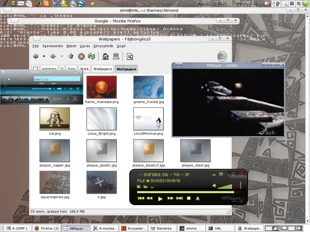
What is the yellowish and bubble-like theme that is behind the Glossy P, in the screenshot with the overlapped window? I like it.
its called H2O-GTK-Amber
hey guys awsome job on almond, love the silver but how do i change the color to black? thanks in advance
Hi! there are two way. The first one is to use the GTK adaptive version (rename home/.theme/Almond/metacity-theme-1-GTKAdaptive.xml to metacity-theme-1.xml), than search a black GTK theme. More difficult solution is editing the theme, replacing the default colors to the wanted colors...
The best metacity theme I've found yet. I love the glossy buttons and the way the theme adapts to the gtk colors. Excellent.
thx i will update it in some hours. it will nicer
Very good mc theme; however, I found a funny bug-like thingie (or perhaps an actual bug) - non-maximised windows have "damaged" close button, ie. button with its left upper corner rounded so it gives an impression of faultiness especially when hovered... Otherwise, great!