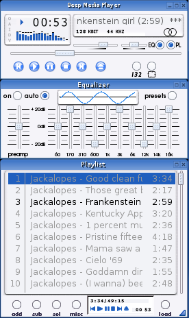
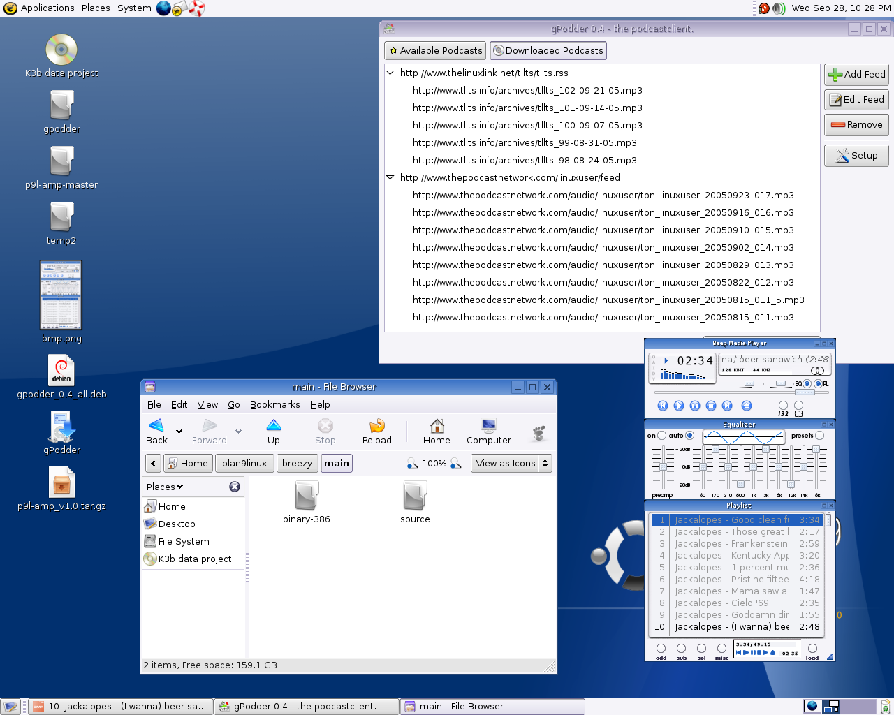
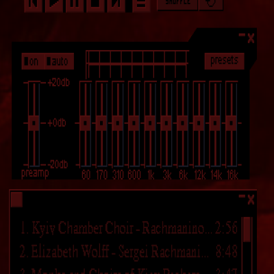
But still nice, nonetheless. Has too much of a "KDE look" (pun intended) for my taste. I can see someone who switches desktop environments often enjoying it for it's consistency. Is the icon theme in the screenshot yours as well?
Thanks for the compliment, and yeah, I know alot of GNOME users don't like the 'KDE Look' ;^)
The theme is actually a modification of Plastik and Ish.
The icons are a port of Everaldo's Clear Looks Icons. I debated about using the Krystaline icons (which I officially work on with others) but it is to incomplete for the GNOME desktop (everyone has concentrated on the KDE apps thus far).
OK. They looked kind of like Crystal except for the stock icons in Nautilus (which are kind of cool by the way) which was what made me ask. Checked out the Krystaline set over at KDE Look. I very much like the crystallized Bluecurve look of them. Wouldn't mind seeing those ported to GNOME (if someone hasn't done it already).


Ratings & Comments
4 Comments
very good!
But still nice, nonetheless. Has too much of a "KDE look" (pun intended) for my taste. I can see someone who switches desktop environments often enjoying it for it's consistency. Is the icon theme in the screenshot yours as well?
Thanks for the compliment, and yeah, I know alot of GNOME users don't like the 'KDE Look' ;^) The theme is actually a modification of Plastik and Ish. The icons are a port of Everaldo's Clear Looks Icons. I debated about using the Krystaline icons (which I officially work on with others) but it is to incomplete for the GNOME desktop (everyone has concentrated on the KDE apps thus far).
OK. They looked kind of like Crystal except for the stock icons in Nautilus (which are kind of cool by the way) which was what made me ask. Checked out the Krystaline set over at KDE Look. I very much like the crystallized Bluecurve look of them. Wouldn't mind seeing those ported to GNOME (if someone hasn't done it already).