


I wanted the beautiful blue folders in Faenza-Cupertino but with the nice frosted grey panel icons like in the regular Faenza-Dark
Icons from:
Faenza-Cupertino (http://gnome-look.org/content/show.php/Faenza-Cupertino?content=12900

Faenza-Dark (http://gnome-look.org/content/show.php/Faenza?content=128143)
It works really well for me, but it is just a hack I did, so it might not be perfect. You shouldn't need the regular Faenza icons installed. This should be complete and separate.
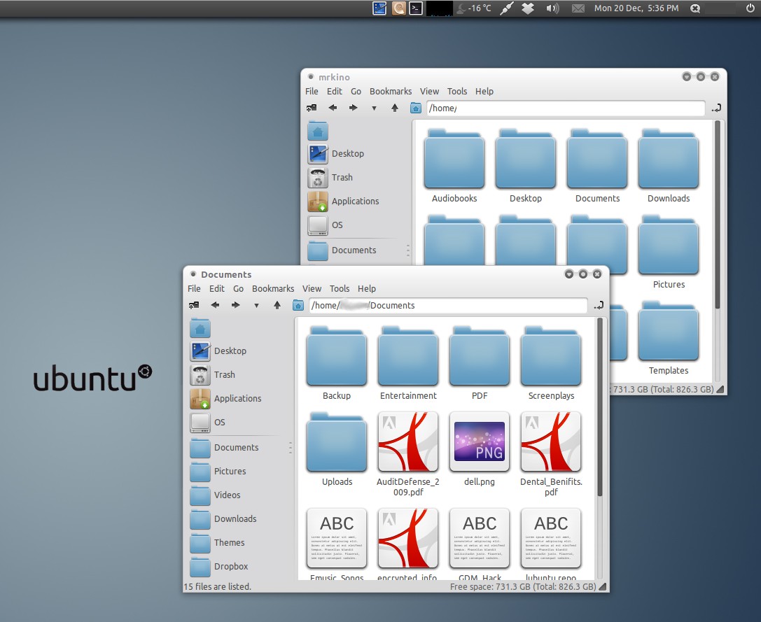
For those interested, in the screenshot:
GTK: http://gnome-look.org/content/show.php/Orta?content=134123
File Manager is PCManFM (not nautilus)


Ratings & Comments
21 Comments
..it doesn't work.
Hi, thanks for all the comments. I am happy to hear people are still using this icon theme. I am not actually maintaining and updating this icon set anymore. But if you want to send me your update with the fixed sys links, I would be happy to update the download link. Devi
Happy to. Link: http://www.mediafire.com/?y84vzafcj4k68n4
Thanks! I've updated the download link, and added your name in the update notes. The Linux Community appreciates your contribution ;)
My pleasure. Thanks :)
Something happened on ubuntu, might be a bug. The shutdown icon that apperas on the "shutdown|restar|suspend" dialog that appears when you press the shutdown button (at least on laptops) is a smaller version (and a different type, judging by the other action's icons) than the one I assumed is the one supposed to be there. Here is a screenshot: http://oi41.tinypic.com/okq6v5.jpg
Ok, I think I found the issue myself. It seems that you were naming the "system-shutdown" icons "system-shut-down". Apparently they don't need the dash in the middle of "shutdown". This is for gnome version found on ubuntu 10.10. I don't know if an Update of gnome is the one 'causing the discrepancy. My 0.025 cents. Thanks for the theme!
Answering myself again the "logout" button from the switch user dialog also had this problem but on this case the system-log-out simbolic link didn't exist. I fixed on my copy of your icon theme but maybe this warrant an update from you...
Hi, thanks for all the comments. I am happy to hear people are still using this icon theme. I am not actually maintaining and updating this icon set anymore. But if you want to send me your update with the fixed sys links, I would be happy to update the download link. Devi
I found an error. If you change the volume with the keyboard, the notification icon on the screen is terribly ugly. Thanks, Greetings!
The icon for parcellite is black, like it's meant for a light panel, and so is the status icons in Empathy. Would like the status icons to have color for intuity, maybe to be squared to integrate with the rest of the theme. Also the envelope indicator could turn blue, when there is a message, to be clearer. Otherwise I find the theme very nice. Using it with docky and Ambiance with blue highlight color instead of orange.
Thanks for the input. It's actually the first time I've heard of Parcellite. If I ever try and update the icons I'll see what I can do.
You've probably heard of glipper. I think Parcellite inherits the icon from this :)
I've found out that there's an isuse in the normal Faenza icon theme as well. It's parcellite again, but the issue occurs on dark panels instead. When using Faenza-Dark, it uses the black icon from the Faenza theme for parcellite, instead of a light one on the panel.
Sorry, I should post this elsewhere...
How you get the side panel icons bigger?
The file manager is PCManFM, not Nautilus. You can install it through the repositories. Then just Edit => Preferences, the Display tab and choose the icon size.
Hi, It's a nice icon theme, I like it a lot. BTW, what GTK and metacity theme used in the screenshot?
Thanks. The GTK is the lovely Orta theme: http://gnome-look.org/content/show.php/Orta?content=134123 and it is the Emerald theme that comes with it, not metacity.
Good job here! Is PcmanFM in he screenshot?
Thanks. And yes that is PCManFM in the screenshot. It's really fast and looks good.