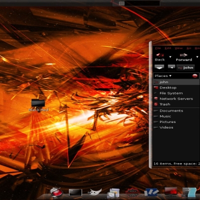
some icons are large when they should be small.
As the Internet icon in add / remove in Ubuntu and some icons are the theme with the default gnome (folders that appear in the local menu).
But this theme is very beautiful. ^^
Don't care about votings ;) Peoples are trying all Sets, no mind. If they like it, they would stay with it ;) Normally with time you get the true percent :D
ROYAL Blue??? You like this name Royal? Good I don't had the idea to make a blue Version ... :D


Ratings & Comments
17 Comments
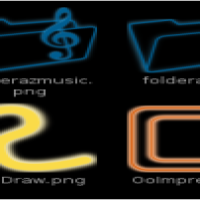
Just a wishlist: Following panel-applets (still uses gnome's default): Battery NetworkManager Bluetooth Sound
The best I've seen! Thanks for sharing...
some icons are large when they should be small. As the Internet icon in add / remove in Ubuntu and some icons are the theme with the default gnome (folders that appear in the local menu). But this theme is very beautiful. ^^
The icons look great! What colour scheme is that? and could you upload that too?
Sorry for the late reply, but I believe the GTK in that screen shot was "Kore".
your icons have brought me 1 step closer to interface heaven!!!
Great Work! i actually feel at home now in my desktop ;) greetings, j
And thank you :)
And I like it, I like it, yeah! Voted up!
I think you did a beautiful job. I love it.
good work I voted good also Black-Red
Thanks, I'm glad you like them.
Lesser saturation on blues could looks better, I think. Voted good!
I'll have to try that. Thanks.
Please, if you are going to vote down, at least give a reason.
Don't care about votings ;) Peoples are trying all Sets, no mind. If they like it, they would stay with it ;) Normally with time you get the true percent :D ROYAL Blue??? You like this name Royal? Good I don't had the idea to make a blue Version ... :D
I chose the name because of the color. It's Royal Blue.