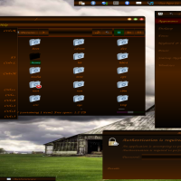
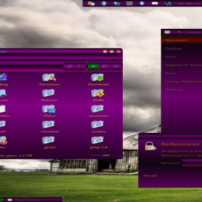
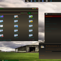
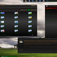
Description: Adwaita is a prefix so theme can be used with Cinnamon 2.0 instructions inside theme folder marked Cinnamon 2.0. Disregard statement in Libre Office as you will see in final picture sky-blue-cinnamon icons are completely functional on that desktop just has to be named appropriately. First time I capitalized S which made it not work!
Here it is a 3rd Version of Black Beauty. You will find the size of the entire theme smaller than previous themes, but do not be swayed by its small size. Make sure you check all the pictures associated with this theme. Once again is not a traditional black and white text theme. Black Beauty III has taken some time and a major toll on me to complete. This is not your everyday normal theme seen on GL. Its completion was sped up due to Cinnamons evolution to 2.0 independent of Gnome Desktop.
Red text has been eliminated on backdrop is just too rough on my eyes and assuming on most other people's eyes also. PNG's have been colorized to enhance looks to programs associated with gtk 2.0. SVG's that were not neccessary were removed to reduce size of theme and in an attempt to promote faster loading of theme. Red text only appears when using Nautilus for options.
Amount of files were reduced as to help those that may want to make their own adjustments. I feel the less the files, the easier something is to find! Once again all of the theme is adjusted to red, amber and green. When you click on something will go through the change, no boring lighter black here! Even the active window on the lower taskbar will display in green! Hovering over the other open windows will display amber.
Alpha aka transparency was used for coloring on gtk3.0 for scrollbars and hover which looks quite nicer than previous versions I created. On Gnome Tweak you will see when is in backdrop is easier on the eyes as well as more attractive. Also what I have referred to as a sort of Flourescent Effect reduces on backdrop for Gnome Tweak.
In a new attempt to cause a special effect background imaging was done. This will appear on selection menus that are large. For instance in Gnome Tweak if you have several themes scrolling down the list will turn darker. Going up turns lighter. This effect is also seen on the main menu under larger lists. If the list is short and does not scroll down normally you will not see this effect. You will notice the main menu appears with a much richer change in color. This is easier accomplished using imaging vs plain background!
Due to some conflicts on my own OS, I unfortunately was not able to fully test on the LXDE desktop. I was however able to test of XFCE and Gnome desktkops to insure its workings are proper!
Once again, I say please look at all the pictures, if you like it download it, if not get something else. Comments to complain of looks not appreciated in the least! Took time to work this all out, so please appreciate that fact. Also appreciate the fact, if something is not right, I will do everything I possibly can to make it right so you can enjoy it on your desktop as much as I do! SPAM NEVER WELCOME!
Ratings & Comments
0 Comments