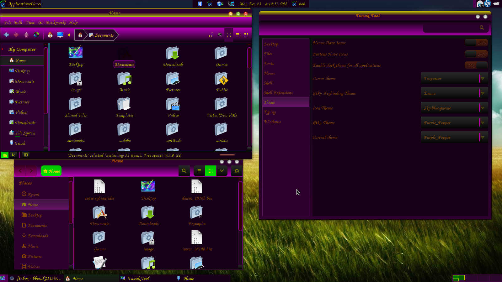
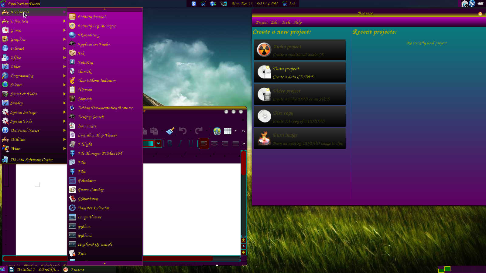
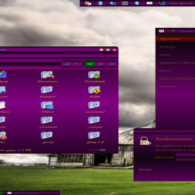
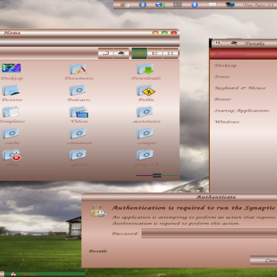
Description: Purple Popper II is a remake of Purple Popper. Was on the bland side with no wows or dazzle. This time am hopeful will have the spark and dazzle it needs to make it more appealing!
Recent work with images, shades and transparencies come to light in this remake. Let's try to give that illusion of things being rounded. Next let's have illusion menu's are lighted! Very unique and basically a one of a kind theme! My main aim is not to look like the same old themes that keep haunting us. I want originality and I sure feel Purple Popper II fits that definition. When looking thru all themes have not come across anything that matches the depth or appearance of this theme.
Of course, once again does not contain white or black text, text on desktop is purple. I also do my very best to show you where you are. What I mean in this is open windows on bottom task bar will show active window in green. Next even on Gedit you will see that same effect when you have more than one text file open. I feel this helps at times when we leave our computers for more than five minutes, then return and do not remember exactly what we were working on! Have no fear, you will see what you were working on lit up in green not cheap lighter coloring!!!! Who can tell the difference on lighter coloring anyway???
Still follows the red, amber, and green effect! I feel is nice to know when we click something there is that change and the coloring effect to tell us exactly what is happening. Even at times us more experienced users can click something and not sure if we did! When we see that change to green, is definitely the sign that proves the fact! I know this format may not appeal to everyone, but has taken quite a bit of time to get there so please appreciate that fact. I hope you will appreciate and enjoy this theme as deeply as I have during its creation. As always, if there are any problems or hassles, let me know and will do my best to correct it immediately! I dedicate all my themes to TheeMahn and HelloKitten. Their inspiration and drive has brought me to this point and just hope to continue and get better as time goes on! Thanks for NO SPAM, keep up the same so important messages can be transmitted!
Is simply my idea, no one else's and very unique in its performance. Took me quite a while to get that to happen! No, am not offended you do not like it and also know I am in no way some seasoned professional. I do make mistakes, but I do my best to correct them. I am sorry, I will never fall into making the same boring themes others make. Is just not me and is another reason I create them as others may feel the same way! Have a Merry Christmas!!! Hmm, I think I see that theme coming!!!
Yet another case of a downvote without a comment to explain. I really hate the voting system here, you should have to post a comment to be able to vote imo.
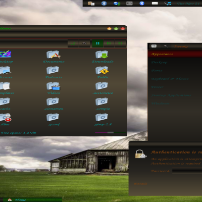
I am not the one that voted down but I think I can see why you were. The theme has clashing colors, difficult to read text and fonts and banded gradients. It is quite jarring to look at.
I see you have put effort into this and I can appreciate that, please take my comment as constructive criticism. Try to avoid clashing colors and make your gradients smoother. The gold font is also hard to read, bot because of the font and the color being hard to pick out from the background. In my opinion the best way to figure out what colors go together is to look at some of the more popular themes and draw inspiration from the elements you like. Keep your themes simple and you will find more positve feedback. Clashing colors don't make things pop or add wow, they hurt the eyes ;)
Keep at it, I look forward to seeing how you improve :)


Ratings & Comments
2 Comments
Is simply my idea, no one else's and very unique in its performance. Took me quite a while to get that to happen! No, am not offended you do not like it and also know I am in no way some seasoned professional. I do make mistakes, but I do my best to correct them. I am sorry, I will never fall into making the same boring themes others make. Is just not me and is another reason I create them as others may feel the same way! Have a Merry Christmas!!! Hmm, I think I see that theme coming!!!
Yet another case of a downvote without a comment to explain. I really hate the voting system here, you should have to post a comment to be able to vote imo. I am not the one that voted down but I think I can see why you were. The theme has clashing colors, difficult to read text and fonts and banded gradients. It is quite jarring to look at. I see you have put effort into this and I can appreciate that, please take my comment as constructive criticism. Try to avoid clashing colors and make your gradients smoother. The gold font is also hard to read, bot because of the font and the color being hard to pick out from the background. In my opinion the best way to figure out what colors go together is to look at some of the more popular themes and draw inspiration from the elements you like. Keep your themes simple and you will find more positve feedback. Clashing colors don't make things pop or add wow, they hurt the eyes ;) Keep at it, I look forward to seeing how you improve :)