

Cyana-3D V2 and Cyana
BBOSAK2143


Source (link to git-repo or to original if based on someone elses unmodified work):
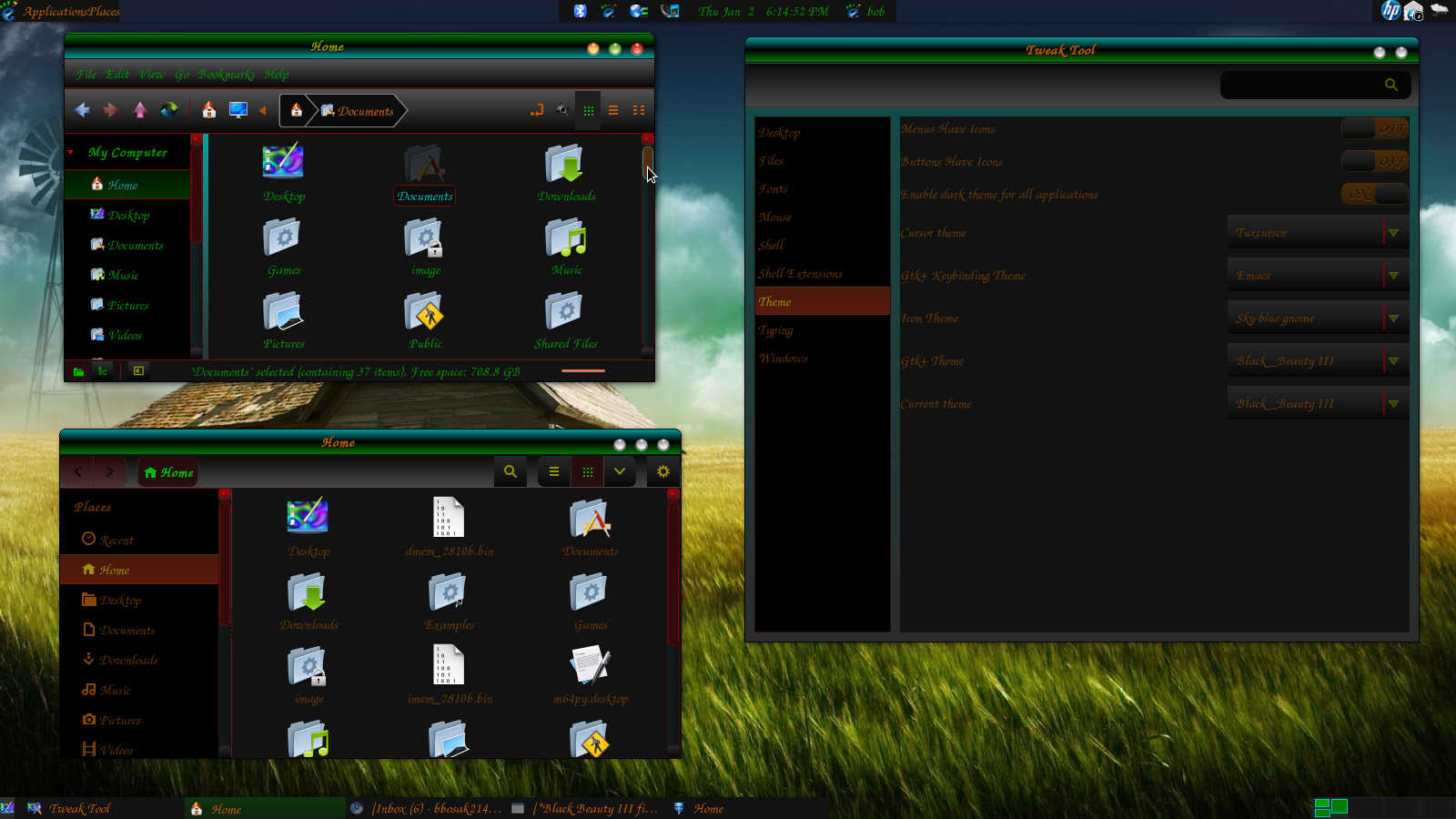
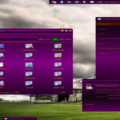
First picture you will notice on Gnome Tweak Tool pictured on the right side is in backdrop. Imaging was used to not loose the effect of the doors or pop down scroll windows. The illusion of being rounded is kept. Text coloring changes and is also reduced in transparency to the effect of 2. This allows text to still be seen but not be overbearing!
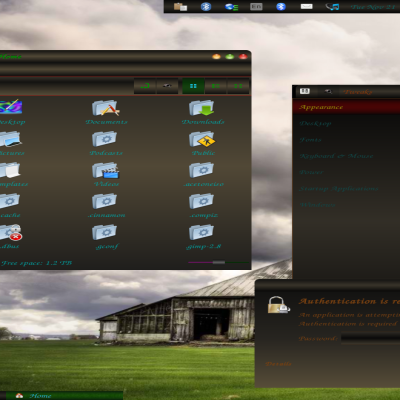
On the left Nemo is active mouse is in hover position to show new effect of scrollbar border changing colors. Also new is the steppers are now seen in red. The effect is also a transparency. When user clicks scrollbar it then changes to final color of green and the border becomes brighter.
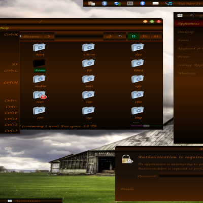
Lower left side picture shows Nautilus and this time is in backdrop. All borders reduced in transparency. There is no GREEN Obnoxious background behind Home as was originally. This is a recent fix I finally understand how to accomplish with the switches as they are complicated when using the color scheme I do!
On the lower panel you will notice the active window is shown in green another transparency as to accurately show you which window is active. You will also notice the active Nemo window upper and main show sort of a curved look. Originally this was not done correctly. Now it is! On backdrop will appear as if is indented. Another 3d type illusion done with imagery.
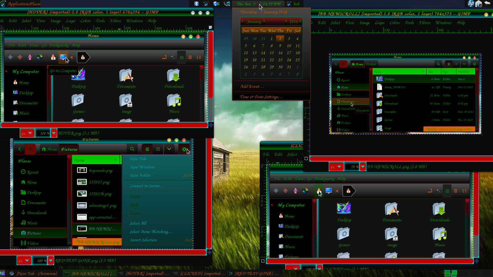
Next is a collage of pictures. Pictured right side shows new hover scroll when moving mouse over menu\'s. This is a new effect just developed today!
Lower right shows the effect when you click on things in the upper menu. This helps us know what we are doing at points!
Upper left shows hover on the icon just right of the one clicked in the lower right.
The lower left picture shows this time I did not make the mistake of leaving red text in and change to a more visible color. Items that are darkened by green text shows the user they can not be clicked/used at the moment. This clearly defines that point!
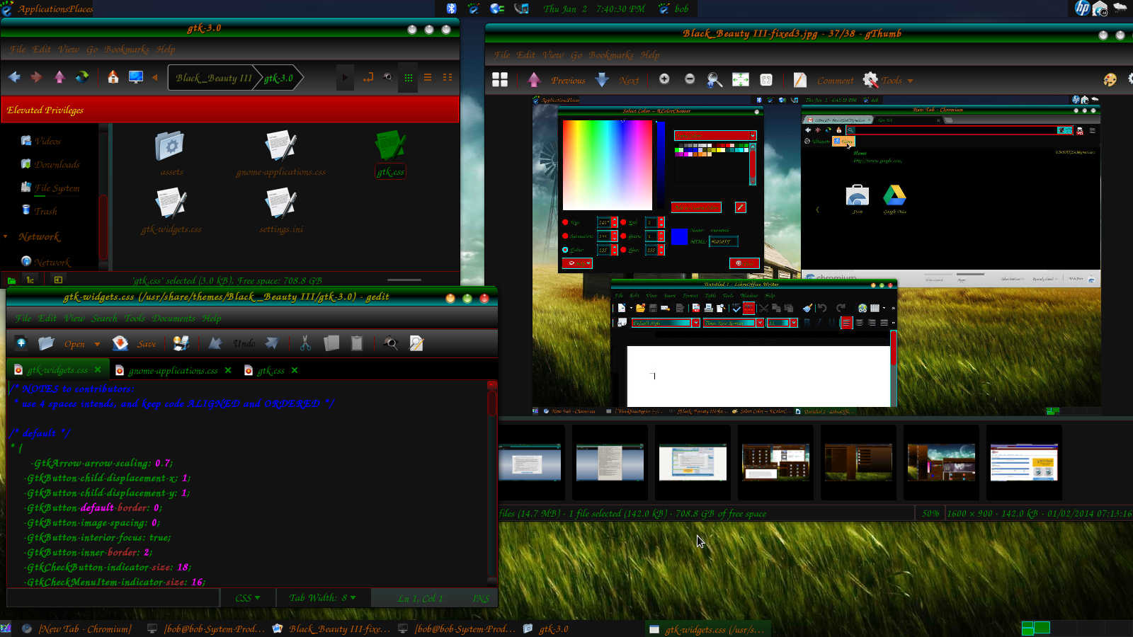
Final collage depicts some of the new colored png\'s for gtk2.0. Most are now more defined but kind of bright, this was done to add a more cheerful look. Text on the hovered buttons is now easier red due to the brighter coloring which is also another reason I moved to that coloring scheme. Largest reason is am no pro with gtk2.0 so do not know the exact command lines to use to define everything more appropriately. On the left hand side of the collage you will see Nemo under sudo has nicer red coloring than the previous brighter almost pink color. Below that depicts when we are working on multiple files in gedit. Now wouldn\'t it be nice to have the exact file we are working on more defined and visible???? Luckily in the past weeks I figured how to do this and implement it to help everyone! My main concern has always been to help! I hope you will enjoy this theme very much as I feel has great looks and great capabilities to aid in all tasks that need be done! Enjoy!


More GTK3/4 Themes from BBOSAK2143:
Other GTK3/4 Themes:


Ratings & Comments
0 Comments