


-------------
Hi guys!
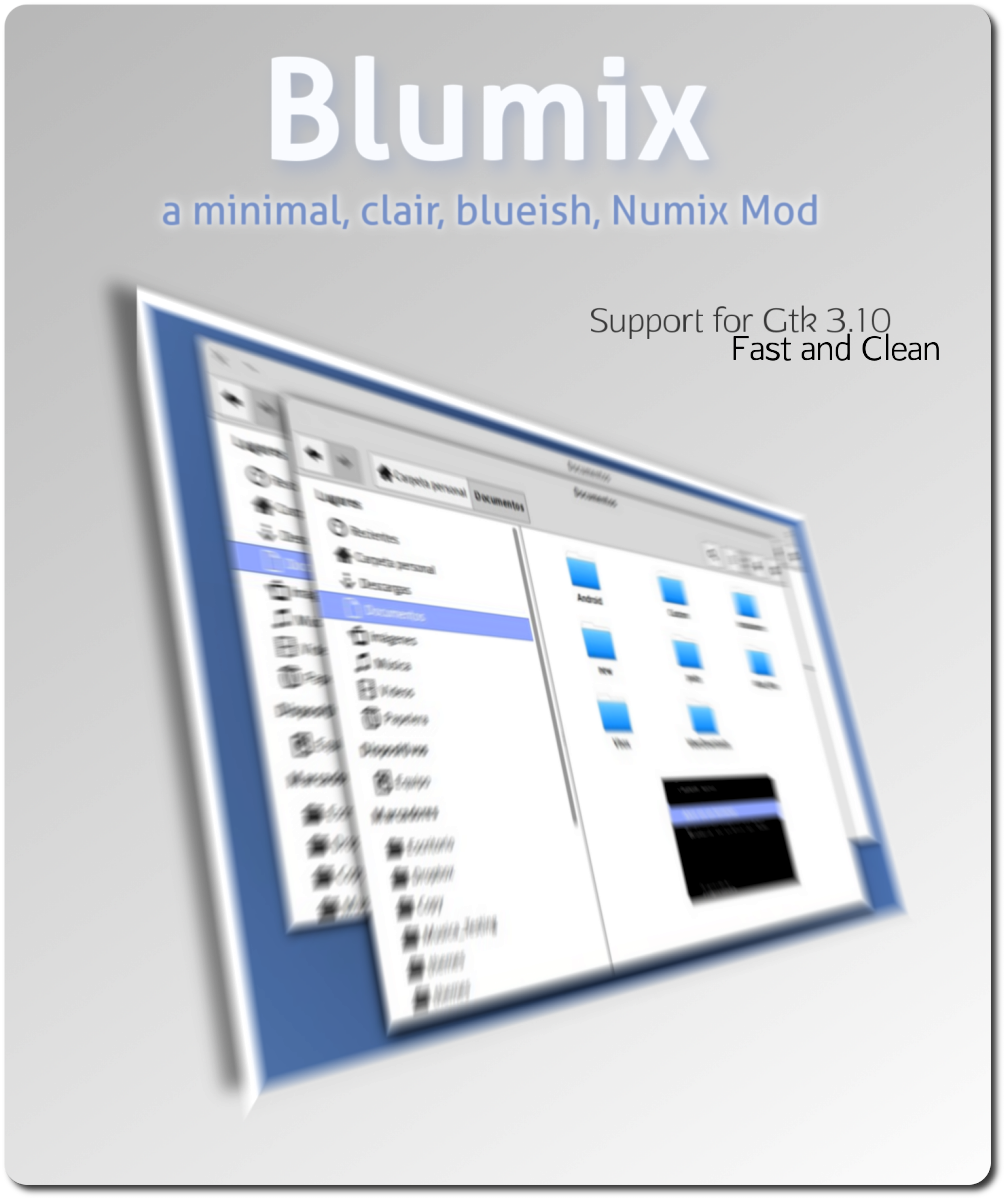
So, this is the second version of Blumix, a new modding project I started a couple of weeks ago. The first version can be found here http://rhoconlinux.wordpress.com/2013/11/10/blumix-mod-de-numix-celestito/
Anyway, the idea is:
· Minimimal minimal minimal
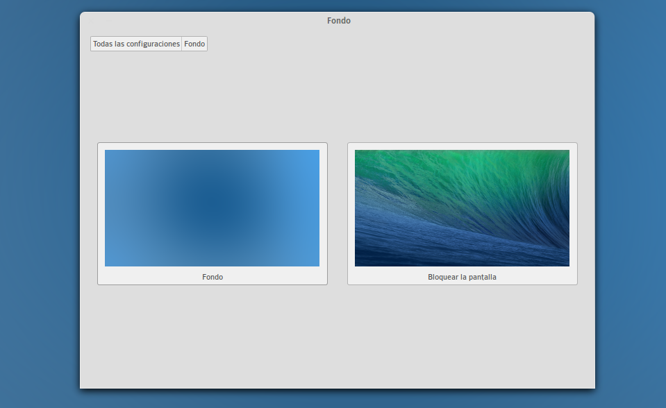
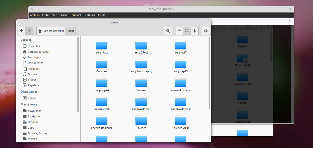
· Clair, light theme
· Blue-ish colors to highlight
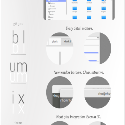
· Flat window borders
The project lives in Github: https://github.com/rhoconlinux/Blumix
One command install: http://rhoconlinux.wordpress.com/2013/11/15/actualizado-gtk-theme-blumix-v-02/
Also in here:
Deviant-art http://rhoconlinux.deviantart.com/art/Gtk-3-8-3-10-Theme-Blumix-V0-2-413729117
Google+ https://plus.google.com/u/0/111935444514160567933.
[Update 22nov]
ALmost Everyday I try some experiments to see wher to go with the theme. If you are interested, you should check the *Edge* Version of Blumix in Github https://github.com/rhoconlinux/Blumix-Edge
[Update 26nov]:
Blumix-Edge (experimental) update:
Gnome-shell theme added, although it is a version 0.01 derived from elegance colors directly. With time it will take form. For now, it is what it is : )
Btw... the edge version already has the major changes for the next release. Stay tunned!
Cheers!
ps. Vote if you liked it ^_^
suggestions and forks are more than welcome!


Ratings & Comments
7 Comments
One big problem. This theme takes up huge space for toolbar (see gedit) compared to original numix or even zukitwo. Would love this theme if this was compact
gorgeous,and i think the the maximum min~ and close button need improve(ps:something like osx"s)
thanks man! I totally agree with the borders stuff : ) In the blogpost I actually mention that this is an interest for the next version. A couple of window borders with different styles would be nice... specially ones in the the fashion you mention :3
Are active windows supposed to have invisible icons and titles?
jajaj, yeah man, indeed. I though could be a nice minimalist touch, so... that was the idea, couse at the end everybody knows where the buttons are. When you do the "mouse-over" you'll see the buttons properly :) I'll change that in the foreground windows in the next version, and probably provide another set of windows with the buttons visible all the time. :)
What a mess of response. :P 1) Yes, it was supossed to be without buttons in all windows, I liked as a minimalist idea to try 1.a) althogh in the foreground window is not implemented yet 2) In the next version I will fix the foreground window so all windows will be flat by default. You seek the button with the mouse as usual. 2.a) I'll do an alternative version to those whom want the buttons there. ...ah, now we are talking :P
jajaj, yeah man, indeed. I though could be a nice minimalist touch, so... that was the idea, couse at the end everybody knows where the buttons are. When you do the "mouse-over" you'll see the buttons properly :) I'll change that in the foreground windows in the next version, and probably provide another set of windows with the buttons visible all the time. :)