


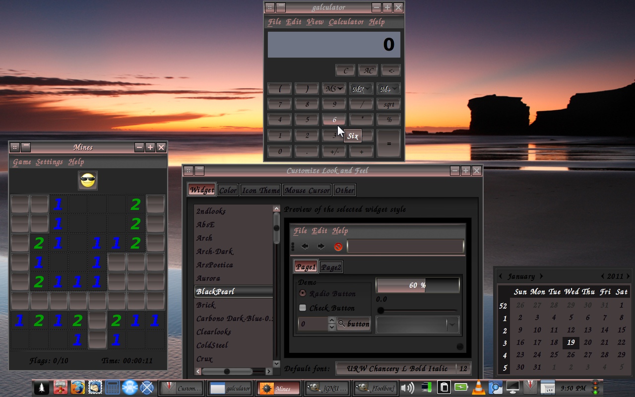
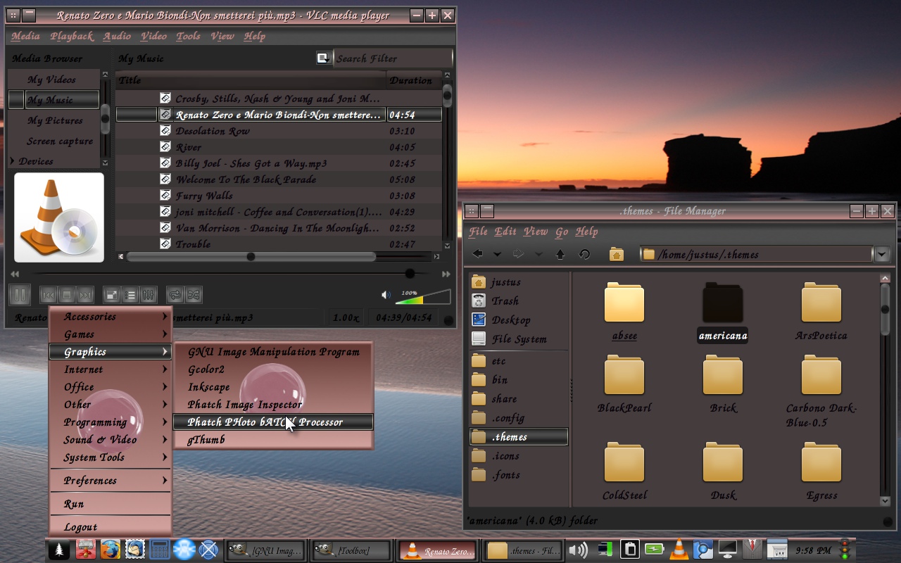
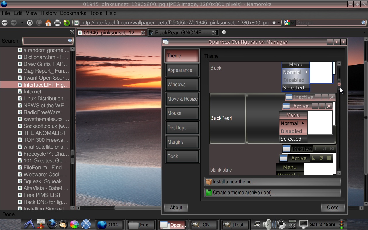
Cranberry
IamJustUs


Source (link to git-repo or to original if based on someone elses unmodified work):
Jan. 19 changes:
Just backpeddling and fixing things
that now know how to?
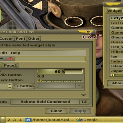
better vert. and horiz. handles with
pink highlight
pink highlights to troughs of scrollbar and range.
pink frosting added to panel top and
panel top buttons
added spin control and buttons
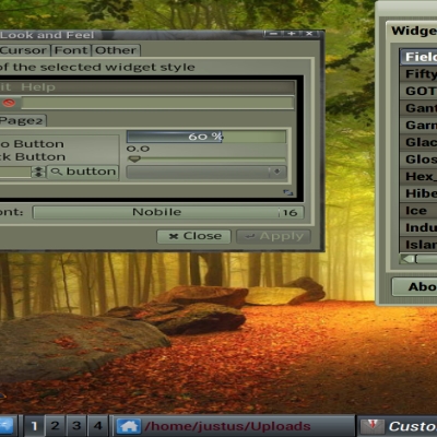
Complete gtkrc redo, removed murrine
engine, managed to create a nice look,
with just pixmap.
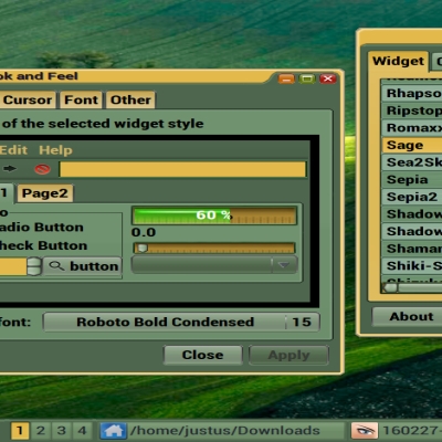
text color change to deep plumb from
light white blue.
highlight bg changed to plumb from pink.
First time I have been able to create a nice usable button from pixmap that worked with Mines, adding a couple of
buttons images to default settings was the trick.
Sept. 28 changes:
last changes caused me lots of strife,
option menu was completely washed out
and unreadable, active tab, active panel button that I darkened because of
text color changes lost that pink pearl
look.
So... added option menu to gtkrc and cleaned up code, which allowed me to just set the menubar text pink, keeping
black foreground for buttons and such.
brought back original active tab and
panel button look, cleaned up the interior and resized them. for better
look in thinner panels.
added my themed arrows to toolbar, changed the pressed toolbar button.
Sept. 26 changes:
menubar text color change for better visibility.
active tab, active panel button, normal button all darkened to mirror text color change.


More GTK2 Themes from IamJustUs:
Other GTK2 Themes:


Ratings & Comments
12 Comments
Nice shiny theme.
Thanks A C,
The download link is dead.
Never mind, it was a hiccup. Sorry about that.
Nice scrollbar and I like the colour tone. But I have to change text colour for readability.
Maybe it is time for an update on this theme. I make my own IceWm themes now, Sounds like a nice winter project.
This could be a lot better if the buttons/selections were less square/"boxed", and the size of things weren't so big. The color scheme is phenomenal. But everything should be readable, even with smaller text. Nice work.
Thanks K, I made this theme for a specific purpose, to go along with a icewm theme. So I, made myself try to keep tighter control, I know this theme has some minor issues and addressed them as well as I could without loosing the specific look I was after.
The black text on menu is hard to read at monitor with low bright. The buttons looks great, I like it. But the buttons on the gnome panel looks ugly and without show the full icon & text.
German, Thanks for the comment, I have uploaded the menu text change. As for you gnome panel problems, I can not understand why you would not want at least an icon in your panel buttons. you must have a highly organized mind. I cant remember one button from the next. Maybe, an artist view? Anyway, here is a possible solution: find...style "panelbuttons" line number 1573 in the gtkrc file, #comment the x and y values or change them to 0. The x, y coordinates tell the panel where to place the icon or text in the panel button. If your not using text or icon it probably is the reason for your ugly button.
Oh thanks. This is how: http://img178.imageshack.us/img178/3603/pantallazoht.png I fix increasing the size of panel. http://img716.imageshack.us/img716/209/pantallazo1zy.png
Thanks for the pics, that really helps, I resized the panel buttons, so it should look better with a thinner gnome panel.