Alacarte < http://ftp.gnome.org/pub/GNOME/sources/alacarte/ > properties dialog looks strangely funny
I'm not using GNOME nor Alacarte any-longer though
Little Sister (KDE)
Home PC (Xfce)
Home Server (IceWM)
Laptop (Xfce/Openbox) [SalixOS GNU/Linux]
and... I'm using it!
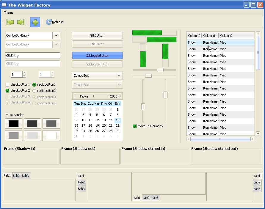
I agree with You that XP style - Luna - is very good theme (I prefer Luna Elements style :-)). Your GTK theme is really great and very similar to XP style. But I think You should notice that Linux is not Windows and some "copied" parts of theme doesn't look good in Linux. For example - windows (buttons, tabs, boxes, columns) in you theme looks beautiful , but I don't like panels and menus. I think panels shouldn't be blue, like on XP. Maybe it'll lookbeter in colours similar to windows color? In menus, dark separator looks bad, and this blue vertical line is also unnecessary. But great job, theme is realy nice, i like this kind of light and warm colours :-)
About the panel: in the next revision there will be a way to have panels and panel buttons JUST like in xfce-redmondxp theme. The separator... I didn't even touch that color, probably will make it some kind of grey.


Ratings & Comments
4 Comments
“scrollbar_color” is no longer supported and will be ignored. Is there an alternative way to colorize the scrollbar to #c3d5fd?
Alacarte < http://ftp.gnome.org/pub/GNOME/sources/alacarte/ > properties dialog looks strangely funny I'm not using GNOME nor Alacarte any-longer though Little Sister (KDE) Home PC (Xfce) Home Server (IceWM) Laptop (Xfce/Openbox) [SalixOS GNU/Linux] and... I'm using it!
I agree with You that XP style - Luna - is very good theme (I prefer Luna Elements style :-)). Your GTK theme is really great and very similar to XP style. But I think You should notice that Linux is not Windows and some "copied" parts of theme doesn't look good in Linux. For example - windows (buttons, tabs, boxes, columns) in you theme looks beautiful , but I don't like panels and menus. I think panels shouldn't be blue, like on XP. Maybe it'll lookbeter in colours similar to windows color? In menus, dark separator looks bad, and this blue vertical line is also unnecessary. But great job, theme is realy nice, i like this kind of light and warm colours :-)
About the panel: in the next revision there will be a way to have panels and panel buttons JUST like in xfce-redmondxp theme. The separator... I didn't even touch that color, probably will make it some kind of grey.