This GTK theme was originally part of LCARS-Desktop, but was forked off due to bug problems. There are a couple of known issues with OpenOffice:
The button text across the top of the OO window is dark-grey on black. This is because OpenOffice uses the same text colour for these buttons as for the main writing field. For usability I wanted a white background for text-entry areas, which naturally requires a dark foreground colour.
Tooltip text in OO is similarly low-contrast for similar reasons.
I hope you enjoy this theme. Thank-you for downloading and/or rating!
I am new to Ubuntu. I'm having trouble installing the theme properly. The message the computer gives me is "Theme will not look as intended because "Tango" is not installed." I was wondering if y'all coulf help me out with this problem
Well, if you are using the latest Ubuntu (12.04 Precise Pangolin) with a standard Unity desktop, this theme just won't work there, as it is a GTK2 theme. You need the GTK3 ones. Too bad there is not an LCARS theme for GTK3, though... :-/
Hey, since this changes the main menu button to the Gnome foot (at least it does on my system), why not make this theme even cooler by getting it to install the Starfleet logo or something and use that! My brother would probably move to Ubuntu if you got that happening, hehe! (Please - no anti-Ubuntu comments... we're all adults here, hehe! It's better than him relying on Windows for the rest of his life, and since he found a Star Trek LCARS theme for WindowBlinds, it's been harder to get him to try Linux).
While I'm here, does anyone know where I can get a decent little logo for this?
I hadn't even noticed that it changed that icon...
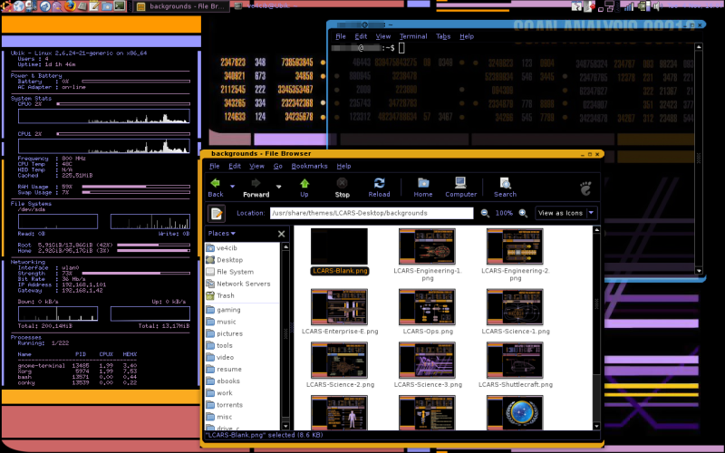
In the LCARS-Desktop download there's a small UFP logo called "menu.png" that should be a suitable replacement. I'll see about trying to tinker with the GTK theme and integrate that.
Or better yet I'll just start working on an LCARS icon theme. That'll take a while, but it's probably a tidier and more satisfying solution in the end.
Hey, have you changed, splash and login screen. I have.
I have found login screen similar to this theme, ( in 1024x768 resolution ), and i've changed splash screen with picture that have black background and"United Federation of Planets" logo and sign. Its quite beutiful when you're loging in.
I've been searching for Star Trek usplash screen, but no luck :(
I also put my Conky to start in 12 seconds delay, and you get effect like, system ( read: Enterprise ) is on line.
If you want i'll send these files to you.
I've already made a GDM login screen that matches with the rest of my LCARS themes: http://www.gnome-look.org/content/show.php/LCARS-Desktop+GDM+(Widescreen)?content=92137
Unfortunately the only monitors I have access to are 1280x800, so I have some difficulty making good-looking backgrounds and login screens for other resolutions.
As for splash screens, honestly, I can't stand them. The first thing I do is disable the splash screens on pretty much anything with that option (including booting with the "nosplash" option). But if there's sufficient demand for one I'll see about making an LCARS splash screen.
As for that Conky script, if you feel like sending it my way that'd be nice. My e-mail address is my username at gmail.com.
Hey, have you changed, splash and login screen. I have.
I have found login screen similar to this theme, ( in 1024x768 resolution ), and i've changed splash screen with picture that have black background and"United Federation of Planets" logo and sign. Its quite beutiful when you're loging in.
I've been searching for Star Trek usplash screen, but no luck :(
I also put my Conky to start in 12 seconds delay, and you get effect like, system ( read: Enterprise ) is on line.
If you want i'll send these files to you.
Okey, i have install it. Now as far as i can see OO looks better, i dont know is it ok, but its still very dark with darkgrey letters. I suppose that's the way it should be. Is it?
Anyway, its much better then first version, and i can live with that. I wish to thank you for your time, and a lot of Star Trek fans are enjoying...
Best regards
OO seems to use the GTK theme in a very weird, awkward-to-configure way. It uses the same colour for the text on the controls and for the text-entry. This means that it's virtually impossible to have a dark control theme if you still want black text on a white background for when you're writing.
The dark grey on black was the closest I could come to something usable without sacrificing the white background/dark text for the page. Hopefully a later version of OO will correct the way it uses the GTK theme colours.


Ratings & Comments
13 Comments
I am new to Ubuntu. I'm having trouble installing the theme properly. The message the computer gives me is "Theme will not look as intended because "Tango" is not installed." I was wondering if y'all coulf help me out with this problem
Well, if you are using the latest Ubuntu (12.04 Precise Pangolin) with a standard Unity desktop, this theme just won't work there, as it is a GTK2 theme. You need the GTK3 ones. Too bad there is not an LCARS theme for GTK3, though... :-/
Can anyone tell me how I get conky into my theme? ( sorry Im a little new to linux)
Hey, since this changes the main menu button to the Gnome foot (at least it does on my system), why not make this theme even cooler by getting it to install the Starfleet logo or something and use that! My brother would probably move to Ubuntu if you got that happening, hehe! (Please - no anti-Ubuntu comments... we're all adults here, hehe! It's better than him relying on Windows for the rest of his life, and since he found a Star Trek LCARS theme for WindowBlinds, it's been harder to get him to try Linux). While I'm here, does anyone know where I can get a decent little logo for this?
I hadn't even noticed that it changed that icon... In the LCARS-Desktop download there's a small UFP logo called "menu.png" that should be a suitable replacement. I'll see about trying to tinker with the GTK theme and integrate that.
Or better yet I'll just start working on an LCARS icon theme. That'll take a while, but it's probably a tidier and more satisfying solution in the end.
Hey, have you changed, splash and login screen. I have. I have found login screen similar to this theme, ( in 1024x768 resolution ), and i've changed splash screen with picture that have black background and"United Federation of Planets" logo and sign. Its quite beutiful when you're loging in. I've been searching for Star Trek usplash screen, but no luck :( I also put my Conky to start in 12 seconds delay, and you get effect like, system ( read: Enterprise ) is on line. If you want i'll send these files to you.
I've already made a GDM login screen that matches with the rest of my LCARS themes: http://www.gnome-look.org/content/show.php/LCARS-Desktop+GDM+(Widescreen)?content=92137 Unfortunately the only monitors I have access to are 1280x800, so I have some difficulty making good-looking backgrounds and login screens for other resolutions. As for splash screens, honestly, I can't stand them. The first thing I do is disable the splash screens on pretty much anything with that option (including booting with the "nosplash" option). But if there's sufficient demand for one I'll see about making an LCARS splash screen. As for that Conky script, if you feel like sending it my way that'd be nice. My e-mail address is my username at gmail.com.
Hey, have you changed, splash and login screen. I have. I have found login screen similar to this theme, ( in 1024x768 resolution ), and i've changed splash screen with picture that have black background and"United Federation of Planets" logo and sign. Its quite beutiful when you're loging in. I've been searching for Star Trek usplash screen, but no luck :( I also put my Conky to start in 12 seconds delay, and you get effect like, system ( read: Enterprise ) is on line. If you want i'll send these files to you.
Sorry for double post, my mistake.
Okey, i have install it. Now as far as i can see OO looks better, i dont know is it ok, but its still very dark with darkgrey letters. I suppose that's the way it should be. Is it? Anyway, its much better then first version, and i can live with that. I wish to thank you for your time, and a lot of Star Trek fans are enjoying... Best regards
OO seems to use the GTK theme in a very weird, awkward-to-configure way. It uses the same colour for the text on the controls and for the text-entry. This means that it's virtually impossible to have a dark control theme if you still want black text on a white background for when you're writing. The dark grey on black was the closest I could come to something usable without sacrificing the white background/dark text for the page. Hopefully a later version of OO will correct the way it uses the GTK theme colours.
Strangely enough it seems to work ok in OOo 3.1.1. But.. Within calc all backgroundcolors in the cells are white. What to do about that?