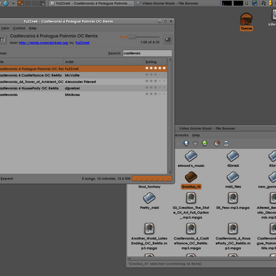
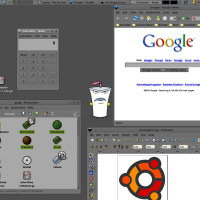
All your three themes look nice, but
the 'easy on the eyes' is not quite true here. Easy on the eyes is possibly low contrast, which means the colors cannot be too dark, since your eyes gonna hurt when watching white space [websites]. If the basic color was a _bit_ brighter, that would be ok.
So I'm gonna do as I usually do - download it, modify a little and then use for myself :)
By the basic color? do you mean the highlight color? it is a bit too dark. i'll probably change it sooner or later. the other 2 themes don't have that problem just the blue one. i have noticed it's not contrasty enough when i select some text.


Ratings & Comments
2 Comments
All your three themes look nice, but the 'easy on the eyes' is not quite true here. Easy on the eyes is possibly low contrast, which means the colors cannot be too dark, since your eyes gonna hurt when watching white space [websites]. If the basic color was a _bit_ brighter, that would be ok. So I'm gonna do as I usually do - download it, modify a little and then use for myself :)
By the basic color? do you mean the highlight color? it is a bit too dark. i'll probably change it sooner or later. the other 2 themes don't have that problem just the blue one. i have noticed it's not contrasty enough when i select some text.