

Cranberry
IamJustUs


Source (link to git-repo or to original if based on someone elses unmodified work):
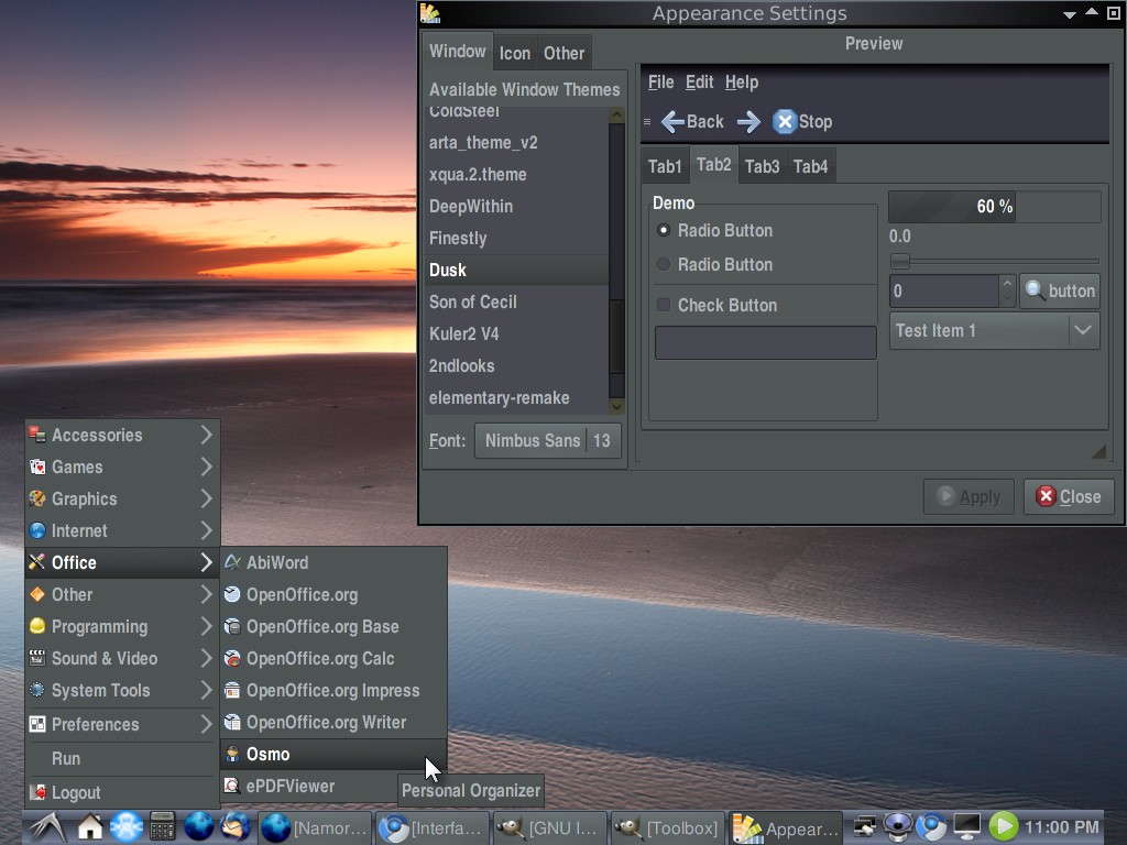
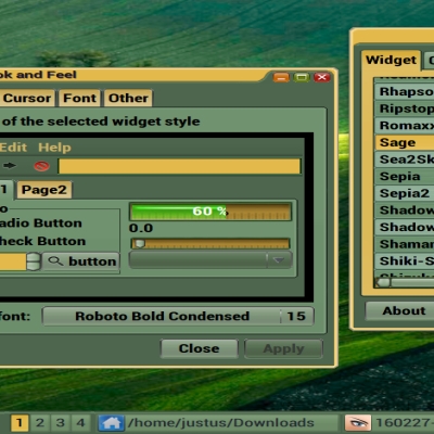
Changed the nbase
color, to clear up non-selected boxes in Firefox and Chrome.
Also updated the Openbox menu text
for more theme unity
--------------
*Second update;
Reworked the menu- bar and toolbar, to
add some depth and
smoothness.
Changed the window
client color and more
for the Openbox theme.
Feb. 22, 2010 changes:
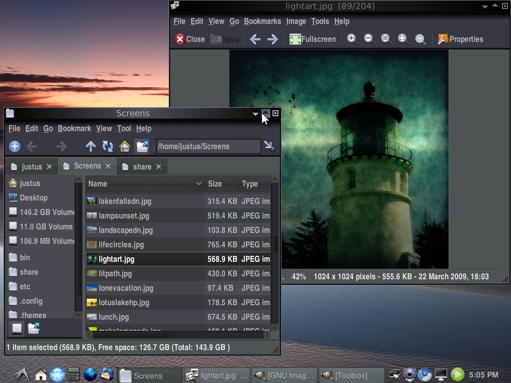
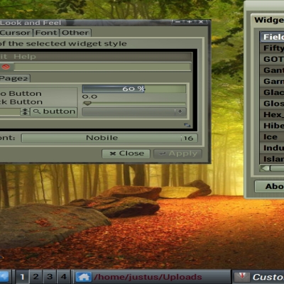
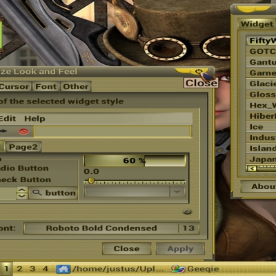
New openbox look
New menu and toolbar
New square slider matches theme better
Darker base color
Changed some icons and colorized others
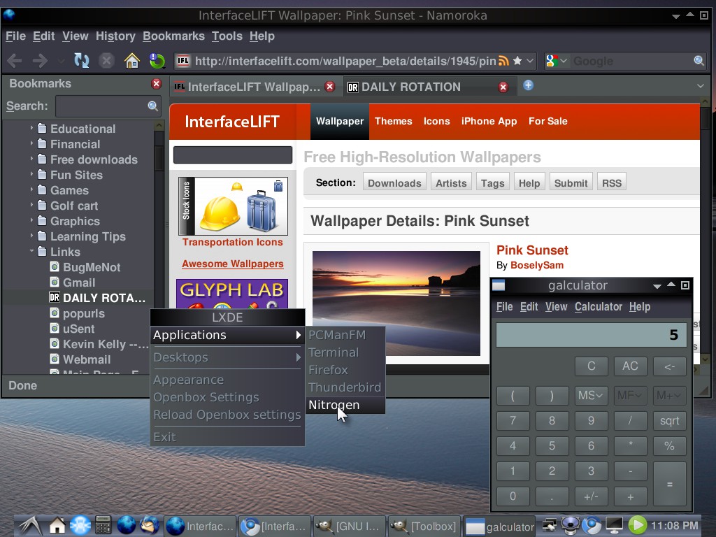
Wallpaper found here:
http://interfacelift.com/wallpaper_beta/details/1945/pink_sunset.html
====================
Final changes and last update:
====================
Feb. 24, 2010
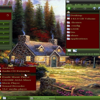
Folder view mode in detailed list or
in exaile player not clear enough.
Had to add a line to the gtkrc file.
GtkTreeView: dd-row-color= shade (0.75, @bg_color)
Also darkened selected bg to enhance
Changed the gtktreeview header, also
Several minor changes


More GTK2 Themes from IamJustUs:
Other GTK2 Themes:


Ratings & Comments
2 Comments
Thanks, for the comment. Yes, from what I observe the fonts, I use are big. It is always a trade off with limited screen size. Good thing, they can be readily changed from user preferences. I look for a taller compact font. That gives the user more clickable space in the menu. I also, go a few sizes larger to reduce eye strain. Engadget is a funky looking font, I readily agree. It does give me the extra height and the numbers are unique ie. #1 looks different from letter L.
I think your theme is a nice work.. it could be better if you will go on working on it looking always for little mods.. For example.. in my opinion, maybe fonts are too big, aren't they?