


Hybridity =)
nyenty


Source (link to git-repo or to original if based on someone elses unmodified work):
3.1.2
Updated theme.desktop
3.1
Final Karmic stable release. Added an emerald theme, metacity's one is now deprecated. Default icons are Gnome-Dust from Gnome-Colors
2.5
Metacity is now human-aurora.
Looks nicer when u remove the menu bar via globalmenu =)


More GTK2 Themes from nyenty:
Other GTK2 Themes:


Ratings & Comments
16 Comments
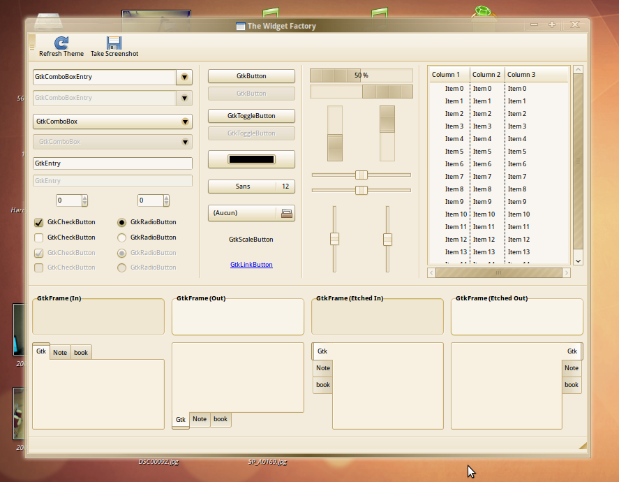
for example http://img34.imageshack.us/img34/3937/26164276.png It is too bright on the general background, what you think? Can you make selected object more darken? and may be in other color ...
Yes I make screenshot without aurora, now i install it. and this line...for what? if this not a secret :)
just to separate the decoration and the content of the window.^^
bug or sumthng? http://img18.imageshack.us/img18/3760/38068667.png
it's not a bug, i wanted this. hey ! it seems that you miss the aurora engine ?
Hey dude, nice work. I want to ask u - where ur art work "Murrina Jackalope theme" ? it simple like hell and very usable.
it's now this theme.
This theme's muted colors are very easy on the eyes. Also integrates surprisingly well with Netbook Remix (just had to slim down the scrollbars a bit). Nice work.
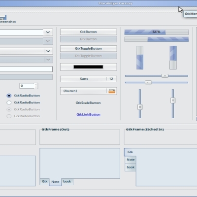
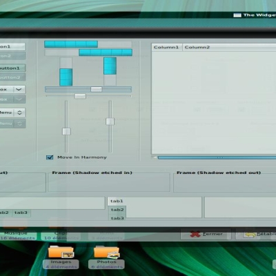
I think the theme is very nice I think the volume sliders would be better if a lot thinner and maybe scrollbars same as buttons. voted good.
Something other than the default ubuntu brown look would be better don't you think?
please tell this to mark shuttleworth... spirit of ubuntu is into orange and brown.
This theme definitely doesn't need any more roundedness. There are way too many round bubbly themes out there already, it's nice to see a few cleaner ones occasionally. Good work!
yes... of course =)) thanks !
this metacity fits much better to your theme. much better... try it! http://www.gnome-look.org/content/show.php/HumanBorderless?content=92604
I think it needs a bit more roundness though, and the striped scrollbars could be nice without the stripes as well. It generally looks nice though.
more roundness definetly but the progressbar is perfect with the stripes. this is so cool!