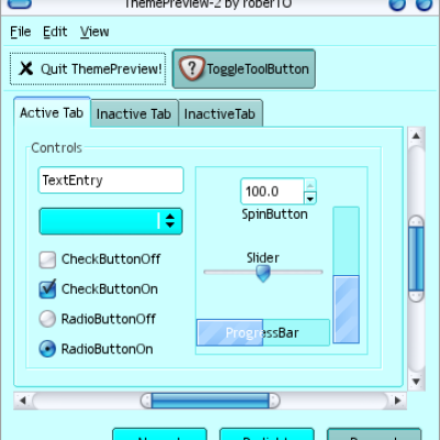
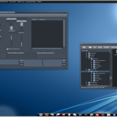
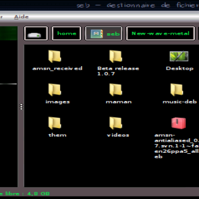
I wanted something simple and sexy, preferably in blue, so here it is. This is my first GTK theme, so be gentle please

Paper Cut
Source (link to git-repo or to original if based on someone elses unmodified work):
Description:
Modification of Murrina Elegant.
I wanted something simple and sexy, preferably in blue, so here it is. This is my first GTK theme, so be gentle please Enjoy.
 Last changelog:
I wanted something simple and sexy, preferably in blue, so here it is. This is my first GTK theme, so be gentle please
v 0.2: Added a mouseover effect, decreased roundness for buttons, increased roundness for scrollbar, and probably some other things I forgot.
v 0.3: Fixed the selected background color. Highlighted text (among other things) now looks as expected.


Ratings & Comments
5 Comments
Does it use the latest murrine engine?
yes it does. I should probably mention that in the description lol
Nice, but the selected item in lists and trees is still very grey and square... Would be nicer if it had rounded edges and perhaps a little colour.
Fixed. I couldn't figure out why they didn't follow the selected background color, but I've got it now.
Easily amongst the best "simple" themes I've been around here. Normally I don't like the high-contrast black lines around things but it definitely works well here.