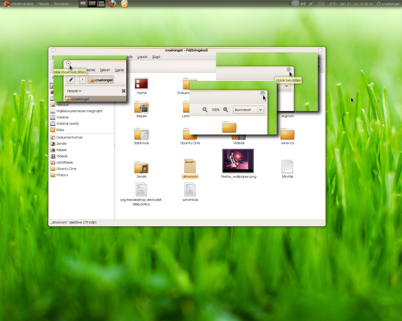
Description: The InHuman theme is based on several awesome themes, mainly the original and the current Human GTK theme, and the InvertedRoom Metacity. It also incorperates elements from the Elementary and Intuition Metacity themes, and some code from Dusk for the dark panel. The Panel background is included in the package, it's from the cafelate theme.
Thumbs up for all the great devs of all those themes and styles.
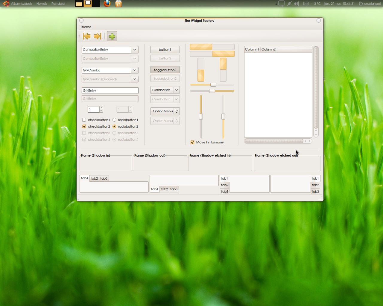
My goal with InHuman was to create an alternate, original looking (no Mac OS X or Vista/Aero copy), but deffinitly ubuntuish desktop experience. Where the focus is on the content, and not the shiny, glossy effects. You will also see that I've added some recomendations for the background image, the fonts and the icon theme.
Oh and another thing: As you guys can see, the version of this theme is "karmic beta", it's beta becouse right now I'm looking for bugs, any kind of bugs. If you encounter any, please post them below. Thanks.
ps. Please only vote bad, if you can describe the reasons below.Last changelog:
10.01.21 Some edits on Metacity buttons, pugfix for window switcher applet.
Awesome theme :) I'm enjoying it now -- the first really sleek look I've seen in a non-FOSS system. Really M$ themes always are terrible -- but what I mean is this theme actually compares to Mac OS X (and without totally pretending to be Mac)
Nice theme, I voted good; I liked the idea of a ubuntish theme, you realized it.
I just did some minor changes:
- I dont like the stripe in the metacity active windows.
- I changed the selection color to grey, so this makes the metacity active line in the top less aggressive.
- The metacity close boton... I dont know.. it have too much contrast, or the lines are too strong. Maybe the classic X works better. The shutdown symbol is too big and too complex.
- In the panel, when some window is calling my attention it flashes to white , in that moment the typography is white too. So I can only see a with rectangle.
Cheers.
- Metacity stripe: Hmm... That one, I'll have to think about, since I like it this way. XD It clearly shows which one is the active window without being "bulky" like let's say the original human. I'll might try to make it less agressive.
- The close button... I see what you mean. I've added the power-off symbol becouse I've found that original, and more life like. (You won't find a big red X on your TV remote, but a standby/power-off symbol.) I'll probably do something about it, though, it realy doesn't look that good this way.
- Panelbug: Okay, that one on the other hand is a bug. I'll start working on it, right now.


Ratings & Comments
6 Comments
Awesome theme :) I'm enjoying it now -- the first really sleek look I've seen in a non-FOSS system. Really M$ themes always are terrible -- but what I mean is this theme actually compares to Mac OS X (and without totally pretending to be Mac)
Could you please give credits to "several" authors? after all, they helped you to come out with this theme, isn't it?
Nice theme, I voted good; I liked the idea of a ubuntish theme, you realized it. I just did some minor changes: - I dont like the stripe in the metacity active windows. - I changed the selection color to grey, so this makes the metacity active line in the top less aggressive. - The metacity close boton... I dont know.. it have too much contrast, or the lines are too strong. Maybe the classic X works better. The shutdown symbol is too big and too complex. - In the panel, when some window is calling my attention it flashes to white , in that moment the typography is white too. So I can only see a with rectangle. Cheers.
- Metacity stripe: Hmm... That one, I'll have to think about, since I like it this way. XD It clearly shows which one is the active window without being "bulky" like let's say the original human. I'll might try to make it less agressive. - The close button... I see what you mean. I've added the power-off symbol becouse I've found that original, and more life like. (You won't find a big red X on your TV remote, but a standby/power-off symbol.) I'll probably do something about it, though, it realy doesn't look that good this way. - Panelbug: Okay, that one on the other hand is a bug. I'll start working on it, right now.
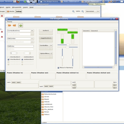
Made the bugfix. Modded the buttons. What do you think now?
Great! And ey, that typography is great. Thank you.