


Ambiance-Humanlooks
scarrs


Source (link to git-repo or to original if based on someone elses unmodified work):
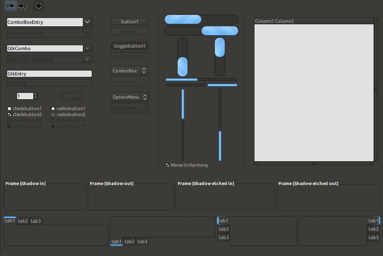
2.0.1 Made progress bars thinner. (Thanks BassUltra).
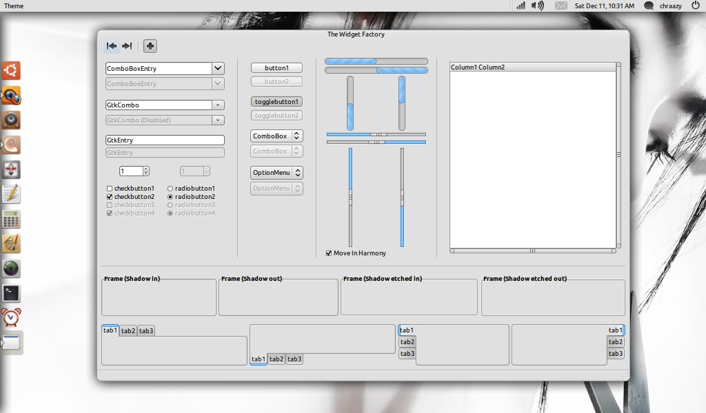
2.0 Made everything smaller and removed a lot of "junk" in the theme file. Changed the default color to something brighter. I also removed all the other colors since you can change the colors with your theme manager. I completely overhauled the metacity, made it smaller and made the buttons invisible until you mouse over them.
1.9.5 edited the metacity just a little bit.
1.9 made changes to dark theme to fit with ambiance metacity and added an orange cream color variation.
1.8 rounded the progress bar and added different color variations. removed everything from the download package I didn't make or help make.


Other GTK2 Themes:


Ratings & Comments
47 Comments
GtkProgressBar::min-vertical-bar-width= 10 GtkProgressBar::min-horizontal-bar-height=10 This will make the progressbars thinner.
Thank you. I'm not sure why I had not done that already.
Nice wallpaper! Where I can get it?
http://dlund42179.deviantart.com/art/Black-and-White-1680-x-1050-111088395
I (somewhat) methodically went thru every typeface on my eeepc, and short listed a few. I found that something compact and bold-ish tends to aid in legibility. I just found that Nimbus had the right balance of spacing, weight, and compactness. I think they're rather beautifully designed typefaces.
I completely agree. I just never really noticed them before. I've been using zekton for so long.
Great update! I like it much and use it on my netbook. :)
Wow! Thank you. That means a lot coming from you. I actually use one of your icon themes. You are a great artist.
Another beautiful dark skin, good work! it's my new default theme :)
Thanks a lot!
looks really fresh, nice looks... definitely gonna use this one for my hp2510p
thanks. I'll be posting one or two more with different colors when lucid is released.
I recommend you change your typeface to something with better legibility. Nimbus Sans L bold, 10 point, is a great choice. This is what I use on my EeePC. Very clean and clear to read.
thanks for the suggestion. I just prefer what I use now.
k, you were right. I changed to the Nimbus Roman No9 L.
Hey, nice theme. What theme are you using for AWN? I can't seem to find one like it.
Its not an installable theme. All you have to do is set your theme to the default flat theme, then open your configuration editor and set the bar angle to -1
Ah, thanks!
Hey men... it is a great theme for minimalists like us :D.... I only have one question... which distro did you installed on oyour netbook? (I have this nb also)
i used ubuntu 9.1 karmic koala
спасибо за хорошую работу... давно не было интересных идей )
Спасибо
It seems to be a very good idea, the picture compaing the default ubuntu theme with your results are very interesting, but... I think that your work lacks of color: this heavy gray can be eye-tiring, and the absence of any color spot in a little screen makes more difficult to find the things you're searching for... :-)
thanks for your comment. The reason I went with gray scale is because it is very neutral and simple. I also find that lots of different color can be distracting. This of course is my personal opinion. And because different people have different opinions, The gtk colors can be changed very easily and the metacity colors change automatically to match thee gtk.
Nice theme but not balanced, Some elements very small but others very big. For example scroll bar and tab bar in gedit. Try to use my theme with your favorite engine? http://www.gnome-look.org/content/show.php/Clearlooks-flat-compact?content=74918