
Ubuntu Fitts Ambiance (Natty Only)
Source (link to git-repo or to original if based on someone elses unmodified work):
Credits to albyrock87 (Fitts) and the Canonical artwork team (Ambiance).
If you have any ideas for better breadcrumbs or other modifications others might enjoy feel free to post a comment or message me personally.
*** Tested and intended for Ubuntu 11.04 ONLY ***
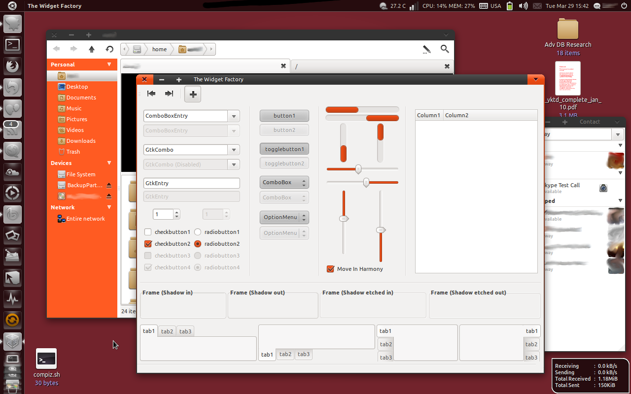
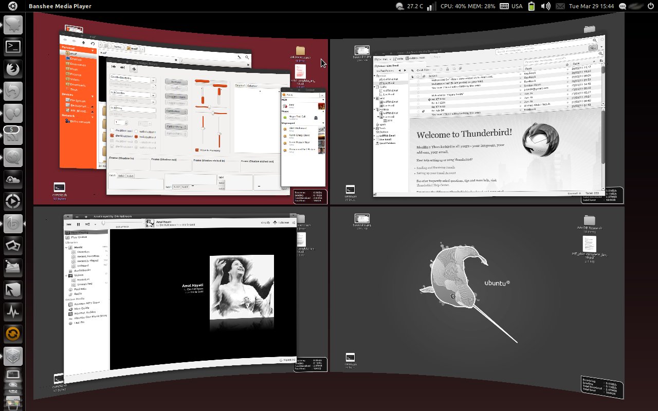
This theme is intended to be used on Ubuntu 11.04 therefore the panel bg has been changed to solid black to match the unity panel. To use it on gnome panel rename panel2.png to panel.png in the theme's img folder. Unity users/testers might want to set the unity panel opacity to 0.67 from the compiz unity plugin for a better experience.
Mar-4-2011
- Removed spacing between metacity buttons.
- modified close button's default gradient to match other buttons.
- Changed scrollbar color
- Changed menu background color
Mar-10-2011
- Decrease metacity buttons width
- Changed default color scheme to match ubuntu branding palette
- Darker buttons
- Changed scrollbar gradient
- Changed metacity Gradient
- Removed Faenza from the default theme settings
- Other Bug Fixes
- Added Infinise v2.5 ubuntu theme
Mar-29-2011
- Added icon theme based on faenza/awoken
- Fixed panel border to match the unity dock
- Changed faenza battery to vertical
- Added nautilus elementary support
- Changed nautilus sidepanel background color
- New breadcrumbs based on ubuntu software center (still not fully satisfied but oh well!)
- Other changes I forgot about ![]()
Mar-30-2011
- Too many bugs in the Icon theme provided so the default icon theme changed to AwOken.







Ratings & Comments
19 Comments
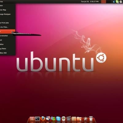
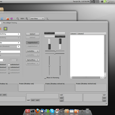
I like the bold use of Ubuntu orange in the nautilus sidebar. Very vibrant and striking theme, the Ambiance Fitts metacity works really well with the colours.
Thanks I appreciate your comment :) I'm still not satisfied with some elements like the breadcrumbs and scrollbars so I'll take a few days off and hopefully come up with some ideas to improve this theme.
I like it because the panel fits unity better. Good job.
Thank you
I like this theme. It is more or less minimal, with larger buttons in Metacity. I would leave it just the way it is. However, I was wondering if you would consider creating a version using Canonical's "Aubergine" color in the titlebar. The combination of an aubergine titlebar with your nice orange controls would, at least in my opinion, be a complimentary pairing, and given that the two colors are featured in Ubuntu by default since 'Lucid', I feel that it would look nice not only with the default wallpaper, but with the many other similarly themed wallpapers as well. It's just a thought, but I would love to see it on my own desktops. Thanks.
Working on some gtk/metacity changes including the official color scheme. I'll update asap. Thanks for the comment.
I played around with your idea for a while and found out that aubergine doesn't render well on this shade of gray. It'll just make reading the title bar more painful sorry. If you would like to have a go at it be my guest. Edit line# 140 in the metacity theme with your desired shade and if you want outlines to the title text edit the lines above 140 in the same section. Good luck and sorry to disappoint.
I like this theme. It is more or less minimal, with larger buttons in Metacity. I would leave it just the way it is. However, I was wondering if you would consider creating a version using Canonical's "Aubergine" color in the titlebar. The combination of an aubergine titlebar with your nice orange controls would, at least in my opinion, be a complimentary pairing, and given that the two colors are featured in Ubuntu by default since 'Lucid', I feel that it would look nice not only with the default wallpaper, but with the many other similarly themed wallpapers as well. It's just a thought, but I would love to see it on my own desktops. Thanks.
I like this them. It is more or less minimal, with larger buttons in Metacity. I would leave it just the way it is. However, I was wondering if you would consider creating a version using Canonical's "Aubergine" color in the titlebar. The combination of an aubergine titlebar with your nice orange controls would, at least in my opinion, be a complimentary pairing, and given that the two colors are featured in Ubuntu by default since 'Lucid', I feel that it would look nice not only with the default wallpaper, but with the many other similarly themed wallpapers as well. It's just a thought, but I would love to see it on my own desktops. Thanks.
Have you consider in making the Metacity theme without borders?
I haven't thought about removing the borders since it'll make resizing windows a bit of a hassle for me. You're welcome to mess with the code.
is that conky down below or...cuz its rad & i want it :p
Yes thats conky :) Its inspired from this script http://gnome-look.org/content/show.php/ConkyWizard?content=126352 so download it and let me know if you have trouble configuring the script.
What font do you use?
Its called NeoTech. Its not freeware so you might need to purchase it unfortunately.
It is a good idea for the newest version of ubuntu in my opinion,I don't like dark themes but this, I appreciated immediatly.Thank you
Thank you :)
cool, but you should probably link to, or at least mention albyrock (the creator).
The link has been there from the start. You missed it.