
Amiga Ubuntunized
Source (link to git-repo or to original if based on someone elses unmodified work):
Description:
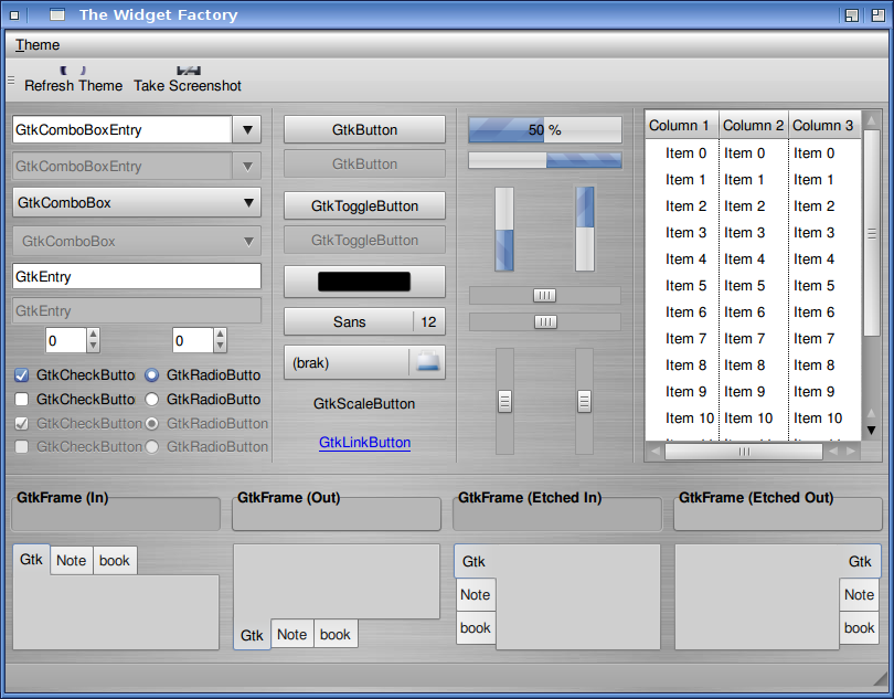
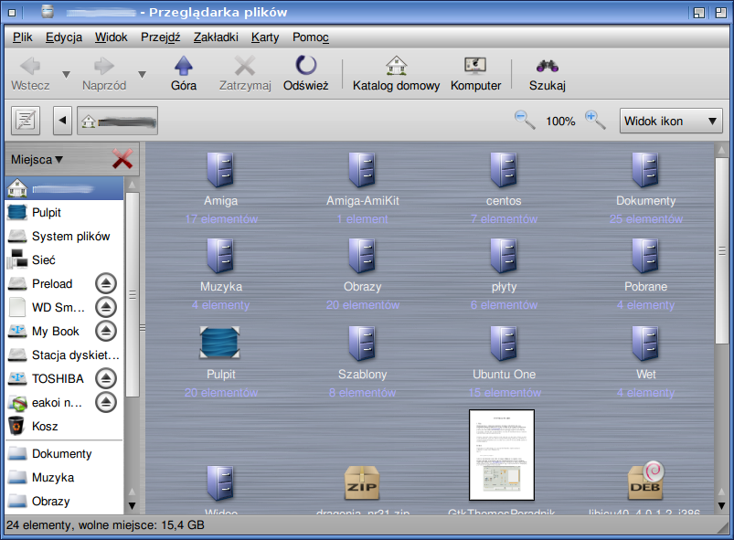
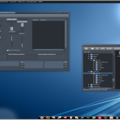
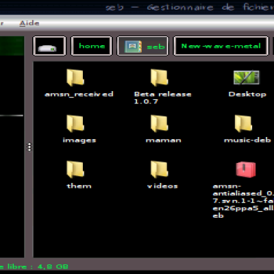
It is not a perfect copy of the AmigaOS4 GUI. This is only a GTK theme inspired by the look of the Amiga system. To reorganize the metacity gadgets I use Ubuntu Tweak in the latest version.
Some bugs: Evolution does not look like it should. Last changelog:
Some bugs: Evolution does not look like it should.
0.5.5 - fixed one png file and changed licencing to GPL
0.5.4 - changed metacity theme
0.5.3 - changed button and scale highlight color
0.5.2 - public release
0.5.1 - metacity theme added
0.5 - beta status
0.2 - selected engine (aurora)
0.1.1 - changed name of the theme
0.1 - first version (without engine)








Ratings & Comments
13 Comments
I'm currently working on something similuar, and your theme is cool. My Tip: do as much as you can with your choosen engine, and use pixbuff for the rest (a little impact in performance, but still better as using only pixbuff).
Now I'm using KDE because I dislike Gnome 3. I dont have plan to update this stuff. Feel free to modify this theme.
Thank you, but my theme is already done: http://gnome-look.org/content/show.php?content=153657 But I understand you, Gnome3 is ... lets say no good road to follow, I'm currently using wmfs. Regards, Daniel
Looks nice
I don't like people who criticize other's work. I think it's great. I know how difficult and time-consuming it is. I come from the Amiga side. However I would like to see a good Amiga theme for Gmome3. Meanwhile, cheers! Keep up the good work!
which engine is this actually running on?
Its aurora engine.
just a few comments on your theme which is very nice by the way :you should remove the windows button menu and move the close button on the left side so that it really looks like the original Amiga style
please, remove the brushed steel background, this is really too "oldschool" and even on default Amiga OS4 style, you don't have it, just a light grey solid backround, this is far better
the menu bar is too "bumpy", you should use a lighter gradient
windows sliders and scroll buttons are wrong, here are some screenshots http://amigakit.leamancomputing.com/catalog/images/os4_classic_4.jpg or http://www.sguidetti.net/foto_temp/autoscaling.jpg
Good work anyway, hope you'll enhance it a bit further to be nearly perfect ;)
Everything in theme is dependent on engine. Appearance of sliders and scroll buttons is that they are defined in the engine. Maybe another gtk engine would be better for this theme. Do you have any idea which gtk engine?
I notice they are far too impulsive with the "criticism", but aren’t too speedy at replying to theirs. Anyone that knows the theme knows this is as close as you will get considering the engines you get to work with. I for one, use this theme 90% of the time. Its beautifully authentic.
Thanks. I have lack of time to improve this theme. Maybe I start working with the theme after installing Gnome 3 or Unity.
Hi, good theme. you can try this icons: http://www.gnome-look.org/content/show.php/Kens+Icons?content=118574 http://www.gnome-look.org/content/show.php/Tamiga?content=100082
Thanks for reply. Kens icons are really good.