

Equinox Grey
GeorgeMurango


Source (link to git-repo or to original if based on someone elses unmodified work):
V1.0
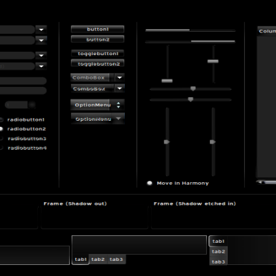
Fixed panel errors. Now displays handles and separators.
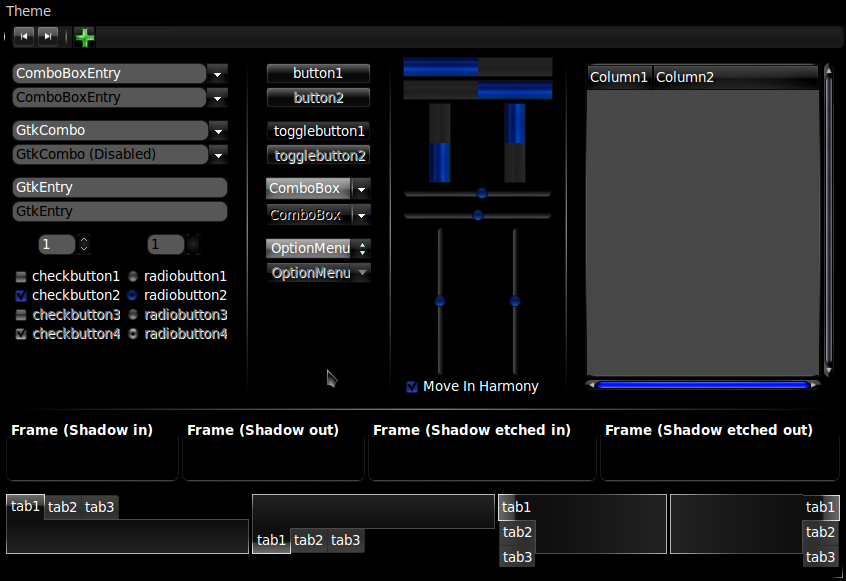
New Scrollbars
New Range sliders
New Checkboxes and radiobuttons
New Progressbar
Added frame to notebook
Fixed Combobox
Menuitem bug fixed
V1.1
New, more visible Tabs
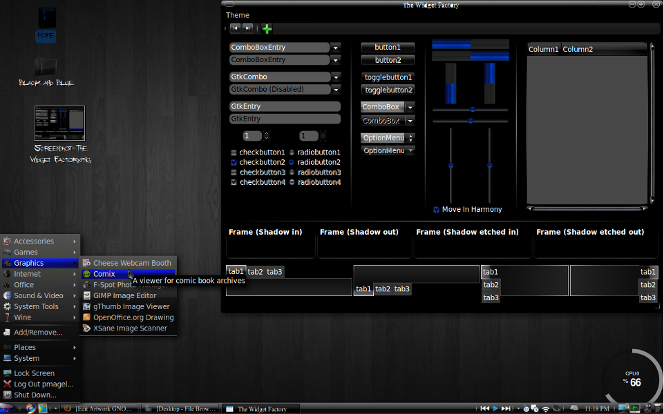
Firefox Chrome file added
Emerald window border added
V1.2
Improved Tabs
New ProgressBar
New Buttons
New MenuHighlight
Improved menu visibility


More GTK2 Themes from GeorgeMurango:
Other GTK2 Themes:


Ratings & Comments
16 Comments
most login screens for websites have the textbox set to white, however the font for this theme is also white, you can see how this gets kinda annoying. maybe a firefox theme could fix this problem?
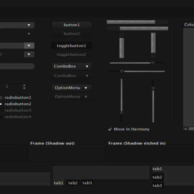
This is probably my favorite dark theme so far! One question: In windows with tabs, the seperation between tabs is not visible, I am assuming the color contrast is too low, can you tell me where to modify that? If you/others like it, there is no need to change it, but I would like it more if it were a bit higher contrast. Thanks for this theme, it is great!
There's actually a one pixel line between tabs. I find that if you're looking at the screen from an angle, they tend to become hard to see. If you want to change it, just go into the theme folder and change the inactive tabs .png files. I'll probably make mine more visible in a future release.
But, when I have selected an item on the main menu I cant read nothing because the fonts are black on blue background. Please fix this minor bug and your theme would be one of my preferred. Thanks for your hard work!
I noticed that just now and am about to upload the fix.
you can remove this awful piece of "ART" from here, for which I thank you in advance.
three questions: 1. What, specifically, about the theme makes you think it is awful? 2. Is it just cause it's a new comment, or is there some way to make every comment get that cool boldface type? 3. Would you, by any chance, be able to tell me ow do get the gosh darn panel to show some separators?
3 answers: 1.The entire look. 2.BBCode can always help you. 3.I can but I'm not here in the role of the teacher.
okay... 1. but what about the whole theme do you not like? Is it the color scheme, the scrollbars, the rounded text entries, what? 2. I have no idea what BBCode is. 3. It's not about being a teacher. If you don't want to spend the effort, I get that. But to say you're not here as a teacher is just... well, odd, really. I wasn't asking for a whole course or lessons, just a quick fix on one bug.
You can find the answers of all your questions in google except for the first one,& nobody can help there but you.
Oh, I see. Nobody but me can tell me what you think about the theme. So you love it?
Don't mind him. He's definitely just a flamer craving for attention. Just stick to your theme-making, and just pay attention to constructive criticisms. Guys like Whippo should just be ignored altogether. He apparently doesn't know the answer, and acts like someone who knows it all.
Ah yes.... Just another poser. You just gotta love those people.:-) Btw, I think the theme is really good, keep up your good work.
i voted not down :) your theme(the update) is very nice!!! voted good :) thx
If you're gonna rate me down, could you tell me why? I just started making GTK themes, and I'd like some feedback
your start is good :) more please!!!