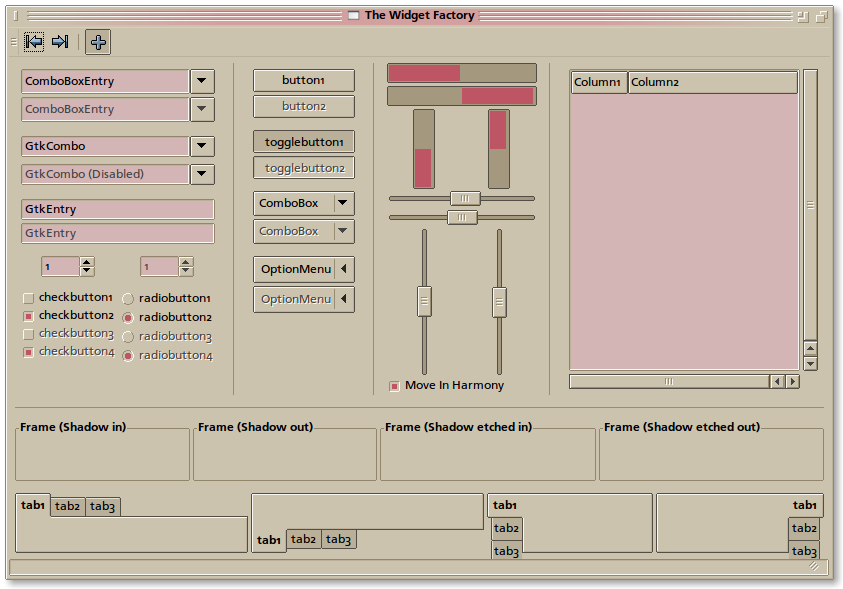
Description: This is an original theme created by me from scratch, vaguely inspired by a combination of pre-OSX Macintosh and the Amiga Workbench. I've been using it for a few years now, but this is the first time i'm releasing it publically.
The GTK portion of the theme requires the LighthouseBlue theme engine
0.1.1 Tweaks for glow on buttons and text entries (requires updated Lighthouseblue Release, see link above) Made gnome-terminal use window instead of textbox colors by default Improved coloring in gedit and other gtksourceview editors tightened spacing on toolbar buttons
Sadly no :(
I'd love to do it, but GTK3's engine infrastructure is so massively different from GTK2's, that it'd involve rewriting the LighthouseBlue engine from scratch. (Twice, I believe, since the engine infrastructure has already changed during GTK3's life cycle)
And I'm not much of a programmer, so this is beyond my ken.
I use a spiffingly speedy updated super computer.. and you know, I still much prefer the way the way Amiga looked!
So I have to say, this is just going to be much loved, just like all the other Amiga themed stuff I use.
Thank you
I really love it, quiet different from the 'modern' looks, polished, glassy, sparkling.
Real joy for the eye of the all day computer user, tired of bold colours and 'breath taking' interface.
Thank you for much for sharing this. I use it already and I am really happy with it.
One thing I miss in it though - focus ring for entries: sometimes it gets harder to find your way in data entering panels/apps where more than 2-3 entries are available when there is no focus indication for them.
Do you mean like how text entry boxes in clearlooks get a blue hilight around them when the cursor is in it?
That would unfortunately require some modification to LighthouseBlue, but i can look into how much effort it would be to add it.
If you mean the dotted line that appears around the labels of selected buttons and other widgets, that should work, and if it's not there it's a bug
The focus ring on regular buttons is shown (as dotted pattern) correctly, I am talking about the focus ring on text areas and text entries, like in clear looks and all other forked engines, like equinox, murrina, aurora and so on. It is also possible to do it in pixmap engine (done like follows:
image
{
function = FOCUS
recolorable = TRUE
file = "entry/entry-active.png"
border = {2, 2, 2, 2}
stretch = TRUE
}
where the png is stretched over the entire widget and the focus ring is simply part of an image and not a real border
)
If the engine does not support it, it is still okay IMO, i was just asking.
Never the less I use the theme now on all my computers and it is awesome!
Ah! Okay.. i thought that was what you meant, but i just wanted to make sure.
Anyhow, I happen to rather love that feature from Clearlooks, and it seems to be well within the spirit of LighthouseBlue (it was originally designed for maximum usability, IIRC, so the feature fits)
I've started hacking it into the engine, and it's mostly working, But the code is ugly and in need of a little refactoring. I'll see if i can't pretty it up any.. if not, i'll release what i have.
I have updated the engine and the theme and now it is perfect, have been using it ever since I found it. Tried twice to go back to another theme but just could not:) This is so good.
Thanks
I'm not to keen on it myself but the design isn't that bad. I like the retro idea, it's different to a lot of the recent themes. I'll vote up because it's good work but not exactly to my taste.
@Tipiaf - Do you EVER post anything nice or vote anything up ? You can give constructive criticism but is what you say really necessary ? It's a website for art enthusiasts and amateurs we don't need your negativity !


Ratings & Comments
15 Comments
Any chance for gtk3 support? Would be epic... Those new themes all look the same:(
Sadly no :( I'd love to do it, but GTK3's engine infrastructure is so massively different from GTK2's, that it'd involve rewriting the LighthouseBlue engine from scratch. (Twice, I believe, since the engine infrastructure has already changed during GTK3's life cycle) And I'm not much of a programmer, so this is beyond my ken.
I use a spiffingly speedy updated super computer.. and you know, I still much prefer the way the way Amiga looked! So I have to say, this is just going to be much loved, just like all the other Amiga themed stuff I use. Thank you
Very nice old theme.
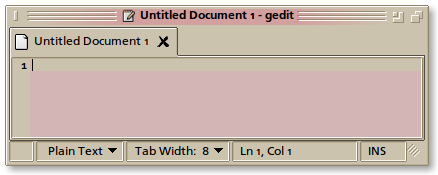
I really love it, quiet different from the 'modern' looks, polished, glassy, sparkling. Real joy for the eye of the all day computer user, tired of bold colours and 'breath taking' interface. Thank you for much for sharing this. I use it already and I am really happy with it. One thing I miss in it though - focus ring for entries: sometimes it gets harder to find your way in data entering panels/apps where more than 2-3 entries are available when there is no focus indication for them.
Do you mean like how text entry boxes in clearlooks get a blue hilight around them when the cursor is in it? That would unfortunately require some modification to LighthouseBlue, but i can look into how much effort it would be to add it. If you mean the dotted line that appears around the labels of selected buttons and other widgets, that should work, and if it's not there it's a bug
The focus ring on regular buttons is shown (as dotted pattern) correctly, I am talking about the focus ring on text areas and text entries, like in clear looks and all other forked engines, like equinox, murrina, aurora and so on. It is also possible to do it in pixmap engine (done like follows: image { function = FOCUS recolorable = TRUE file = "entry/entry-active.png" border = {2, 2, 2, 2} stretch = TRUE } where the png is stretched over the entire widget and the focus ring is simply part of an image and not a real border ) If the engine does not support it, it is still okay IMO, i was just asking. Never the less I use the theme now on all my computers and it is awesome!
Ah! Okay.. i thought that was what you meant, but i just wanted to make sure. Anyhow, I happen to rather love that feature from Clearlooks, and it seems to be well within the spirit of LighthouseBlue (it was originally designed for maximum usability, IIRC, so the feature fits) I've started hacking it into the engine, and it's mostly working, But the code is ugly and in need of a little refactoring. I'll see if i can't pretty it up any.. if not, i'll release what i have.
Feature added. :) Thank you for the suggestion.
I have updated the engine and the theme and now it is perfect, have been using it ever since I found it. Tried twice to go back to another theme but just could not:) This is so good. Thanks
Hey, that's perfect! Thanks!
Really really crappy design. My opinion.
Maybe not 80s, but mid 90s :) It is intended to be retro, after all. I'm sorry you don't like it.
looks like crap to most of (us) but to each their own :P Not saying I'd use it, but it's good for some people, that's fine by me rofl
I'm not to keen on it myself but the design isn't that bad. I like the retro idea, it's different to a lot of the recent themes. I'll vote up because it's good work but not exactly to my taste. @Tipiaf - Do you EVER post anything nice or vote anything up ? You can give constructive criticism but is what you say really necessary ? It's a website for art enthusiasts and amateurs we don't need your negativity !