Description: A clean and compact clearlooks theme featuring pleasant colors and a smooth unified look built in the spirit of my previous Blue Muse theme. I used the Clearlooks engine because it is fast and looks very nice and professional (Not that I hate Murrina, I just am liking Clearlooks lately).
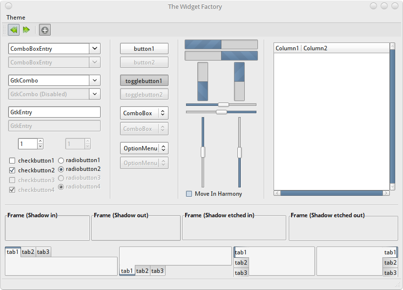
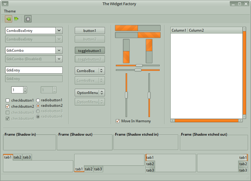
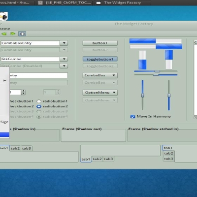
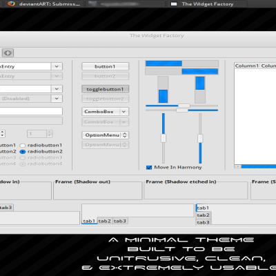
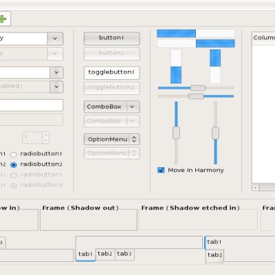
The Blue Bard theme (screenshot 1) is suitable for regular, all-around use while Industrial Bard (screenshot 2) features more subdued look suitable for work or business. The new release, Deviant Bard, is dedicated to all the artists on DeviantArt but is fine for anyone else to use.
If anyone would like color mods, information, etc. please comment. I like comments. Yes I do.
The metacity from the Elementary Desktop Project (or in Deviant Bard's case: BlendedSmall) and the icons are Hydroxygen. If anyone would like the background, please comment and I will send it to you.Last changelog:
Nice theme..
Two suggestions that may make your life easier :
1 - g-inspector : have you used firebug in firefox during hte webdevelopment process? this is similar.
2 - drop box : instead of making us run around half the internet to get your file, I would like to draw your attention to a service & gnome program called dropbox.
please think about using it.
I believe deviant art will also let you point all the download links to what ever external storage service you are using.
I'll try g-inspector tomorrow (it's nearly midnight where I am).
I have a DropBox account (although I prefer not to use it). I prefer DevianArt because I like pageviews/favorites/comments/DeviantWatchers/etc. associated with havaing a file on DeviantArt. I am sorry that this is giong to sound mean, but the Download button is quite easy to reach on DeviantArt and I'd rather not forsake all the niceties of DeviantArt.
I hope I did not make you made or sad or annoyed or of any similar feeling. I'd really make me feel bad if I made you mad/sad/annoyed/etc.
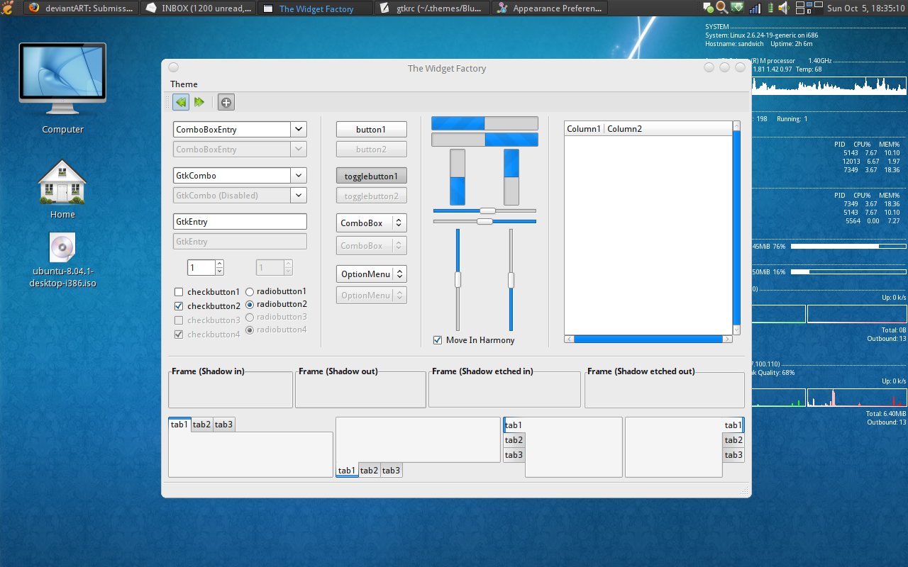
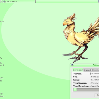
Thanks. The thing on my desktop is conky (http://conky.sf.net). You can compile it or get it from your distribution's repository. If you'd like my '.conkyrc', just ask here in the comment threads.
Really good theme, very pleasant.
Like the compactness, the colors, and usually i don't even like clearlooks.
Blue Icons (like Mist) suddenly look much better.
Not sure about the scrollbars though, they are quite narrow and the blue is very intense.
But i also like this blue somehow, i have to use this for a while.
Thanks. All the themes I make for my personal use so I test them and use them for at least a couple weeks/months before releasing them. (Actually most of them don't get released because I don't feel that they are good enough for anybody else)
The blue is intense but you get used to it. You can change it to something softer (like #729CFF for a brighter looks or #6484A4 for a more subdued, industrial look) through the GNOME Color Chooser dialog under 'Change Background> Theme > Customize > Colors'.
This will be my default theme for a long time )) Great work thanks! Very smooth and professional look.
However i have some feature requests for newer versions (top picture = how it looks now)
1) http://img225.imageshack.us/my.php?image=suggest1uj8.png
2)http://img233.imageshack.us/my.php?image=suggest2gl5.png
3) Clearlooks Classic style tabs instead clearlooks??
http://img300.imageshack.us/my.php?image=suggest3bv7.png
4) Maybe version with white menubar?
Ok, I'm going to answer them in order.
1) This is a limitation in the Clearlooks engine that has been bugging me, but I'll try and solve it.
2) I don't know to fix this without using pixmaps. I'll check the Clearlooks documentation.
3) I personally don't like the Clearlooks classic tabs, but I'll add another version that has them.
4) You can change the color of the menubar by editing the '.panelrc' file in the theme's directory (usually '~/.themes/Blue bard/gtk-2.0'). I'll include an alternate version with the white panel in the next release.
Thanks for your comments. I'll try and fix these up and get a new release out soon.


Ratings & Comments
9 Comments
Nice theme.. Two suggestions that may make your life easier : 1 - g-inspector : have you used firebug in firefox during hte webdevelopment process? this is similar. 2 - drop box : instead of making us run around half the internet to get your file, I would like to draw your attention to a service & gnome program called dropbox. please think about using it. I believe deviant art will also let you point all the download links to what ever external storage service you are using.
I'll try g-inspector tomorrow (it's nearly midnight where I am). I have a DropBox account (although I prefer not to use it). I prefer DevianArt because I like pageviews/favorites/comments/DeviantWatchers/etc. associated with havaing a file on DeviantArt. I am sorry that this is giong to sound mean, but the Download button is quite easy to reach on DeviantArt and I'd rather not forsake all the niceties of DeviantArt. I hope I did not make you made or sad or annoyed or of any similar feeling. I'd really make me feel bad if I made you mad/sad/annoyed/etc.
Thanks. The thing on my desktop is conky (http://conky.sf.net). You can compile it or get it from your distribution's repository. If you'd like my '.conkyrc', just ask here in the comment threads.
very nice. btw, what tool is in the screenshot which shows uptime, cpu utilisation etc., ?
Really good theme, very pleasant. Like the compactness, the colors, and usually i don't even like clearlooks. Blue Icons (like Mist) suddenly look much better. Not sure about the scrollbars though, they are quite narrow and the blue is very intense. But i also like this blue somehow, i have to use this for a while.
Thanks. All the themes I make for my personal use so I test them and use them for at least a couple weeks/months before releasing them. (Actually most of them don't get released because I don't feel that they are good enough for anybody else) The blue is intense but you get used to it. You can change it to something softer (like #729CFF for a brighter looks or #6484A4 for a more subdued, industrial look) through the GNOME Color Chooser dialog under 'Change Background> Theme > Customize > Colors'.
Thanks. All the themes I make for my personal use so I test them and use them for at least a couple weeks/months before releasing them. (Actually most of them don't get released because I don't feel that they are good enough for anybody else) The blue is intense but you get used to it. You can change it to something softer (like #729CFF for a brighter looks or #6484A4 for a more subdued, industrial look) through the GNOME Color Chooser dialog under 'Change Background> Theme > Customize > Colors'.
This will be my default theme for a long time )) Great work thanks! Very smooth and professional look. However i have some feature requests for newer versions (top picture = how it looks now) 1) http://img225.imageshack.us/my.php?image=suggest1uj8.png 2)http://img233.imageshack.us/my.php?image=suggest2gl5.png 3) Clearlooks Classic style tabs instead clearlooks?? http://img300.imageshack.us/my.php?image=suggest3bv7.png 4) Maybe version with white menubar?
Ok, I'm going to answer them in order. 1) This is a limitation in the Clearlooks engine that has been bugging me, but I'll try and solve it. 2) I don't know to fix this without using pixmaps. I'll check the Clearlooks documentation. 3) I personally don't like the Clearlooks classic tabs, but I'll add another version that has them. 4) You can change the color of the menubar by editing the '.panelrc' file in the theme's directory (usually '~/.themes/Blue bard/gtk-2.0'). I'll include an alternate version with the white panel in the next release. Thanks for your comments. I'll try and fix these up and get a new release out soon.