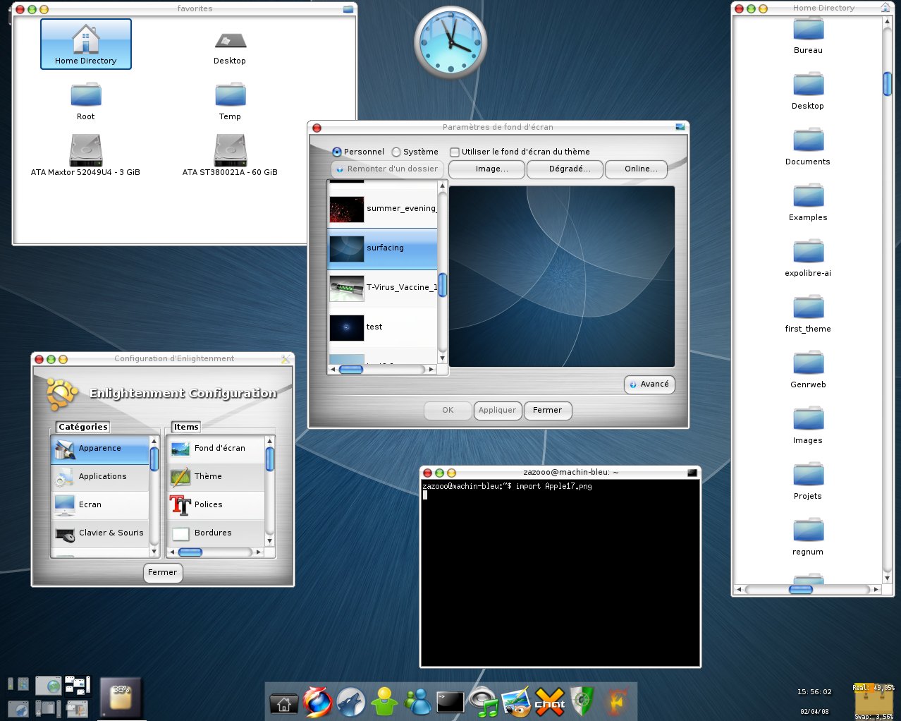
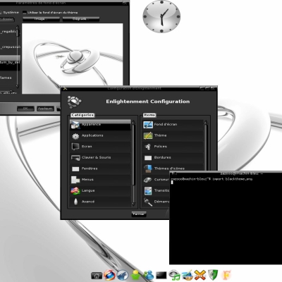
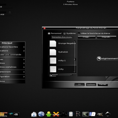
Description: Mac OS like theme in two version: one with detail buttons on the right of the window border, and the other with buttons on the left (Apple 17 LB)
The theme seems very nice, but i cant load it.
It says ..was unable to import theme.
are you sure this is really a valid theme
Can someone help?
THanks
I've corrected the scrollbar and improve the menu background. I didn't change the font because DejaVue makes the border too big, so if you want the theme to work well, do not use personalised font!
Exebuf and winlist are now with a real bg as the menu and the dialog.
TODO:
- Personalise widgets
- Improve buttons an other stuff
Better than before.
Could you please also consider implementation of a 'round corners' into 'menu' ('windows menu', 'popups', etc.) and adjustment of overlapping blue selection in configuration menu (there're only a couple of pixels actually 'overlapped', but...)?
And why not to use custom fonts?
http://img134.imageshack.us/img134/6793/20080402220704ln8.png
Anyway your results are quite neat and eye-friendly. Good job!
I can tell that you have never tried to make a e17 theme... the round corners are a TOUGH task (so far).
Getting them in the titlebar is a pretty big hack...and, at the moment... nearly impossible for other parts.
>> I can tell that you have never tried to make a e17 theme...
REALLY???
and wtf is this all about?
http://forum.enlightenment.org/comments.php?DiscussionID=231&page=1#Item_1
http://forum.enlightenment.org/comments.php?DiscussionID=224&page=1#Item_11
>> the round corners are a TOUGH task (so far).
Getting them in the titlebar is a pretty big hack...and, at the moment... nearly impossible for other parts.
LOL!!! ROFL! wanna bet?
Yes you can make round corners for the menu background, that's not so difficult, there is an option in the code that you just have to de-comment (item: "shaped" "1";)
But for this theme, I don't think it will be nice, so for the moment I let the square menu.
Hi,
please beg my pardon for my words, but, despite that at the first glimpse this theme looks a WAY better than ex-Black, but...
There's quite a lot of things, wich might be improved: from the strange behaviour of minimize button on mouse,in -> mouse,over till the scrollframes in EFM and bunch of other minor (and not so minor) things...
If you're interested - I'll list all components, which should be settled.
If not - my congratulations with yet another theme....
My Best Regards,
sda
Ok. Please note that it's only my IMHO. I'm always running current-cvs of E, some things could behave a bit different in your distro.
First of all - it's great that you're not trying to blind-copy Mac OS look, but rather develop something different.
Take a look at the window 'minimize' buttot (default border style) and overall look of window buttons (close, minimize and maximize) for all theme-provided border styles. They're not function neither look properly in E-cvs (examples):
http://img228.imageshack.us/img228/1179/20080329210030rn2.png
http://img246.imageshack.us/img246/1465/20080329210104ng7.png
Improve 'rubberhand' selection tool.
As told before - make scrollbars in EFM similar with the one in configuration dialogs. Improve'em:
http://img170.imageshack.us/img170/3294/20080329202223ya8.png
Increase minimum allowed height and width for dragbars. Consider to fix a 'blindspot' between scrollbars:
http://img337.imageshack.us/img337/204/20080329202619kt4.png
Improve the look of a 'winselector' and 'run command' windows/modules.
Pay attention to gadman popup section.
Include customization for a most-used modules, customize standard 'cpufreq' and so on...
Get rid of Vera* fonts. Use DejaVu instead (it's not the point, because a lot of things could be configured via text classes, but when you get faked 'squares' instead of native letters "out from the box"... you know...)
Replace e17_slider_bt* with the ones used in scrollframes and make'em looking similar... Or vice-versa, up to you.
Customize the toolbar.
How about to make a round upper corners in menu (like they're in window borders)?
Don't hesitate to bother me in case of any questions :). All things I wrote above is my IMHO. "Listen to you heart..." ('Roxette') and just consider to make less but outperform in quality.
E - ROCKS, "All others - <consored> shit!..." (Guns'n'Roses)


Ratings & Comments
15 Comments
I can't find this file anywhere on the Internet, all links and archives are dead. Share file please or send me in attachment on 100010000@mail.ru
please could restore the link. Thank
Great theme! You are very talented :)
I like this theme and use Apple_LB theme. Almost everything works well, just except for window buttons (close, minimize and maximize). Sda mentioned about this, and my case is even worse. The close button almost can't be seen. http://img207.imageshack.us/img207/3743/20090226122724.png http://img4.imageshack.us/img4/5484/20090226120032.png I also use the svn version E17.
The theme seems very nice, but i cant load it. It says ..was unable to import theme. are you sure this is really a valid theme Can someone help? THanks
hey this is a great theme please continue developing.. is the best theme i have seen for enlightment Congratulations Dont Give Up
I've corrected the scrollbar and improve the menu background. I didn't change the font because DejaVue makes the border too big, so if you want the theme to work well, do not use personalised font! Exebuf and winlist are now with a real bg as the menu and the dialog. TODO: - Personalise widgets - Improve buttons an other stuff
Better than before. Could you please also consider implementation of a 'round corners' into 'menu' ('windows menu', 'popups', etc.) and adjustment of overlapping blue selection in configuration menu (there're only a couple of pixels actually 'overlapped', but...)? And why not to use custom fonts? http://img134.imageshack.us/img134/6793/20080402220704ln8.png Anyway your results are quite neat and eye-friendly. Good job!
I can tell that you have never tried to make a e17 theme... the round corners are a TOUGH task (so far). Getting them in the titlebar is a pretty big hack...and, at the moment... nearly impossible for other parts.
>> I can tell that you have never tried to make a e17 theme... REALLY??? and wtf is this all about? http://forum.enlightenment.org/comments.php?DiscussionID=231&page=1#Item_1 http://forum.enlightenment.org/comments.php?DiscussionID=224&page=1#Item_11 >> the round corners are a TOUGH task (so far). Getting them in the titlebar is a pretty big hack...and, at the moment... nearly impossible for other parts. LOL!!! ROFL! wanna bet?
Yes you can make round corners for the menu background, that's not so difficult, there is an option in the code that you just have to de-comment (item: "shaped" "1";) But for this theme, I don't think it will be nice, so for the moment I let the square menu.
I can't find anywhere to download this theme. Share file please or send me in attachment on 100010000@mail ru
Hi, please beg my pardon for my words, but, despite that at the first glimpse this theme looks a WAY better than ex-Black, but... There's quite a lot of things, wich might be improved: from the strange behaviour of minimize button on mouse,in -> mouse,over till the scrollframes in EFM and bunch of other minor (and not so minor) things... If you're interested - I'll list all components, which should be settled. If not - my congratulations with yet another theme.... My Best Regards, sda
I have not finished this theme, but I was too impatient to see what people think of it :p Please tell me what you think I have to work!
Ok. Please note that it's only my IMHO. I'm always running current-cvs of E, some things could behave a bit different in your distro. First of all - it's great that you're not trying to blind-copy Mac OS look, but rather develop something different. Take a look at the window 'minimize' buttot (default border style) and overall look of window buttons (close, minimize and maximize) for all theme-provided border styles. They're not function neither look properly in E-cvs (examples): http://img228.imageshack.us/img228/1179/20080329210030rn2.png http://img246.imageshack.us/img246/1465/20080329210104ng7.png Improve 'rubberhand' selection tool. As told before - make scrollbars in EFM similar with the one in configuration dialogs. Improve'em: http://img170.imageshack.us/img170/3294/20080329202223ya8.png Increase minimum allowed height and width for dragbars. Consider to fix a 'blindspot' between scrollbars: http://img337.imageshack.us/img337/204/20080329202619kt4.png Improve the look of a 'winselector' and 'run command' windows/modules. Pay attention to gadman popup section. Include customization for a most-used modules, customize standard 'cpufreq' and so on... Get rid of Vera* fonts. Use DejaVu instead (it's not the point, because a lot of things could be configured via text classes, but when you get faked 'squares' instead of native letters "out from the box"... you know...) Replace e17_slider_bt* with the ones used in scrollframes and make'em looking similar... Or vice-versa, up to you. Customize the toolbar. How about to make a round upper corners in menu (like they're in window borders)? Don't hesitate to bother me in case of any questions :). All things I wrote above is my IMHO. "Listen to you heart..." ('Roxette') and just consider to make less but outperform in quality. E - ROCKS, "All others - <consored> shit!..." (Guns'n'Roses)