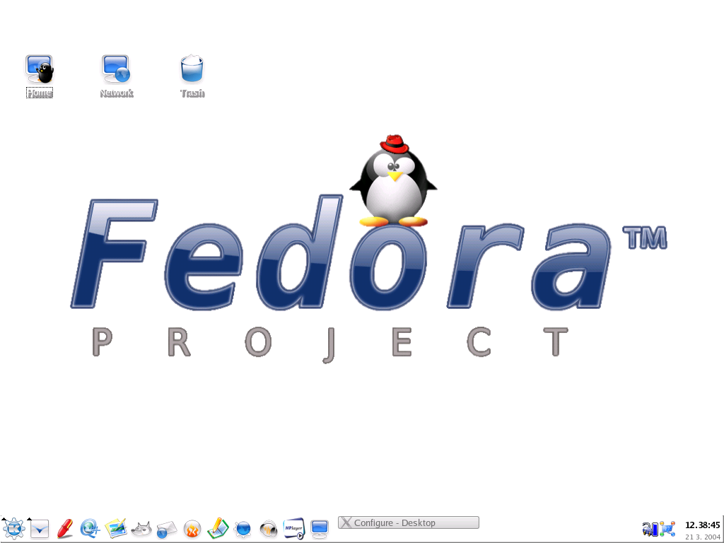
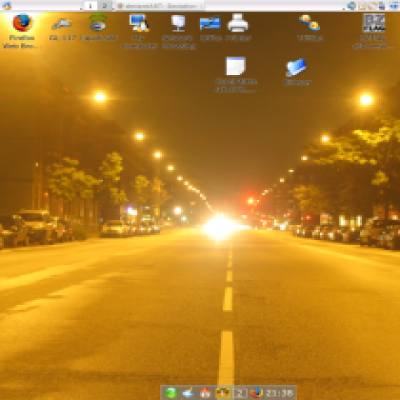
Description: I didn't seem to be able to find a wallpaper uniting Tux and Fedora out there (at least not one I liked), so I took the famous Crystal Penguin icon and mixed it up with Bluecurve RedHat and a Fedora Core logo and messed around with GIMP a bit.
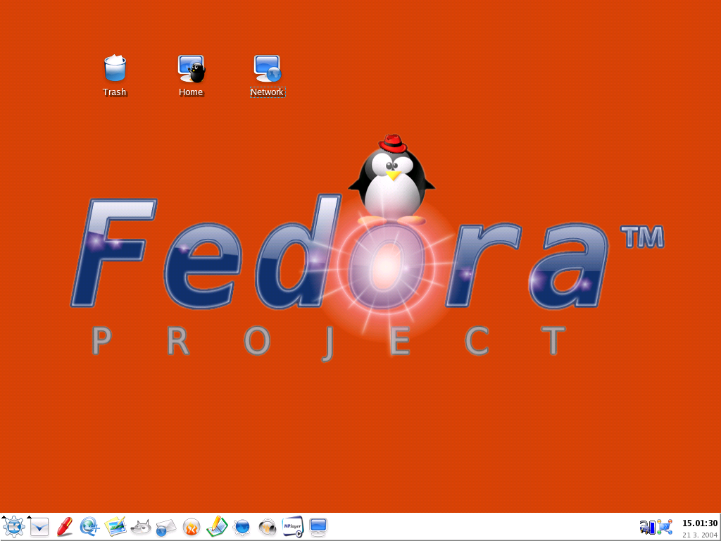
I don't really think someone except for me to like it with an orange coloured background, that's why I just added translucency, so you can add the color of your choice.
Have fun, I hope someone likes it .
P.S.: It's my first submit here, so be nice when commenting on it...Last changelog:
- Removed lightning on 03.21.04 - Removed ugly pixels on 03.21.04 - Smoothed out all the lines - Fedora logo and Tux as well on 03.21.04 ------------------------------- Hope, you like it better now .
- Added a version including a flare effect on 03.21.04
First of all this comment is not directed so much at the auther of this wallpaper but everyone that submits to this site.
It seems to me that the spirit of Linux is to create something and submit it to the community with source, then other people either fork it and start their own, like it the way it is or make improvements then submit it back.
Why doesn't anyone ever supply the source to these images?
All anyone ever does is submit the static image and then everyone bitches about changes they want or :0 "I love it, your wonderful, here's my daughter, do some more"
What a bunch of crap.
This site would explode with submissions and variations of different wallpapers if the code went along packaged with the static image.
What about themes and icon sets? Do them the same way!
I say to all submitters. Supply the original gimp, sodipodi or whatever file along with your final art.
Let Linux breath free!
I agree (of course) - but:
Trouble is, I don't have any. Because I didn't think this to become a big thing, I possess only PNG-images myself but not any GIMP- or other source-files. In addition, I made this one up using different images of which I don't possess any source either.
But because I really agree with you I'll try and submit the source in future - at least the source of any chances that will (hopefully) be done...
It's easy-most people don't need sources so why they should download it? And disk space that you get on kde-look.org also isn't big. I'm also publisher on kde-look and I'm really rare add sources to my artworks, but If anyone ask for it I'm sending it to him.
There is no "blue one" - it's transparent, so just add a deep dark color for background and there you are ;-).
Concerning the flare effect:
I'll submit an additional version including a flare effect, soon. I'm experiencing a bit trouble in finding a suitable intencity at the moment - I don't want to exagerate one more time...
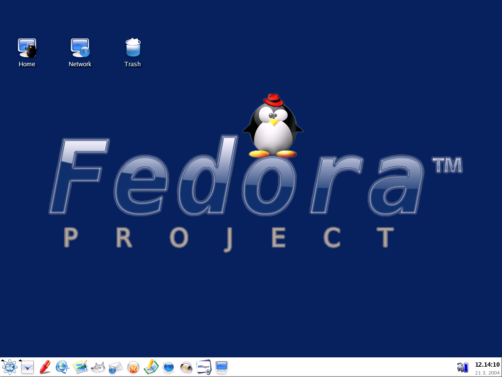
Okay, thanks everyone for the comments.
I have to agree - as I said already - the lightning IS too much. I'll try and make it a bit (okay, a big bit ;-) "less powerful". Or would you like a version without it better?
In addition, I'll try and smooth out those ugly blueish pixels.
Even if your comments didn't seem to be highly encouraging, I'm delighted that you seem to like it in general at least - and I think they really will help me to improve the wallpaper.
So - keep commenting, please and be patient with me ;).
P.S.: I'm sorry, but I'm not able to bring out a version without Tux - firstly, that would not be the point of this piece of work and in addition you can find the logo-only-wallpaper around here somewhere I think - so there would really be no point in doing that.
The orange color is simply disgusting, the lighting is too strong. Aren`t you able to properly use a rubber in order to remove the blue pixels, surrounding the text? Come on, give it another try, smooth down the orange and clean up the pic. ; )
I didn't read that the orange is only used on your desktop. (I think my brain was still irritated from the color *g*)
But nonetheless, the pic needs cleaning up and the lighting could be softer. : )


 .
. .
.


Ratings & Comments
12 Comments
First of all this comment is not directed so much at the auther of this wallpaper but everyone that submits to this site. It seems to me that the spirit of Linux is to create something and submit it to the community with source, then other people either fork it and start their own, like it the way it is or make improvements then submit it back. Why doesn't anyone ever supply the source to these images? All anyone ever does is submit the static image and then everyone bitches about changes they want or :0 "I love it, your wonderful, here's my daughter, do some more" What a bunch of crap. This site would explode with submissions and variations of different wallpapers if the code went along packaged with the static image. What about themes and icon sets? Do them the same way! I say to all submitters. Supply the original gimp, sodipodi or whatever file along with your final art. Let Linux breath free!
I agree (of course) - but: Trouble is, I don't have any. Because I didn't think this to become a big thing, I possess only PNG-images myself but not any GIMP- or other source-files. In addition, I made this one up using different images of which I don't possess any source either. But because I really agree with you I'll try and submit the source in future - at least the source of any chances that will (hopefully) be done...
It's easy-most people don't need sources so why they should download it? And disk space that you get on kde-look.org also isn't big. I'm also publisher on kde-look and I'm really rare add sources to my artworks, but If anyone ask for it I'm sending it to him.
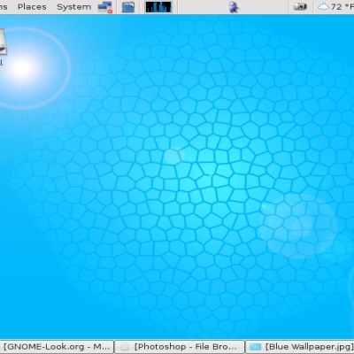
I prefer the blue wallpaper. From where can it be downloaded ? The lens flare effects are fine !
There is no "blue one" - it's transparent, so just add a deep dark color for background and there you are ;-). Concerning the flare effect: I'll submit an additional version including a flare effect, soon. I'm experiencing a bit trouble in finding a suitable intencity at the moment - I don't want to exagerate one more time...
Awesome wallpaper! Good job!
Okay, thanks everyone for the comments. I have to agree - as I said already - the lightning IS too much. I'll try and make it a bit (okay, a big bit ;-) "less powerful". Or would you like a version without it better? In addition, I'll try and smooth out those ugly blueish pixels. Even if your comments didn't seem to be highly encouraging, I'm delighted that you seem to like it in general at least - and I think they really will help me to improve the wallpaper. So - keep commenting, please and be patient with me ;). P.S.: I'm sorry, but I'm not able to bring out a version without Tux - firstly, that would not be the point of this piece of work and in addition you can find the logo-only-wallpaper around here somewhere I think - so there would really be no point in doing that.
I like the orange. Possible for one without tux?
The orange color is simply disgusting, the lighting is too strong. Aren`t you able to properly use a rubber in order to remove the blue pixels, surrounding the text? Come on, give it another try, smooth down the orange and clean up the pic. ; )
I didn't read that the orange is only used on your desktop. (I think my brain was still irritated from the color *g*) But nonetheless, the pic needs cleaning up and the lighting could be softer. : )
That lens flare effect is too much ;)
Well - it depends on the color you use for background of course. Good point, though...