Description: I'll say this now: what follows in the artwork is of Christian content. If this annoys you, I suggest you move on now rather than flaming. I am not trying to preach, convert or confuse anyone, just post some artwork I've made. If anyone is offended by this, I'm sorry but you need to get a life. Please respect my artwork by keeping all comments off the topic of whether religion is right or not. After all, some of our most famous artists did religious pieces
=======================================
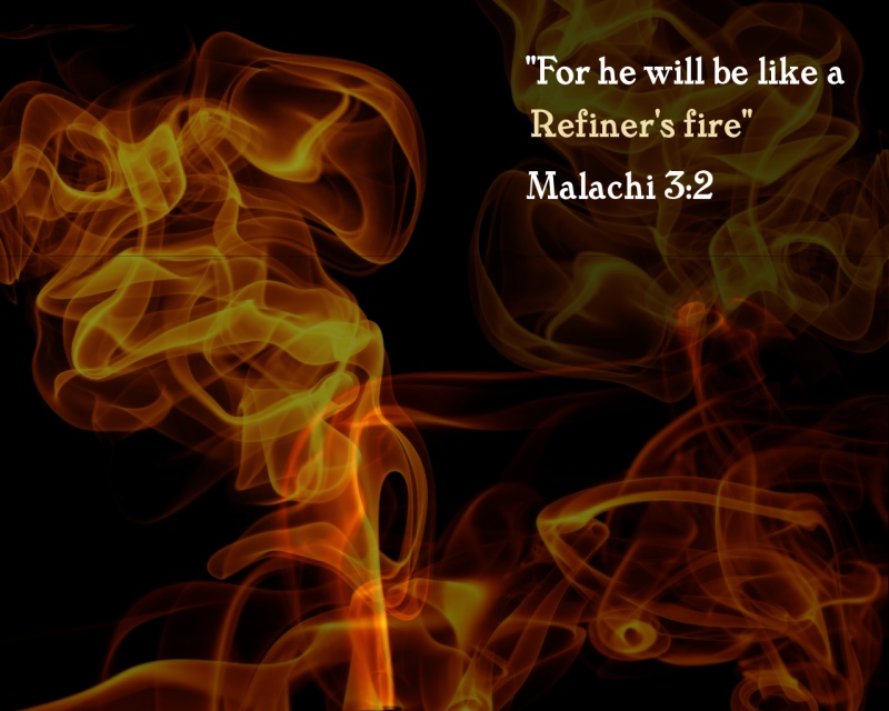
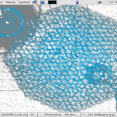
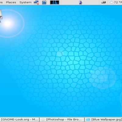
Desktop background 1280 x 1024. I hope you like. If you want the .xcf, post below and I'll upload it
thats kinda not cool
saying that the Bible has Holocostal messages in it is out of line, and don't be hatein' on the wallpaper because it has a Christian message
Another reason for the lack of good reviews, besides the busy appearance and disjointed font colors, might be the nature of the content.
Christian? Perhaps, but not of a broad appeal, given the context of the verse quote, as later parts of Malachi reveal what is to be burned in the "Refiners Fire":
" Malachi 4:1-3, “Surely the day is coming, it will burn like a furnace. All the arrogant and every evildoer will be stubble, and that day that is coming will set them on fire, says the Lord Almighty. “Not a root or a branch will be left to them. But for you who revere my name, the sun of righteousness will rise with healing in its wings. And you will go out and leap like calves released from the stall. Then you will trample down the wicked; they will be ashes on the soles of your feet on the day when I do these things, says the Lord Almighty.”
I'm not a Christian, but even if I was I can't imagine finding an image referring to people being burned in some sort of Holocaustal fire and having their ashes trampled into the ground to be something I'd want staring me in the face when I boot up my computer. Wow. Grim to say the least. Conceivably even a visual expression of hatred (wrath?) toward differing belief systems, which is certainly what the passage seems to suggest.
How broad did you expect the appeal of that image and text to be?
the image is nice and being a christian myself I agree with the message but the text is out of place. It is my opinion the font should be smaller and of a differrent type and color.
The reason that this background is getting poor reviews is that it's too busy. All the graphics are attractive as an image, but impractical as a background.


Ratings & Comments
6 Comments
thats kinda not cool saying that the Bible has Holocostal messages in it is out of line, and don't be hatein' on the wallpaper because it has a Christian message
Another reason for the lack of good reviews, besides the busy appearance and disjointed font colors, might be the nature of the content. Christian? Perhaps, but not of a broad appeal, given the context of the verse quote, as later parts of Malachi reveal what is to be burned in the "Refiners Fire": " Malachi 4:1-3, “Surely the day is coming, it will burn like a furnace. All the arrogant and every evildoer will be stubble, and that day that is coming will set them on fire, says the Lord Almighty. “Not a root or a branch will be left to them. But for you who revere my name, the sun of righteousness will rise with healing in its wings. And you will go out and leap like calves released from the stall. Then you will trample down the wicked; they will be ashes on the soles of your feet on the day when I do these things, says the Lord Almighty.” I'm not a Christian, but even if I was I can't imagine finding an image referring to people being burned in some sort of Holocaustal fire and having their ashes trampled into the ground to be something I'd want staring me in the face when I boot up my computer. Wow. Grim to say the least. Conceivably even a visual expression of hatred (wrath?) toward differing belief systems, which is certainly what the passage seems to suggest. How broad did you expect the appeal of that image and text to be?
the image is nice and being a christian myself I agree with the message but the text is out of place. It is my opinion the font should be smaller and of a differrent type and color.
The reason that this background is getting poor reviews is that it's too busy. All the graphics are attractive as an image, but impractical as a background.
Agreed. If you made the text a bit more minimal, it would definitely be much better.
You mean smaller text and to a corner? OK, I've done. Thanks for the feedback - its really appreciated :-)