


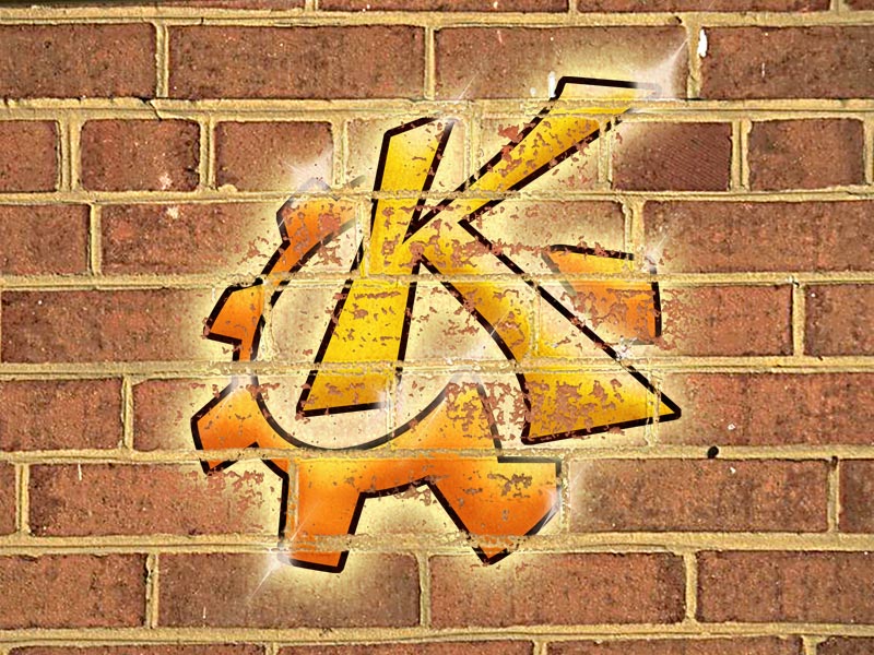

weAreGear png
gg3po


Source (link to git-repo or to original if based on someone elses unmodified work):
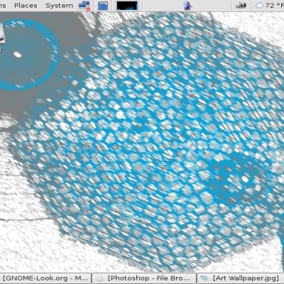
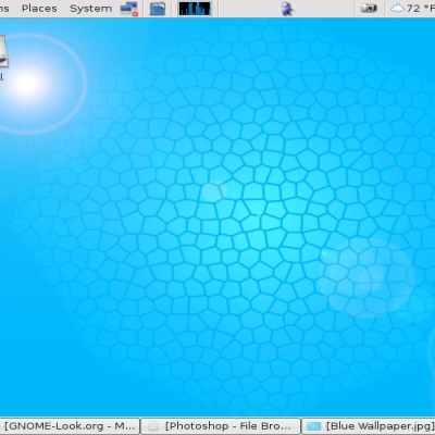
0.2:
- Modified shape of the "K"
- made less paint chipping
- made sparkles less opaque
- moved logo up a bit to distance from kicker (assuming your kicker's at the bottom of the screen)
- made black outlines thicker
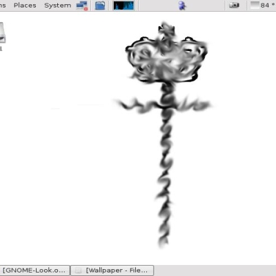
0.1:
first version


More Wallpaper Other from gg3po:
Other Wallpaper Other:


Ratings & Comments
5 Comments
This is very very very well done work. Keep working like that.
Very very awesome, but I think the white glistening shines were a little cheesy looking.
Yeah, the shines do add a certain cheese factor... :-) Basically it's meant to look reminiscent of a 1970's Funk-ish, 'bling bling'-kinda-thing. That genre (if you can call it that) was usually kinda cartoonish (a cross between Fat Albert and Parliament Funkadelic, if you will :-) ).
this is good man!
Original! Nice work.