Yeah, I think that the main advantage of this site is so that people can find artwork for their gnome desktop.
So why not let people use their distro's logo as their background if they want to?
If people come here and they don't find what they want - e.g. backgrounds with their distro's logo - then they're soon gonna use some other artwork site. But if you look at my first paragraph, this kinda defeats the purpose.
If you don't agree to using their distro's logo as a background, just don't. It's a free world :-), even though some companies (like one that begins with micro and ends with soft) think they need to deposit their logo everywhere. So I can understand why you might not want a logo as your background, but as I am a proud Linux user, I personally have no problem with having a logo as my background :-D.
Not to sound rude, but there is a place called "Ubuntu-art.org" which is a sister site to this.
This is GNOME-look, so it should remain only Gnome, you can go to Ubuntu-art and post your artwork there.
It is quite good, but not my cup of tea :)
so youre saying the only things that should be on this site are feet?
wallpapers of the gnome foot?
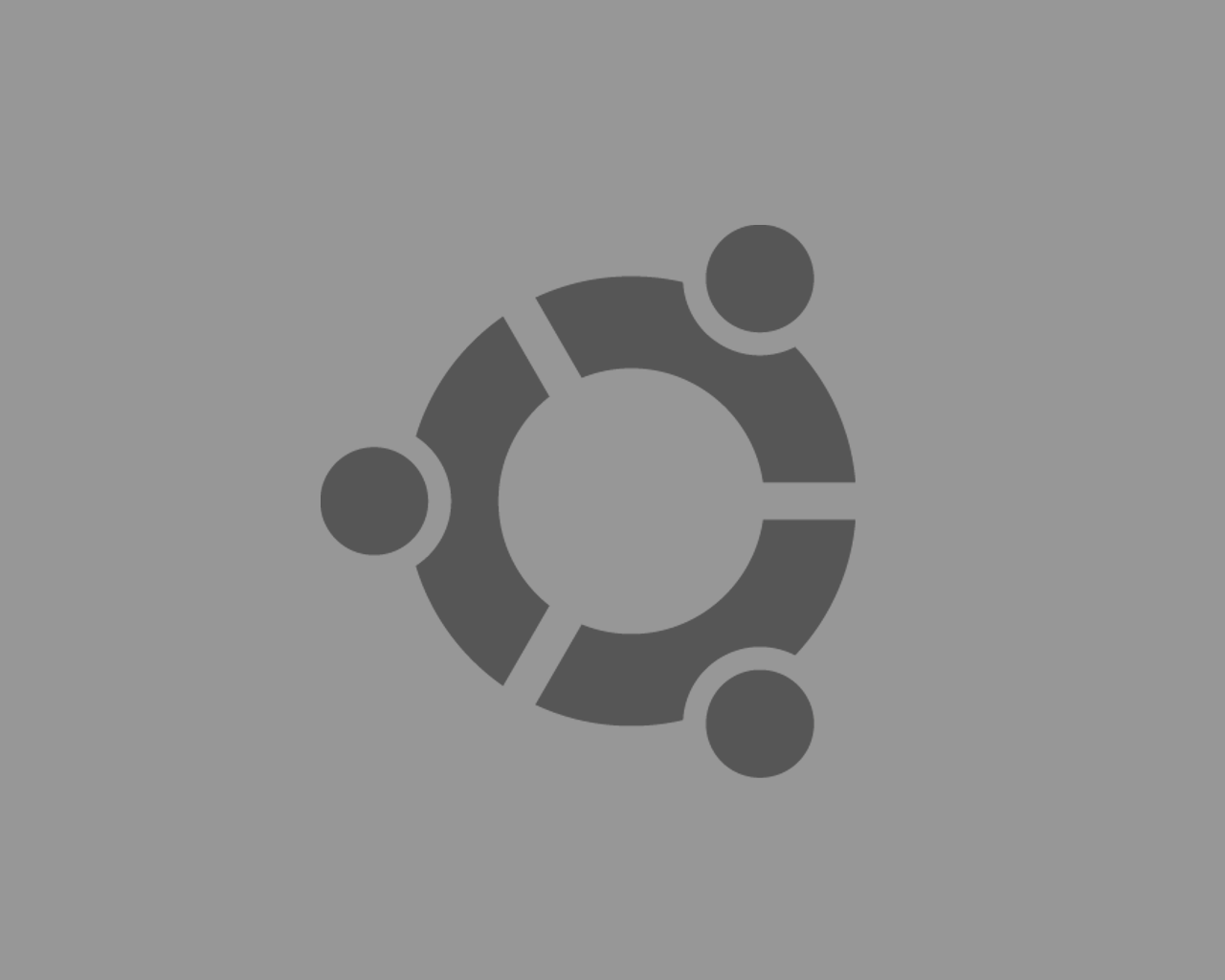
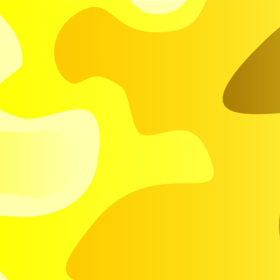
then why is it ok to have suse and fedora logos on stuff here and no one cries.
for some reason people hate on ubuntu because they think it makes them cool or something. it doesnt make you a rebel or more 1337.
this is gnome-look, this wallpaper can be used on a gnome desktop, it could also be posted at kde-look because it could be used on a kde desktop.
if you go to kde-look.org, youre not gonna see nothign but gears.
this site has plenty of wallpapers of other distro's logos, but the most of ubuntu.
i hate to see people crying over it.
this is in no way an attack on you, and 'you' refers to the people here in general that do the above mentioned. this is my opinion.


Ratings & Comments
8 Comments
But thanks for your tip about ubuntu art, I'll upload it there too.
Yeah, I think that the main advantage of this site is so that people can find artwork for their gnome desktop. So why not let people use their distro's logo as their background if they want to? If people come here and they don't find what they want - e.g. backgrounds with their distro's logo - then they're soon gonna use some other artwork site. But if you look at my first paragraph, this kinda defeats the purpose. If you don't agree to using their distro's logo as a background, just don't. It's a free world :-), even though some companies (like one that begins with micro and ends with soft) think they need to deposit their logo everywhere. So I can understand why you might not want a logo as your background, but as I am a proud Linux user, I personally have no problem with having a logo as my background :-D.
Not to sound rude, but there is a place called "Ubuntu-art.org" which is a sister site to this. This is GNOME-look, so it should remain only Gnome, you can go to Ubuntu-art and post your artwork there. It is quite good, but not my cup of tea :)
so youre saying the only things that should be on this site are feet? wallpapers of the gnome foot? then why is it ok to have suse and fedora logos on stuff here and no one cries. for some reason people hate on ubuntu because they think it makes them cool or something. it doesnt make you a rebel or more 1337. this is gnome-look, this wallpaper can be used on a gnome desktop, it could also be posted at kde-look because it could be used on a kde desktop. if you go to kde-look.org, youre not gonna see nothign but gears. this site has plenty of wallpapers of other distro's logos, but the most of ubuntu. i hate to see people crying over it. this is in no way an attack on you, and 'you' refers to the people here in general that do the above mentioned. this is my opinion.
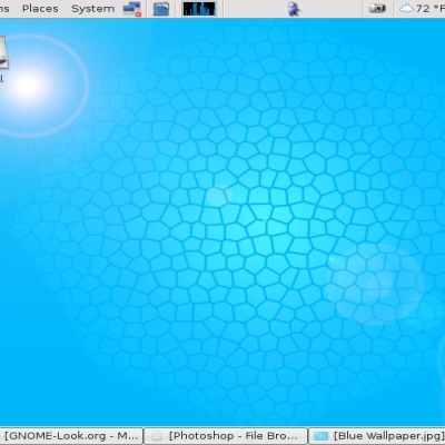
now thats what im talkin about! thanks a lot, i love it. now i can use it!
Ok, I fixed them. Optimised file size too. Hope you like it now. (The ubuntu logo was the wrong way around too.)
Its cos I used rotoscoping. Hang on, I'll fix it for you. Itll be online soon.
Why is the logo all wobby like? not smooth... i wanted it but not like that :s