


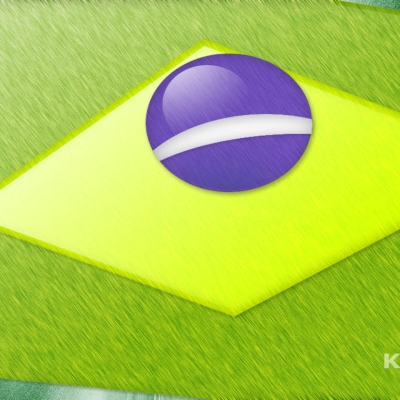
Natural Difference
zwobits


Source (link to git-repo or to original if based on someone elses unmodified work):
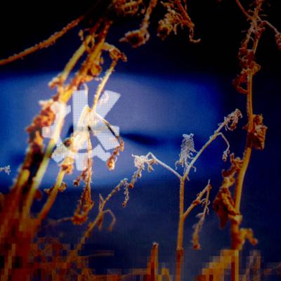
Changed Screenie 1/2 to a improved version, with different contrast in Screenie 2, and a high res. pic with a hopefully better 'glow' in Scr. 2.
Use it whenever you want.


More Wallpaper Other from zwobits:
Other Wallpaper Other:


Ratings & Comments
8 Comments
The gear looks very nice. I love it. But you should do something with the text. The text is too simply and needs some similar effect to look similar like the gear.
excelent! excellent idea and great implementation! VERY nice and professional. Go ahead!
The idea of KDE logo is very good. Making "default" wallpaper, splashes, windecs... is going to be much easier, because creators will have the basic concept-logo. But I think logo should be "keramik-compatible", because keramik style will IMHO be default style in next KDE releases and, of course, logo and style should be "compatible". So, I suggest that you make something similar to keramik style and ksplash_keramik_ian splash screen.
right-right... keramik style rocks.... ksplash_keramik_ian rocks... ermmm... ;) ian!
Sure i could take a screenshot of (the really great) Keramik Style. I agree with math, but i don't think that this is incompatible with Keramik. In my opinion a vectorial looking logo could also be compatible with a 3d shadowed thing like Keramik buttons, if some other parts fit together e.g. color or other attributes. In next version I'll try to make it more fit to Keramik.
i like it! it's clean and nice for an eye... you have a good graphical feeling and your photos are very interesting for me too... i like your style.
I don't really know how I should rate your logo. Ok, it's clean but it also looks a bit too much "80's style" to me. Why don't you do some KDE wallpapers etc. with your photos at zwobits.deviantart.com. I really like your work there. Especially the b/w photography. I would like to see these used for wallpapers etc... ian!
Using this shots in graphics for Kde is difficult because there is no relation between b/w photographs of buildings and desktops. But thank you very much for your comment. Please remember that it is still under development. I'll try to change the 80's in the next release. Thanks