I did try it with black but preferred it with the white.
If you want to try it, go to the gtkrc file and locate the following text:
style "panelbuttons"
{
fg[NORMAL] = "#ffffff"
fg[PRELIGHT] = "#ffffff"
fg[ACTIVE] = "#ffffff"
fg[SELECTED] = "#ffffff"
fg[INSENSITIVE] = "#ffffff"
and replace the f's with 0's. You only actually need to do the replacement for the fg[NORMAL] entry but have a play and see what works best for you.
Here is what makes this theme so awesome:
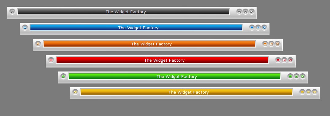
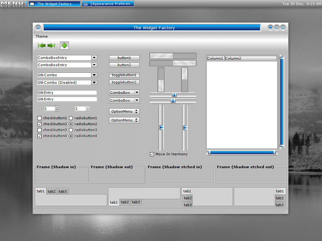
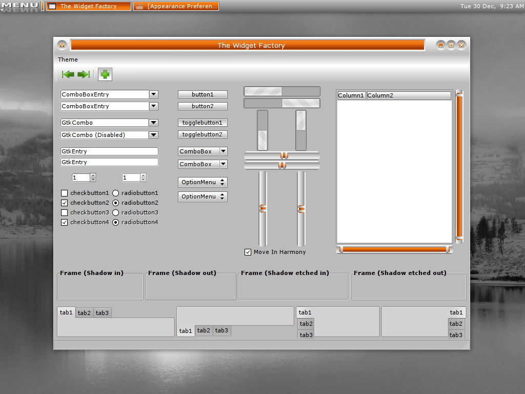
1) balance. It has balanced shading, the lines are straight or well-rounded where they should be. The top bar is perfectly shaded and I like the in-cut element of it. Looks like a real colored bar encased in metal.
2) the silver-grey contrasts very well with the color. There is even well-done and balanced detail in the shading for the grey when you open your menus. No shortcuts appear to have been made even for the toolbar/panel where there is the silver-grey.
3) the added touch of the color in those menus is well-placed and gives it a professional feel.
4) finally, it doesn't try to be a Mac or Vista.
Hope this honest appreciation prompts others to try it and rate it well.
extra: The blue goes well with Firefox Gradient iCool theme, and Chameleon Sky-Blue cursors.
Thank you very much for your kind comments.
I'm really pleased with the way the theme has worked out and it's great that someone else appreciates it as much as you do.
Sorry, you can actually disregard the highlighted text issue - that is not a firefox or your theme's problem. I was using the "Basic Brushed" firefox add-on theme, so that author's work was the cause of the problem! There are no highlighting issues with another theme (Crystal Fox Qute) I tried.
Thanks - look forward to the changes.
Thanks for looking at my feedback. Highlighting: I was referring to when one goes on any text on the internet, clicks and drags over it. Usually there should be a dark background with light text when you do it so you know which words you are dragging over after you click the mouse.
Colors: I'm thinking a dark gold, green, and maybe crimson. I have to say the ones you have a already excellent and go well with the theme.
Thanks for changing the panels & hope this helps. Again, the theme really deserves high scores for tasteful originality and using color in the right places.
I am a bit puzzled over the highlight problem. I'm using Fx 3 with no issues. which browser are you using?
Thanks for mentioning the panel issue. I always use a 24 pixel panel so I've never noticed a problem before. You have helped me to learn something for future reference, so thanks.
I'll have a look at introducing those new colours you suggested. Hopefully I'll get to update sometime next week.
Brilliant. Out of the hundreds here, this one is gorgeous, attractive, modern and yet simple and light. Please add this, and it will be perfect:
1) ability to highlight words. It is invisible and I can't tell which ones have been highlighted to cut/paste selected words.
2) ability to increase the width of the toolbars (or panel) at the bottom or top without it becoming inconsistent.
3) if you solve these problems, please add other colors as options. This is good work.
Thanks for the feedback.
I have made a change to the panel graphic so that it can handle different size panels, at least up to a size of 34 pixels.
I am not sure what you mean about the text highlighting. I cannot find this problem on my machine. What programme is giving you this text highlight problem? When I know, I will look into fixing it.
By the way, what additional colours would you suggest?
I'm really impressed: I love this theme!! thanks a lot!!!
Moreover, my openbox theme works really well with your theme!
http://www.box-look.org/content/show.php/Leopard+Openbox?content=96082


Ratings & Comments
17 Comments
Thanks for these nice gtk themes, but where to download the corresponding emerald themes?
They are metacity themes rather than emerald themes. They are included in the download along with the gtk themes.
Thanks for the upgrade. The wider panel helps those of us who need larger fonts see better, and the red addition is just great!
Nice and original...........
One thing I noticed is a black font against the silver/grey panel might contrast a little bit better to make it more readable (time, date, etc).
I did try it with black but preferred it with the white. If you want to try it, go to the gtkrc file and locate the following text: style "panelbuttons" { fg[NORMAL] = "#ffffff" fg[PRELIGHT] = "#ffffff" fg[ACTIVE] = "#ffffff" fg[SELECTED] = "#ffffff" fg[INSENSITIVE] = "#ffffff" and replace the f's with 0's. You only actually need to do the replacement for the fg[NORMAL] entry but have a play and see what works best for you.
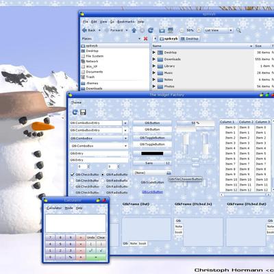
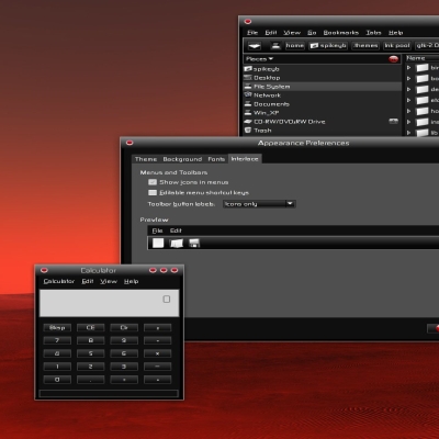
Here is what makes this theme so awesome: 1) balance. It has balanced shading, the lines are straight or well-rounded where they should be. The top bar is perfectly shaded and I like the in-cut element of it. Looks like a real colored bar encased in metal. 2) the silver-grey contrasts very well with the color. There is even well-done and balanced detail in the shading for the grey when you open your menus. No shortcuts appear to have been made even for the toolbar/panel where there is the silver-grey. 3) the added touch of the color in those menus is well-placed and gives it a professional feel. 4) finally, it doesn't try to be a Mac or Vista. Hope this honest appreciation prompts others to try it and rate it well. extra: The blue goes well with Firefox Gradient iCool theme, and Chameleon Sky-Blue cursors.
Thank you very much for your kind comments. I'm really pleased with the way the theme has worked out and it's great that someone else appreciates it as much as you do.
I agree with these comments. Well done!
Sorry, you can actually disregard the highlighted text issue - that is not a firefox or your theme's problem. I was using the "Basic Brushed" firefox add-on theme, so that author's work was the cause of the problem! There are no highlighting issues with another theme (Crystal Fox Qute) I tried. Thanks - look forward to the changes.
Thanks for looking at my feedback. Highlighting: I was referring to when one goes on any text on the internet, clicks and drags over it. Usually there should be a dark background with light text when you do it so you know which words you are dragging over after you click the mouse. Colors: I'm thinking a dark gold, green, and maybe crimson. I have to say the ones you have a already excellent and go well with the theme. Thanks for changing the panels & hope this helps. Again, the theme really deserves high scores for tasteful originality and using color in the right places.
I am a bit puzzled over the highlight problem. I'm using Fx 3 with no issues. which browser are you using? Thanks for mentioning the panel issue. I always use a 24 pixel panel so I've never noticed a problem before. You have helped me to learn something for future reference, so thanks. I'll have a look at introducing those new colours you suggested. Hopefully I'll get to update sometime next week.
I just wanted to say thank you to those people who have taken the time to comment. I'm very pleased you like the theme.
Brilliant. Out of the hundreds here, this one is gorgeous, attractive, modern and yet simple and light. Please add this, and it will be perfect: 1) ability to highlight words. It is invisible and I can't tell which ones have been highlighted to cut/paste selected words. 2) ability to increase the width of the toolbars (or panel) at the bottom or top without it becoming inconsistent. 3) if you solve these problems, please add other colors as options. This is good work.
Thanks for the feedback. I have made a change to the panel graphic so that it can handle different size panels, at least up to a size of 34 pixels. I am not sure what you mean about the text highlighting. I cannot find this problem on my machine. What programme is giving you this text highlight problem? When I know, I will look into fixing it. By the way, what additional colours would you suggest?
I'm really impressed: I love this theme!! thanks a lot!!! Moreover, my openbox theme works really well with your theme! http://www.box-look.org/content/show.php/Leopard+Openbox?content=96082
very,very,very NICE :) thx