The only thing I can think of is that your monitor brightness is set much higher than mine. If I set my monitor brightness up and increase the colour temperature, I can lose the contrast between the check box background and the normal background.
From your home folder locate the file .themes\Salinx\gtk-2.0\circ1.png. Open this file with an image editor and make it darker. See if that helps with your contrast.
If you do get chance to try this, please let me know if it works or not.
Thanks.
No, it has nothing to do with that. I see them fine in other themes.
The "bullets" of the radiobuttons are there, but not their surrounding circular box. The same for the checkboxes. The checks ("V") are there, but not the boxes.
Compare with an original Clearlooks theme please and you will see what I mean.
I looked at your gtkrc file: you haven't defined them.
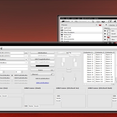
Actually, but that's just my opinion, the most beautiful would be if you worked with pixmaps for them. It's not too difficult: just look at how other themes have done it.
Nevertheless this is a fine theme.
You're very welcome, though I feel that I haven't helped you that much. But, if you permit me, I will give you some advice. Download this theme: http://gnome-look.org/content/show.php/Azel?content=76898, Azel. It is one of the most professional themes around. Or take one from TheRob. Install it and look at the checkboxes and radioboxes. then look in the directory of the theme. You will find a "Check-Radio" directory where you can find the pixmaps the author made and used. Each has no less than seven states = seven pixmaps. Then look at the gtkrc-file for the description (and don't forget the instructions you have to give at the end.)
It's a bit of work, but it will make a very good theme even more professional looking. Succes.
that its really nice, ooh and i use Clearlooks-OSX-iconset to go with this theme, looks really good.
Heres the Clearlooks iconset, and gtk
http://www.mobelforum.com/greyworld
Kind Regards MikeDK
I'm really stuck when it comes to recommending icons and wallpapers.
I love the nuoveXT icon set and never really feel satisfied with any other set, even though there is some seriously professional looking work out there.
As for wallpapers, I'm changing mine all the time.
I notice that the theme is being voted bad.
Can anyone help explain to me what parts of it you don't like?
Thanks in advance for any feedback you can give me.


Ratings & Comments
15 Comments
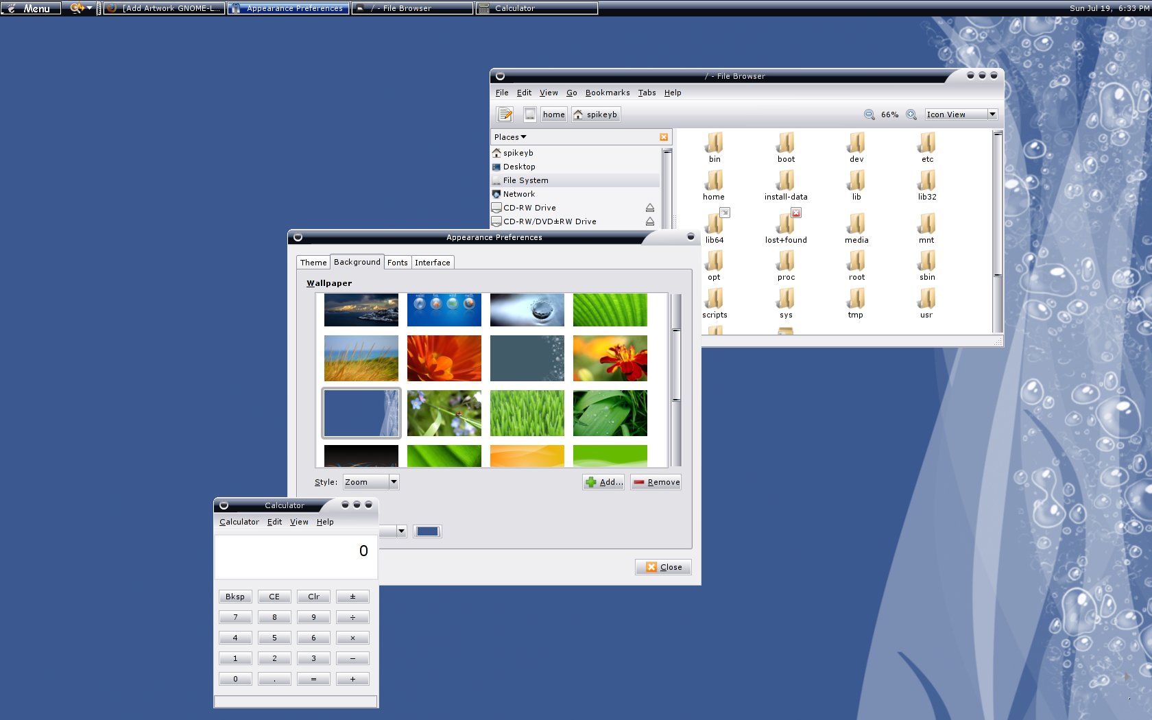
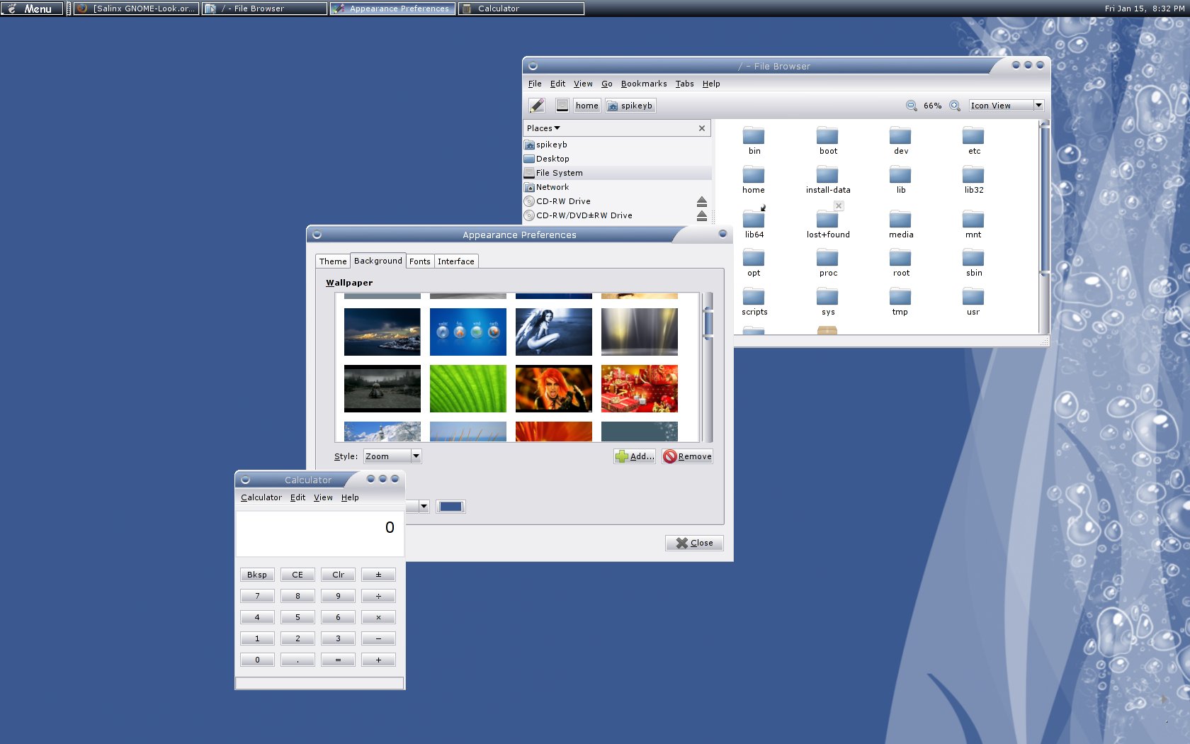
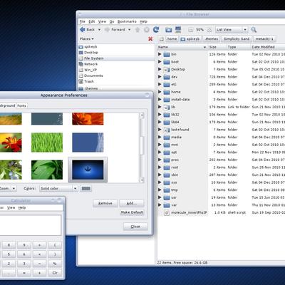
A very nice theme and very well executed, though I seem to have some problems with the check and radio boxes. Anyway, good job: voted up. :)
Hi and thanks for your vote. What problem are you having with the check and radio boxes? Is it a font colour on background issue or they don't work?
They work, but the boxes aren't showingn only the signs inside them.
The only thing I can think of is that your monitor brightness is set much higher than mine. If I set my monitor brightness up and increase the colour temperature, I can lose the contrast between the check box background and the normal background. From your home folder locate the file .themes\Salinx\gtk-2.0\circ1.png. Open this file with an image editor and make it darker. See if that helps with your contrast. If you do get chance to try this, please let me know if it works or not. Thanks.
No, it has nothing to do with that. I see them fine in other themes. The "bullets" of the radiobuttons are there, but not their surrounding circular box. The same for the checkboxes. The checks ("V") are there, but not the boxes. Compare with an original Clearlooks theme please and you will see what I mean. I looked at your gtkrc file: you haven't defined them. Actually, but that's just my opinion, the most beautiful would be if you worked with pixmaps for them. It's not too difficult: just look at how other themes have done it. Nevertheless this is a fine theme.
Thanks for your help. I will investigate further and hopefully will learn something new.
You're very welcome, though I feel that I haven't helped you that much. But, if you permit me, I will give you some advice. Download this theme: http://gnome-look.org/content/show.php/Azel?content=76898, Azel. It is one of the most professional themes around. Or take one from TheRob. Install it and look at the checkboxes and radioboxes. then look in the directory of the theme. You will find a "Check-Radio" directory where you can find the pixmaps the author made and used. Each has no less than seven states = seven pixmaps. Then look at the gtkrc-file for the description (and don't forget the instructions you have to give at the end.) It's a bit of work, but it will make a very good theme even more professional looking. Succes.
that its really nice, ooh and i use Clearlooks-OSX-iconset to go with this theme, looks really good. Heres the Clearlooks iconset, and gtk http://www.mobelforum.com/greyworld Kind Regards MikeDK
@sudomattchu @Naf71 @kai100 Thanks for your comments, I appreciate you taking the time to jump in and let me know your thoughts.
i like your style!!! thx
I like your theme is very simple and nice... good job. Naf
It's an early set dude, but from my end the set looks clean n' fresh. Any thoughts on specific icon sets to match with, wallpaper as well?
I'm really stuck when it comes to recommending icons and wallpapers. I love the nuoveXT icon set and never really feel satisfied with any other set, even though there is some seriously professional looking work out there. As for wallpapers, I'm changing mine all the time.
I notice that the theme is being voted bad. Can anyone help explain to me what parts of it you don't like? Thanks in advance for any feedback you can give me.
Please don't think of this as a plea for sympathy. What I'm looking for is solid constructive criticism if you think the theme is bad.