


ψ (Psi)
16777216


Source (link to git-repo or to original if based on someone elses unmodified work):
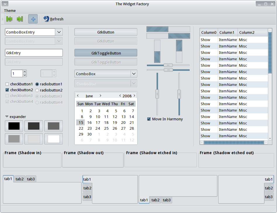
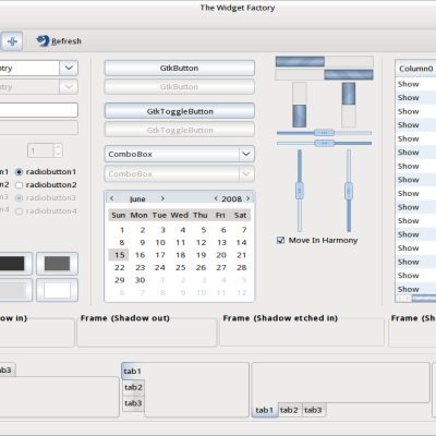
0.2:
Fixed sliders not prelighting.
Menu/toolbar now blends together better. Menu prelight color now matches with rest of theme.
Colors adjusted to match in many other places.
Scroll bar sliders now have diagnal strips and ( tiny ) handle marks.
Other fixes that I can't remember.
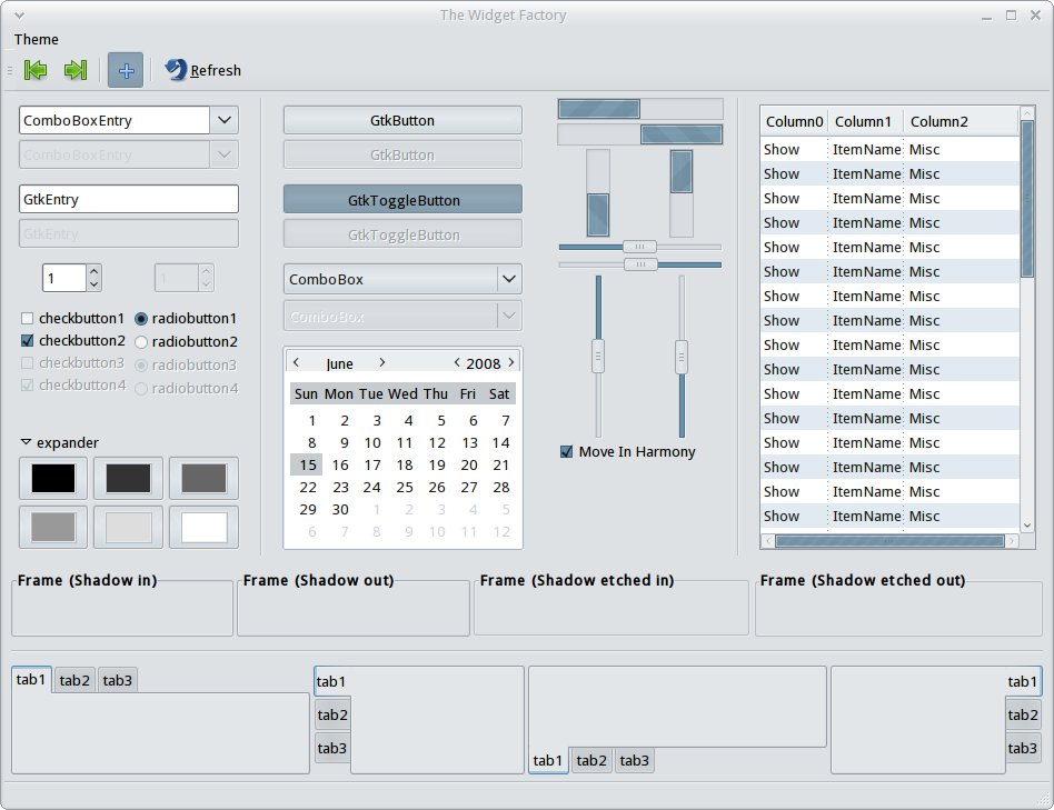
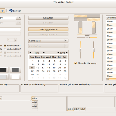
Second screen shot shows improvements.


More GTK2 Themes from 16777216:
Other GTK2 Themes:


Ratings & Comments
12 Comments
I don't think we'll ever be able to agree on an entire theme. :P However, this is your best so far, I think.. All these new styles - is there some kind of documentation available for them? I'd like to see if I can put what I think looks better into a theme, so it's not just blurry written things I'd be spewing.
LOL The themes are really not that hard to edit once you get an idea how the options affect the theme. I personally go to my themes folder ( ~/.themes ) and copy the folder of the theme I want to modify to the desktop then, rename the folder and compress it as a .tar.gz. I then install this archive as any other theme and make it active. Then open gedit and open ~/.theme/NewThemeName/gtk-2.0/gtkrc Trash the file and folder on your desktop as they are no longer needed. Run the widget factory and change a parameter in the gtkrc save it and hit refresh in the widget factory to see what it did then repeat until the theme looks the way you want, save make a new tar.gz, upload, ???, profit. :) Also more information can be found at http://live.gnome.org/GnomeArt/Tutorials/GtkThemes
I just found this too and it seems helpful as well. http://orford.org/gtk/
I just found this too and it seems helpful as well. http://orford.org/gtk/
GTK themes can get pretty subtle; every other theme here seems to use a definite no-no, such as mixing aurora and clearlooks (they use different highlighting methods which is both ugly and potentially confusing). The best way to learn is to look at some high quality themes (most were not released) and see what they're up to. I've made a couple dozen themes over the last year and only one, Murrina Symphonic, is the only one I still stand by. Probably the best way of going about this is to think of something you want to do and then try and do it, so you learn the limitations of clearlooks or murrine, etc. Hope this helps a little.
Sorry, the "most were not released" was about my own themes, not the high quality ones I refer to.
paraboy: "Probably the best way of going about this is to think of something you want to do and then try and do it, so you learn the limitations of clearlooks or murrine, etc." The problem is that their is no engine that can do all of what I want. If I want soft rounded corners or strong gradents I want them on everything unless I define it not to be. It really sucks I haven't learned to program yet or I would have made my own engine with the features I want. ( rgba, variable roundness for everything, inner/outer "glow" with adjustable strength, top/bottom/left/right gradients, raised/sunken widgets and probably a few more things I forgot. )
I know what you're talking about. What I was trying to say is that as long as you're not working in the pixmap engine you have to understand what the various other engines can do. Trying to get them to do what they're not supposed to is bound to end up with ugly inconsistencies. They also have bugs, which you must learn to work around. But good things lie ahead: http://www.advogato.org/proj/Gtk%20CSS%20Engine/ Keep up the good fight :)
I just had a look at your theme again, so I thought I'd leave some more concrete comments: the sliders don't behave like the buttons, which seems strange; highlighted checkboxes & radiobuttons in the menus are inconsistent with the normal ones; the menubar, menus, and lists are very squashed, though it seems this is a design decision. Also, since you're using a blending metacity you may want to consider using the following new feature of murrine: flat menubar without shadow for ultra blendy goodness :)
I'm still learning ( by doing ) and have been going on what looks nice and is easy to see ( I'm colorblind. ) and not necessarily for unification though that is a goal as well. What exactly do you mean by "the sliders don't behave like the buttons"? Where is this happening? ( So I know what to check in the future. ) "highlighted checkboxes & radiobuttons in the menus are inconsistent with the normal ones" "the menubar, menus, and lists are very squashed, though it seems this is a design decision" You would be correct on this. I despise long menus. How do I go about doing this? "flat menubar without shadow" Thank you for your comments, all of you. Because of them I am learning what people want and how to go about doing it. I love to create and, hope to do more and more in the future better than ever.
For the checkboxes in the menu, have a look at the "View" menu in Rhythmbox. The sliders look like buttons, but don't prelight like buttons. Seems odd to me. For the flat menubar add the following in the default style GtkMenuBar :: shadow-type = GTK_SHADOW_NONE and change menubarstyle to 0 inside the murrine engine options.
Ah, yes, Thank you. And, thank you for the advice.