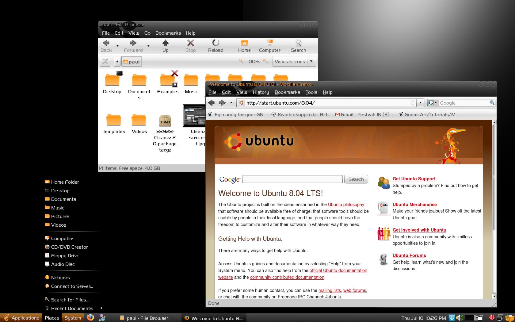
A modest attempt at making a new default ubuntu theme. While preserving the basic 'ubuntu-colors' I tried to make a theme that is more soothing to the eyes, and creates a nice and calm work-environment.
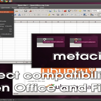
Visually I tried to incorporate a partial shadow of the ubuntu-logo within the top-window-frame. Gtk-theme and Metacity-theme work together into creating this effect.
A good metacity theme is one that is only visually present when you need it. Therefore the metacity-buttons - or should I say 'circles'- only visually highlight when you move the cursor over them.
The menu's are all consistently with a black background. This theme goes well with a dark (black) wallpaper.
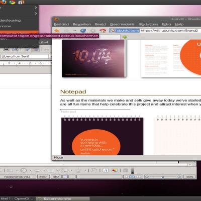
About the screenshots: A kean themer will have noticed that I have created a heavily modified version of the 'Slickness'-theme made by Th3Rob Icon-theme: Oxygen-Refit2 - Orange Version Wallpaper: a modified version of 'distro balls' by Jackfox05. This modified version is in the download-package. The font I use is: HandelGotDlig, which you will also find in the downloadfile with install-instructions.
Installing: Within the download-file you can find the 'installation instructions' documents. There's a special file included that modifies the fontcolor of the panel to white, in case you have a black font in the panel. Just drag and drop this ".gtkrc-2.0" file in your home folder, logout and login again and it should be changed to white.
Please comment, rate or make suggestions..
Yes, I know that Gnome looks is fed up with yet another ubuntu theme and that linux is not all about ubuntu, but please rate it on its merits...
Ubuntu-bashing seems to be popular.Last changelog:
Changed the black-menu-button in the panel to get a uniform look when using a top-panel.
Added an excellent Emerald-theme made by Mariux especially for this theme !
If you have installed version 1.0 of this theme then remove it before you install version 2.0
Upgraded to version 3.0 Iconsize of the main-menu-items changed to 24x24 as suggested by Schollidesign
Please de-install previous version before installing version 3.0, log-out and log-in again afterwards
Some graphics refined in 4.0 Minor adjustments in 5.0
Poor contrast between the text and the black background on the title bars, plus the buttons at the right end of the Metacity or Emerald theme don't contrast very well either, and that's why I voted bad.
Thanks for creating this great theme! Finally a good theme that's not a Vista or OsX clone. I have two question for you though:
- How can I get the font working for my GNOME-menu-bar and the window-title-bar? I changed all font areas in the Layout (Don't know how this is called in English, because I use the Dutch version of Gnome), but they won't change.
- In Evolution, when I select an e-mail in the list, both the selection box and the font of the selected mail appear in white, so you see an empty box and you cannot read the title of the e-mail anymore. How to solve this?
Thanks for your or anyone else's answers.
Greetings,
Eelke
Love the theme, first black theme I can live with! Only problem I've found is that when I select an email in Evolution, the highlight bar is white with white text.
Everywhere else, highlights seem to be black or gray with white text, any way of tweaking Evolution? Or gtkrc appropriately?
Edit - the folders menu shows highlights correctly in dark gray with white text. Another problem, the Edit/Preferences dialog in evolution is mostly white text on white under the Mail Preferences option, but ok elsewhere.
very nice themes but it would be better if u change few things...
http://img504.imageshack.us/img504/6171/beznazwyfo8.th.png
color of buttons isnt good .. hard to see which network is in use ... color of central point should be different. another thing is http://img391.imageshack.us/img391/1818/beznazwy2rv2.png
i dont know why they arent smooth i can see each pixel ... probably because im using transparent bar..
I laughed when i read this part "While preserving the basic 'ubuntu-colors'". There is no basic ubuntu colors to my eyes. I just wanted to point this out.
On another note, This is a very good theme. THANKs! I voted GOOD!
Just had to reply to this. It is THE BEST theme i have come accross for my buuf icon set. "Therob themes" are good for the "black and white icon themes" in my own opinion but I was looking for something satin and glossy. The Buuf icons have a satin and green look to it but the blackness of your theme works perfect. I also love the brown color with the blackness of the menu. It works perfect with opacity at 78 and gaussian blurr in compiz manager. It is my default theme and I just took out the technix theme which was my default. OHH YES! the metacity is one of the best ones i have seen. I love the circles and how they glow. Lots of eyecandy here so move along folks!
Hi paul
I installed the 3.0 version and i found 24x24 iconsize worster than the 2.0 version. 24x is definitely too big, your theme is better with something smaller, lixe 18x18 or 20x20... try making a version with 18x18!!!
maybe 20x20 or 22x22? But smaller please no! Because see little Points in the menu is the worst. But Paullinux know how to change it and he can decide himself what look is better ;)
By the way... the Desktop-Icon on the panel could have a brown background, too?!
What you mean?
sincerly schollidesign
go ahead ! you don't need any approval from me. But if you want to I'll incorporate it in the download-package. But I'll have to see the result first. Just upload it in the Beryl or compiz section, I'll find it...
Hallo Paullinux
Nochmals danke für den Hinweis.
Habe zwei kleine Kritikpunkte zum Theme:
- Beim Update-Manger habe ich nicht den
schönen schwarzen Balken. Aber vllt. ist das Absicht.
- Das markieren ist meiner Meinung nach etwas zu dunkel. Das könnte eine Aufhellung vertragen.
Ansonsten: Super Arbeit ;)
You will only get the big black area in the top of the window when there is a menu beneath the metacity-window. The update-manager has no menu, so you will only see the upper-part of the window.


Ratings & Comments
41 Comments
Could you change the panel theme to match the menu bar colour? That way, it will look more comprehensive.
Nice theme. But as some of the others say, the contrast of the fonts seems to be very poor. Btw, what is the iconset that is used in the screenshot ?
Not sure what the other guy is on about in relation to contrast as it looks great and no contrast issues here - thanks for this excellent theme :)
Poor contrast between the text and the black background on the title bars, plus the buttons at the right end of the Metacity or Emerald theme don't contrast very well either, and that's why I voted bad.
Hats off to you mate, very polished theme, love it!!
Thanks for creating this great theme! Finally a good theme that's not a Vista or OsX clone. I have two question for you though: - How can I get the font working for my GNOME-menu-bar and the window-title-bar? I changed all font areas in the Layout (Don't know how this is called in English, because I use the Dutch version of Gnome), but they won't change. - In Evolution, when I select an e-mail in the list, both the selection box and the font of the selected mail appear in white, so you see an empty box and you cannot read the title of the e-mail anymore. How to solve this? Thanks for your or anyone else's answers. Greetings, Eelke
'nuff said.
Love the theme, first black theme I can live with! Only problem I've found is that when I select an email in Evolution, the highlight bar is white with white text. Everywhere else, highlights seem to be black or gray with white text, any way of tweaking Evolution? Or gtkrc appropriately?
Edit - the folders menu shows highlights correctly in dark gray with white text. Another problem, the Edit/Preferences dialog in evolution is mostly white text on white under the Mail Preferences option, but ok elsewhere.
very nice themes but it would be better if u change few things... http://img504.imageshack.us/img504/6171/beznazwyfo8.th.png color of buttons isnt good .. hard to see which network is in use ... color of central point should be different. another thing is http://img391.imageshack.us/img391/1818/beznazwy2rv2.png i dont know why they arent smooth i can see each pixel ... probably because im using transparent bar..
I laughed when i read this part "While preserving the basic 'ubuntu-colors'". There is no basic ubuntu colors to my eyes. I just wanted to point this out. On another note, This is a very good theme. THANKs! I voted GOOD!
Just had to reply to this. It is THE BEST theme i have come accross for my buuf icon set. "Therob themes" are good for the "black and white icon themes" in my own opinion but I was looking for something satin and glossy. The Buuf icons have a satin and green look to it but the blackness of your theme works perfect. I also love the brown color with the blackness of the menu. It works perfect with opacity at 78 and gaussian blurr in compiz manager. It is my default theme and I just took out the technix theme which was my default. OHH YES! the metacity is one of the best ones i have seen. I love the circles and how they glow. Lots of eyecandy here so move along folks!
this is a very nice ubuntu color/black like theme, keep up the good work man
Hi paul I installed the 3.0 version and i found 24x24 iconsize worster than the 2.0 version. 24x is definitely too big, your theme is better with something smaller, lixe 18x18 or 20x20... try making a version with 18x18!!!
maybe 20x20 or 22x22? But smaller please no! Because see little Points in the menu is the worst. But Paullinux know how to change it and he can decide himself what look is better ;) By the way... the Desktop-Icon on the panel could have a brown background, too?! What you mean? sincerly schollidesign
As Schollidesign suggested I will enlarge the iconsize of the main-menu item to 24x24 instead of 16x16. A new version will be uploaded shortly
Emerald theme is now ready! I'm waiting for Paul's approval, then i'll upload it! Cheers Mariux
go ahead ! you don't need any approval from me. But if you want to I'll incorporate it in the download-package. But I'll have to see the result first. Just upload it in the Beryl or compiz section, I'll find it...
Ah yes, forgot something. Post a screenshot please
Done. Emerald available in the Bery-Emerald topic ;-) What do you think about?
brilliant ! I'll put in into the package if you allow me to...?
of course, just please give me credits in the download page on gnome-look and deviantArt!
of course ! Thanks for your contribution !
Hallo Paullinux Nochmals danke für den Hinweis. Habe zwei kleine Kritikpunkte zum Theme: - Beim Update-Manger habe ich nicht den schönen schwarzen Balken. Aber vllt. ist das Absicht. - Das markieren ist meiner Meinung nach etwas zu dunkel. Das könnte eine Aufhellung vertragen. Ansonsten: Super Arbeit ;)
You will only get the big black area in the top of the window when there is a menu beneath the metacity-window. The update-manager has no menu, so you will only see the upper-part of the window.