I don't like the orange here... seems too violent... what about this one?
#DA5A2A
and I think it could looks better if you could set a bitmap for check and radio buttons in FOCUS state ;) just put a image as
function= FOCUS
and other as
function=FLAT_BOX
both having the same image
into the styles for radio and check.
voted good anyway; nice to see some lite settings using murrina.
btw, nice the #1C0712 color...
Well I'll be updating the theme shortly with a slightly darker orange (E96336) for the menu-items (your proposed color is a bit to dark for me) and changed the style of the menu-items to be more flat. Which gives it a smoother look.
I usually work with pixmaps-themes. These are easier to work with because you can use images to get where you want.
So I'm a bit in the dark here. This is the first time I'm playing with the murrine-theme. And I do not know how to add what you've proposed...
Nice Work Compiling this theme,
I Believe you can get the new Ubuntu Metacity theme somewhere if you'd like :)
Though this purple step on ubuntu's part is not to my taste it's not your fault. great work, so i rate up your theme! :D
Well the new 'default'-colors are disputable, but they are an improvement. I do not know anybody that actually liked the former brown-orange theme.
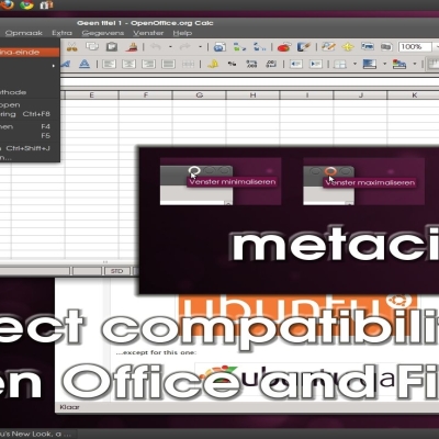
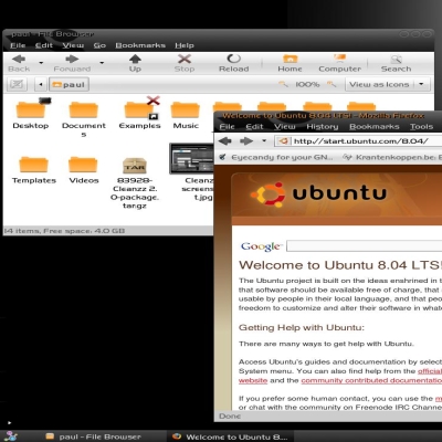
This theme uses the shiki-wise GTK-theme and the new-wave-metacity to get the best compatibility on any application.
There are a lot of theme's out here that fail miserably on that issue.


Ratings & Comments
5 Comments
I like this. Very similar to the Lucid theme. I'll be watching for future updates. Nice work.
I don't like the orange here... seems too violent... what about this one? #DA5A2A and I think it could looks better if you could set a bitmap for check and radio buttons in FOCUS state ;) just put a image as function= FOCUS and other as function=FLAT_BOX both having the same image into the styles for radio and check. voted good anyway; nice to see some lite settings using murrina. btw, nice the #1C0712 color...
Well I'll be updating the theme shortly with a slightly darker orange (E96336) for the menu-items (your proposed color is a bit to dark for me) and changed the style of the menu-items to be more flat. Which gives it a smoother look. I usually work with pixmaps-themes. These are easier to work with because you can use images to get where you want. So I'm a bit in the dark here. This is the first time I'm playing with the murrine-theme. And I do not know how to add what you've proposed...
Nice Work Compiling this theme, I Believe you can get the new Ubuntu Metacity theme somewhere if you'd like :) Though this purple step on ubuntu's part is not to my taste it's not your fault. great work, so i rate up your theme! :D
Well the new 'default'-colors are disputable, but they are an improvement. I do not know anybody that actually liked the former brown-orange theme. This theme uses the shiki-wise GTK-theme and the new-wave-metacity to get the best compatibility on any application. There are a lot of theme's out here that fail miserably on that issue.