

C4-Pack
dictionary


Source (link to git-repo or to original if based on someone elses unmodified work):
VERSION 1.0
-----------
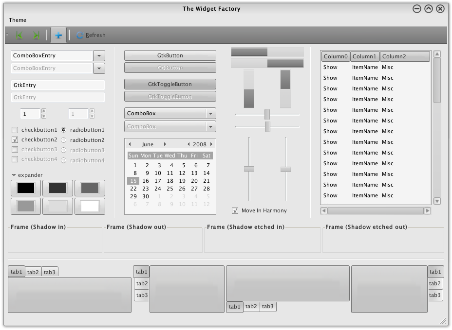
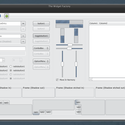
1. Changed the buttons, next up tabs!
2. Tabs done, next up the elements!
3. Almost done, a few touch ups!
4. Done!
VERSION 1.1
-----------
Edited the in-active tabs to be more complete.


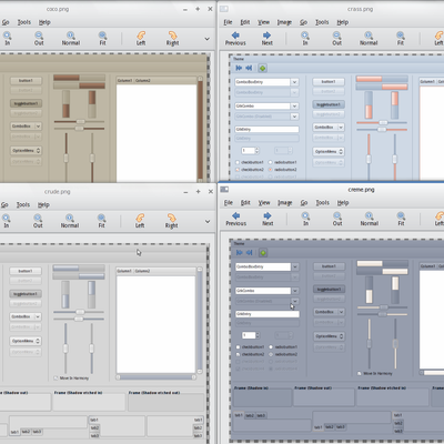
More GTK2 Themes from dictionary:
Other GTK2 Themes:


Ratings & Comments
16 Comments
Thanks for sharing
great job
There is a slight problem with tabs though. Inactive tabs has a small blank space under them, which doesn't look too good. The toolbar could be a little lighter too, to better fit with the rest of the theme.
Er, it doesn't look eh? I had deliberately cut that part to make it more distinguishable, well ok, now that you've mentioned it, the original tabs are on their way ;) Thanks.
Tabs are fixed. And the panel looks fine enough, isn't it? Well atleast I felt so. In any case, I will build up some different contrasts in the next update, and you can use whatever background you feel comfortable.
Tabs look excellent, as does the panel. :) It's this part I'm a bit fuzzy about: http://farm4.static.flickr.com/3066/2889731131_9be405764b_o.png It seems too dark to me.. A little lighter would be great.
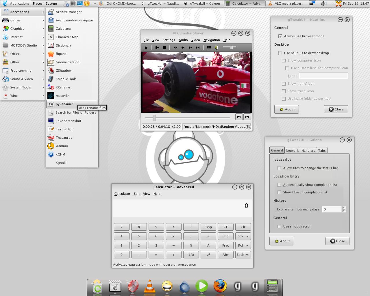
It's a very nice Theme, but ... Users and Language don't fits well on Panel. The bottom from Windows (Line) is too dark. More I hadn't found at moment ;) Another ask? You had tried it with the actual Royal-Icons? I think you will stay surprised ;)
Thanks for the feedback! Honestly I didn't understand anything you said. If you can elaborate it with screenshots for each of the issues you have mentioned, it would be mighty fine. Of course I don't want to impose on you, you can do at your own time ;)
I thought my English is bad... but soo bad you don't understand nothing! Oh ... Okay here you get a Picture for being finally understanded ;) http://ubuntu-pics.de/bild/3704/odi_p6V2C5.jpg But this with the Royal-Icons you have understand, I think?! Okay there are some things in a middle good status, but the usability is yet very high. You should try it, because it fits very well on your Theme ;)
Hehe I don't want to comment on your English, it isn't my native either, so you can say I don't understand it good enough rather than you can say it bad enough ;) I got the things in the pic. Working on it, should be fixed in next update. As for icons, it's just individual taste, so you're free to choose, I don't want to tie any one particular thing to the theme :P
ha ha of course here is a free choose. Only I wanted you knows it fits well on your Theme... nothing else ;)
- Progress bars are veri nice imo - Need a little work on tabs again - Scrolling bar are too present Cygoku
Yeah working on tabs right now, I didn't understand your comment on scrollbars. Are they too pale/plain?
Good idea!! ;-)
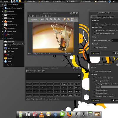
from where you have that background? cheers manuel
You can find it under the Abstract section at hdwallpapers.net